This site uses cookies to improve your experience. To help us insure we adhere to various privacy regulations, please select your country/region of residence. If you do not select a country, we will assume you are from the United States. Select your Cookie Settings or view our Privacy Policy and Terms of Use.
Cookie Settings
Cookies and similar technologies are used on this website for proper function of the website, for tracking performance analytics and for marketing purposes. We and some of our third-party providers may use cookie data for various purposes. Please review the cookie settings below and choose your preference.
Used for the proper function of the website
Used for monitoring website traffic and interactions
Cookie Settings
Cookies and similar technologies are used on this website for proper function of the website, for tracking performance analytics and for marketing purposes. We and some of our third-party providers may use cookie data for various purposes. Please review the cookie settings below and choose your preference.
Strictly Necessary: Used for the proper function of the website
Performance/Analytics: Used for monitoring website traffic and interactions
The Google Maps Timeline has long been a useful though slightly uncomfortable feature that maintains a complete record of everywhere your phone goes (and probably you with it). Many Google users grew quite fond of having access to that data. However, Google had access to it, too. You can probably see where this is going.
Apple plans to start using images it collects for Maps to train its AI models. The company originally released the feature alongside its 2019 revamp of Apple Maps. The company originally released the feature alongside its 2019 revamp of Apple Maps. Look Around is Apple's answer to Google Street View.
Study after study has shown that minority drivers are ticketed at a higher rate, and data from speed cameras suggests that it's not because they commit traffic violations more frequently. But now, Lyft has given a group of researchers access to detailed data from their drivers. But this leaves open the question of why.
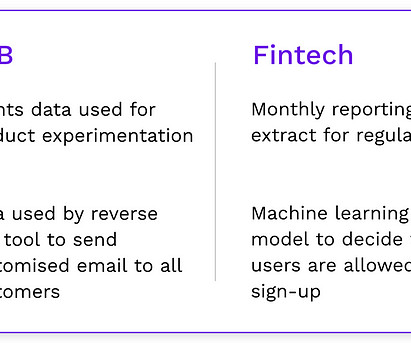
By combining the power of its CRM with integrated data and cutting-edge artificial intelligence, Salesforce empowers nonprofit organizations of all sizes to cultivate deeper relationships with donors through hyper-personalized engagement. One tip is migrating over the most important subset of data like the last 3-5 years of giving history.
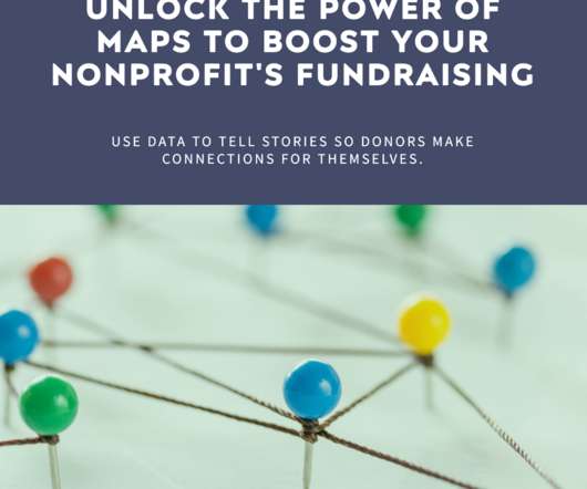
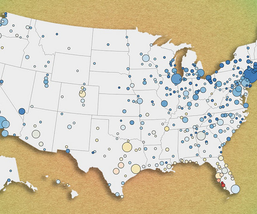
Uncover the Benefits of Maps for Nonprofit Fundraising. When we use images that are based on real data and facts, our story, and more importantly – our conclusions – become self-evident. Maps are one of the most powerful tools available to nonprofits when it comes to creating compelling visual stories.
Data Science embodies a delicate balance between the art of visual storytelling, the precision of statistical analysis, and the foundational bedrock of data preparation, transformation, and analysis.
Are you looking for a new way to view and analyze your data in a geographical context? Salesforce Maps may be the perfect solution for your association! With Salesforce Maps, your organization can identify trends, patterns, and opportunities within your data, mapped geographically. What is Salesforce Maps?
Efficient geospatial manipulations for OSM mapdata Photo by Tabea Schimpf on Unsplash If you’ve worked with OSM data before, you know it’s not the easiest to extract. OSM data can be huge, and finding performant solutions for what you want to analyze is often a challenge. Let’s get into what this library can do! ?
The map above shows the year-over-year change in metro-area home prices from December 2023 to December 2024. The map below shows how metro-area home prices at the end of 2024 compare to that respective markets peak in 2022. Click here to view an interactive version of the map below. Springfield, Ohio: +11.8% Ocala, Florida: -1.9%
From vaccine distribution plans to fire trackers to bar crawls for your best friend’s birthday, maps help people visualize space and express impact. Felt is a collaborative software company that wants to make it easier for people to build maps on the internet. Felt allows users to build a map with data sets integrated into it.
Donor Journey Mapping is a process for helping organizations understand their current donor experience, identify opportunities to improve, and implement a plan to enhance it. The team at Intermountain Health used their existing donor data to identify the new donors they wanted to focus on. Need help understanding your donors?
The main selling point for the app's premium version, which shows health and fitness data, is a suite of new AI features. Access to Garmin Connect data has been free compared to competitors like Whoop, Fitbit, and Oura, which require paid subscriptions or offer a premium tier.
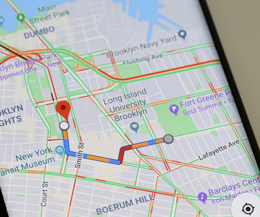
Google says that its update to Google Maps will give users more control over their location data. The navigation app's Location History feature, which is turned off by default, stores your activity in the cloud, showing where you've recently been. The idea is to help people remember the places they've. Read Entire Article
Geospatial visualization has become an essential tool for understanding and representing data in a geographical context. It plays a pivotal role in various real-world applications, from urban planning and environmental studies to real estate and transportation.
Strategically enhancing address mapping during data integration using geocoding and string matching Many individuals in the big data industry may encounter the following scenario: Is the acronym “TIL” equivalent to the phrase “Today I learned” when extracting these two entries from distinct systems? 1: Capitalization (eg.
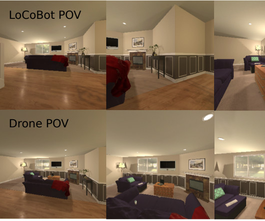
Building robots that are proficient at navigation requires an interconnected understanding of (a) vision and natural language (to associate landmarks or follow instructions), and (b) spatial reasoning (to connect a map representing an environment to the true spatial distribution of objects).
.” Stephen Few, data visualization expert On a single day, Facebook users share 2.45 The competition for eyeballs is fierce, but data visualization offers a way to stand out. The competition for eyeballs is fierce, but data visualization offers a way to stand out. Why is data visualization so effective?
Spencer Czapiewski August 6, 2024 - 6:34pm Kyle Massey VP Lead Software Engineer Kyle Massey, a two-time Tableau DataDev Ambassador and co-leader of the DataPride Tableau User Group, shares his experience with VizQL Data Service. What is VizQL Data Service? Why should you be excited about VizQL Data Service?
The information comes from an interactive map published by British price comparison site Cable.co.uk, which gathered information about 5,603 mobile data plans from 237 countries this year to arrive at its conclusion. Per the report, Zimbabwe was the most expensive place in the world to buy mobile data, with one.
Going by either the Senkaku Islands or the Diaoyu Islands, depending on which side of the argument you’re taking, they inspired a request from China to members of the Maps team to make them appear larger, even when viewers are zoomed out on the map.
As detailed in a paper in the journal Geology , Research Institute for Marine Geodynamics scientist Yuya Akamatsu and Hiroshima University associate professor Ikuo Katayama examined data collected by NASA's InSight Mars lander, which touched down on the Red Planet in 2018.
However, mapping your digital ecosystem is easier said than done. A digital ecosystem map allows organizations to measure their footprint and make sure they are making the most for their operational budget. What is a digital ecosystem map? Within your map, prioritize according to how critical each tool is to your organization.
Concerns about AI’s complexity and the technical skills needed to ensure data privacy, security, and fairness are valid and warrant consideration. One of the most promising applications is in humanitarian response, where rapid access to reliable data can mean the difference between life and death. Conversational analysis.
Not architecture per se, the design encases a shoebox-size data storage center thats attempting to prove the concept of off-world disaster recovery services. Commissioned by Florida startup Lonestar Data Holdings , the solar-powered 8-terabyte data storage device is tacked onto the side of the lunar lander now making its way to the moon.
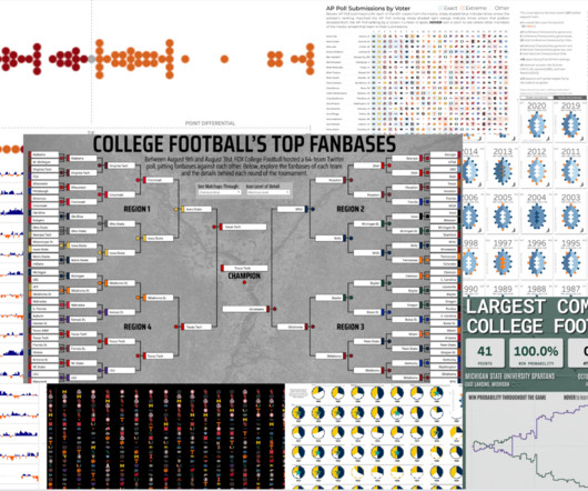
My journey into the world of data visualization has led me to embrace a unique passion: college football. Now, after over three years of engaging with the #DataFam on Tableau Public , I'm excited to present a curated collection of college football data visualizations that capture the sport's essence like never before.
To get to that conclusion, the researchers examined data collected by the Multi Unit Spectroscopic Explorer spectrograph located in the Chilean Atacama Desert, as well as observations taken by NASA's Hubble Space Telescope. LRG 3-757 on its own is absolutely huge, with 100 times the mass of the Milky Way.
Dozens of established players and newer entrants are competing to bring the most cutting-edge remote sensing data to customers. The “endgame,” as Nuview founder and CEO Clint Graumann put it, is to map the entire land surface of the Earth with lidar — on an annual basis. The company has kept a low profile since then.
In grantmaking, one word makes more eyes glaze over than any other – data. With one shift in our understanding about data, we can reclaim a sense of wonder, creative agency, and value in our data work: Recognizing that information does not equal data and data does not equal knowledge.
Data Quality Chronicles Missing data, missing mechanisms, and missing data profiling Missing Data prevents data scientists to see the entire story the data has to tell. One of them was, unsurprisingly, Missing Data. Photo by Ronan Furuta on Unsplash. Image by Author. Let’s consider an example.
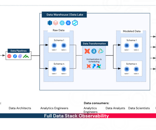
How to Identify Your Business-Critical Data Practical steps to identifying business-critical data models and dashboards and drive confidence in your data Source: synq.io This article has been co-written with Lindsay Murphy Not all data is created equal. There’s a good reason for this. Source: synq.io
Data Management A tutorial on how to use VDK to perform batch data processing Photo by Mika Baumeister on Unsplash Versatile Data Ki t (VDK) is an open-source data ingestion and processing framework designed to simplify data management complexities.
Data Entropy — More Data, More Problems? How to navigate and embrace complexity in a modern data organisation. Business users are unable to find and access data assets critical to their workflows. Data engineers spend countless hours troubleshooting broken pipelines. Every “minor” change upstream results in mayhem.
Another spacecraft, NASA's Lunar Trailblazer , will also hitch a ride on the flight to orbit the moon and map locations of lunar water. billion in contracts with private-sector vendors to help deliver instruments to the moon and send back crucial data. Additionally, the company has upgraded its dishes on the ground for receiving data.
Nicola Fox, associate administrator for science at NASA, said the study was commissioned to create a road map on how to use the tools of science to evaluate and categorize the nature of UAPs going forward. This road map, Fox added, will help the government obtain usable data to explain. Read Entire Article
The trend of open data is taking hold around the world and it will unleash untold innovation. McKinsey notes that open data, which is data that can be freely used and freely redistributed, could contribute $3 trillion annually to the global economy and has the potential to “unleash innovation and transform every sector of the economy.”
Under the hood of every AI application are algorithms that churn through data in their own language, one based on a vocabulary of tokens. Tokens are tiny units of data that come from breaking down bigger chunks of information. The faster tokens can be processed, the faster models can learn and respond.
With NVIDIA CUDA-X libraries for data science, developers can significantly accelerate data processing and machine learning tasks, enabling faster exploratory data analysis, feature engineering and model development with zero code changes. These resources include source code, sample data, a demo application and documentation.
Fitbit activity analysis with DuckDB Photo by Jake Hills on Unsplash Wearable fitness trackers have become an integral part of our lives, collecting and tracking data about our daily activities, sleep patterns, location, heart rate, and much more. What insights are buried within my archive of personal fitness activity data?
In service of this, in this blog, we’re highlighting five things we’ve heard about our grants data that aren’t quite accurate. Myth 1: “Candid grants data” is the same as “990 data.” These forms are a primary source of data about U.S. These forms are a primary source of data about U.S. Many of the largest U.S.
Gartner identifies these qualities as key to delivering value: A customer journey mapping process that extends beyond acquisition and purchase through the life of the relationship. The ability to accurately develop personas and create their journey maps. The data results in business intelligence that better meets customer needs.
Uber has struck agreements with Oracle and Google to migrate 95% of its data center contents onto the cloud, with plans to leverage additional services such as Google Ads, the Google Maps platform, and database service Cloud Spanner. Both agreements would last seven years. Uber's transition to the Google Cloud. Read Entire Article
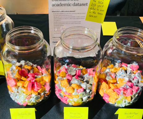
For parents, it might mean shopping for supplies and mapping out carpool schedules. At Candid, it means thinking about how we can get more data into the hands of academic researchers for the betterment of the social sector. However, we know that many researchers don’t have the resources to purchase a custom data set. nonprofits.
While usage is a great data point to evaluate your product’s success, there’s so much more to consider when weighing the options to build an in-house solution or use an off-the-shelf product. Additionally, it’s critical that the project road map is managed meticulously to avoid risk of delays that can lead to cost overruns.
We organize all of the trending information in your field so you don't have to. Join 12,000+ users and stay up to date on the latest articles your peers are reading.
You know about us, now we want to get to know you!
Let's personalize your content
Let's get even more personalized
We recognize your account from another site in our network, please click 'Send Email' below to continue with verifying your account and setting a password.


Let's personalize your content