This site uses cookies to improve your experience. To help us insure we adhere to various privacy regulations, please select your country/region of residence. If you do not select a country, we will assume you are from the United States. Select your Cookie Settings or view our Privacy Policy and Terms of Use.
Cookie Settings
Cookies and similar technologies are used on this website for proper function of the website, for tracking performance analytics and for marketing purposes. We and some of our third-party providers may use cookie data for various purposes. Please review the cookie settings below and choose your preference.
Used for the proper function of the website
Used for monitoring website traffic and interactions
Cookie Settings
Cookies and similar technologies are used on this website for proper function of the website, for tracking performance analytics and for marketing purposes. We and some of our third-party providers may use cookie data for various purposes. Please review the cookie settings below and choose your preference.
Strictly Necessary: Used for the proper function of the website
Performance/Analytics: Used for monitoring website traffic and interactions
Earlier this month, Candid released a new version of its taxonomy, the Philanthropy Classification System (PCS). Think of the PCS as a system of “tags” that Candid applies to its data to make it more searchable and usable. What are the benefits of Candid’s updated taxonomy? What does it take to update Candid’s taxonomy?
Nonprofit data nerds will love this new resource from Media Impact Funders and Foundation Center called “ Foundation Maps for Media Funding ,” a free, interactive mapping and research tool that shows the full scope of philanthropically funded media projects worldwide since 2009. Click to See Visualization.
This generalisation makes their data models complex and cryptic and require domain expertise. Even harder to manage, a common setup within large organisations is to have several instances of these systems with some underlaying processes in charge of transmitting data among them, which could lead to duplications, inconsistencies, and opacity.
The reason for search results is usually bad data. Retailers often get incomplete and inaccurate product data from brands of people listing secondhand items for sale, which means items don’t show up in search results. Pixyle AI’s team on a green mountain top.
I've been in Washington, DC for the Network Effectiveness and Social Media Strategy Map working session for Packard Foundation Grantees convened by Monitor Institute. This is a post to help me identify what I don't know about social network analysis and mapping tools with the hope that you'll fill in the gaps in the comments.
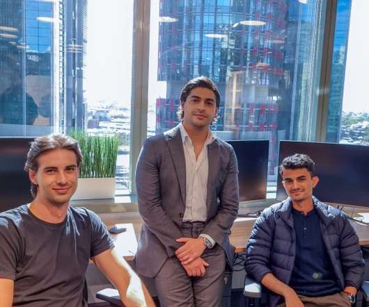
Avarni’s platform aggregates supply chain and spending data into one comprehensive dataset, and it uses that and AI to help clients report and forecast their carbon footprint. Enterprises pay a flat fee based on the amount of procurement data analyzed by Avarni. Avarni founders Misha Cajic, Tony Yammine and Anuj Paudel.
How are they different from taxonomies? Gavin's post does a great job explaining the definitions and the advantages of a taxonomy over a folksonomy. The semantic web and the continued evolution of search, data design, and user interface design will help. social network and community sites.
Drawing on a taxonomy of professional backgrounds and skills, which includes tags across expertise areas, industries and roles, the platform’s AI model attempts to predict the right programs and coach-student matches with the highest probability of achieving desired development outcomes.
Prior to Revelio, Zweig was a managing data scientist at IBM in the chief analytics office. “While at IBM, I had worked on a lot of people analytics projects using internal HR data,” Zweig told TechCrunch in an email interview. ” Image Credits: Revelio. . ” Image Credits: Revelio.
I'm summarizing the parts I found interesting: The give us some numbers of tagging, although since it is the first time they have asked about tagging there is not data to determine whether tagging is increasing or not. The report also shares some traffic data for the popular tagging sites, Flickr and Delicious. taxonomies.???
Hence, developing algorithms with improved efficiency, performance and speed remains a high priority as it empowers services ranging from Search and Ads to Maps and YouTube. We provided a model-based taxonomy that unified many graph learning methods. We also quantified the degree to which LLMs emit memorized training data.
Here are three tools I created or co-authored that can help you match skills to roles: Nonprofit Data & Tech Skill-Building Checklist — a worksheet that provides an inventory of technology and data-related skills and a way to rate your skills or those of a team member or job candidate.
By hard coded, I mean in the legal policies you've adopted, the features you've released and prioritized, your datataxonomies, your site map and information hierarchy. I do think that there are some discoverable values that are hard coded into any online platform. But other values are also discoverable.
Pages 9 and 10 pull together data from the NEA, the Irvine Foundation, Dance/USA, RAND, and the Knight Foundation to tell a tight, compelling story about the demographic shift from consumptive to active participation and the extent to which traditional arts audiences are also participating in art-making outside of traditional arenas.
There are also broader metaverse-related taxonomies like one from game designer Raph Koster , who draws a distinction between “online worlds,” “multiverses,” and “metaverses.” To Koster, online worlds are digital spaces — from rich 3D environments to text-based ones — focused on one main theme.
I’ll come back to it at the end to demonstrate how it maps to the example. If visitors can assign their own tags to artifacts, then we can create visitor-generated folksonomies alongside traditional taxonomies—and people who are searching for content can find artifacts of interest via either path. First, some background on tagging.
This taxonomy will enable us to aggregate data and provide benchmarking services for the purpose of supporting corporations, foundations, and NPOs to connect over shared interests. Currently, we are building a solution to enable people to use uniform measurement for social change.
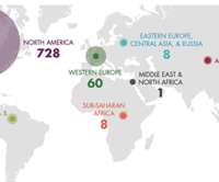
Since 2010, Human Rights Funders Network (HRFN) and Candid have partnered on research that maps funding for human rights globally. For over a decade, our annual Advancing Human Rights research has mapped trends in funding for human rights, breaking down funding into three major categories: issues, strategies, and populations.
billion in grants specifically for “community college education,” according to Candid data. Under Candid’s taxonomy , we track funds supporting “community college education,” which encompasses funding both to community colleges and to their foundations. Data gathered on September 13, 2021 from Foundation Maps. [2]Candid
I started experimenting with these concepts back in 2008 at SXSW session on Nonprofit ROI and SXSW Session on Nonprofit Crowdsourcin g as well as at the NTC in 2009 on a session mapping metrics to strategy. It’s free but you can purchase additional data for reasonable amounts (for example you can get Klout Scores ).
We organize all of the trending information in your field so you don't have to. Join 12,000+ users and stay up to date on the latest articles your peers are reading.
You know about us, now we want to get to know you!
Let's personalize your content
Let's get even more personalized
We recognize your account from another site in our network, please click 'Send Email' below to continue with verifying your account and setting a password.


Let's personalize your content