This site uses cookies to improve your experience. To help us insure we adhere to various privacy regulations, please select your country/region of residence. If you do not select a country, we will assume you are from the United States. Select your Cookie Settings or view our Privacy Policy and Terms of Use.
Cookie Settings
Cookies and similar technologies are used on this website for proper function of the website, for tracking performance analytics and for marketing purposes. We and some of our third-party providers may use cookie data for various purposes. Please review the cookie settings below and choose your preference.
Used for the proper function of the website
Used for monitoring website traffic and interactions
Cookie Settings
Cookies and similar technologies are used on this website for proper function of the website, for tracking performance analytics and for marketing purposes. We and some of our third-party providers may use cookie data for various purposes. Please review the cookie settings below and choose your preference.
Strictly Necessary: Used for the proper function of the website
Performance/Analytics: Used for monitoring website traffic and interactions
I am a big fan of actionable metrics. Fenton’s guide divides up the kinds of metrics you can focus on under the headings See, Say, Feel and Do. Ss I suggest in my Community Mapping approach , the actions and metrics should be mapped against the segments of the community doing them. What do you think?
We covered how to do Community Mapping (identifying the segments and goals of the community), Content Mapping (creating a plan for which content goes where, and why), and Data Tracking (pulling all the numbers together). DIY Community Engagement Metrics. Community Mapping. >> Content Mapping. >>
. —– I love data as much as the next person. Give me an interactive map, a pivot table, even a plain old pie chart and I’m happy. But, there’s more to being data-informed and more to what we should demand of our data, right? Is data helpful if you aren’t using it? data nten'
Without clear boundaries or metrics, decision-making slows, trust erodes, and blame becomes a substitute for ownership. A financial services firm, for example, implemented a bonus system heavily weighted toward individual performance metrics. Map out how each division, team, and role contributes to achieving these goals.
We believe strongly in this capability because it lowers the barrier to entry for new users, and we believe that data is for everyone. The release of Tableau Pulse introduces some redundancies to the platform, including search-based analytics with Ask Data and Tableau Metrics. In 2020, Metrics in Tableau launched.
Data: Strategy and Storytelling. I’ve documented the community and content mapping processes before, you can use the slides above to see the process or review the blog post with instructions. You can also use these links to get the templates: Community Mapping template. Content Mapping template! Presentation.
There is no need to get compliance approval for sensitive data or to get IT support for integrations — everything can be managed by the line-level users themselves. In this piece, we will take a closer look at this trend — and specifically how it has fundamentally altered pricing — and at a framework for mapping pricing to customer value.
Then single people started making their decisions based on this data and gave up the apps and social gatherings in order to spend more time at the courthouse. Value Every Stage Assign appropriate credit to awareness activities Measure engagement metrics Track time-to-conversion Consider assisted conversions 3. Ridiculous, right?
.” Stephen Few, data visualization expert On a single day, Facebook users share 2.45 The competition for eyeballs is fierce, but data visualization offers a way to stand out. The competition for eyeballs is fierce, but data visualization offers a way to stand out. Why is data visualization so effective?
In particular, the new multiple marks layers feature lets you add an unlimited number of layers to the map. This means you can visualize multiple sets of location data in context of one another, and there’s no need for external tools to build custom background maps. . Drag and drop map layers—yes, it’s just that easy.
While usage is a great data point to evaluate your product’s success, there’s so much more to consider when weighing the options to build an in-house solution or use an off-the-shelf product. Throughout the evaluation process, it’s important to keep your association’s unique goals and success metrics top-of-mind.
Marketing automation tools integrate with CRM systems, ensuring that donor data is up to date and synchronized across platforms. Other types of engagement, (clicks, email opens, social follows) can be factored into the scoring system, even if the data comes from a third party source. Which email copy is best? Test both!
The annual M+R Benchmarks Study is a wide-ranging exploration of digital fundraising, advocacy, and marketing data. Participation primarily involves collecting and coding a big stack of data, which our analytics team will combine (anonymously!) Your data security and anonymity are VERY IMPORTANT to us. Read time: 2 minutes.
Prioritizes outcomes—views customer satisfaction as the significant metric of success. Gartner identifies these qualities as key to delivering value: A customer journey mapping process that extends beyond acquisition and purchase through the life of the relationship. “Guessing about member preferences is not an option.
Now is the time to celebrate what all your organization achieved, reflect upon what you didn’t, and learn from that data to make 2022 your best year yet. To answer that question, you want to be sure you’re pulling up the right data. Website metrics. Email metrics. Social Media metrics. Fundraising metrics.
Are you looking at a map or the rearview mirror? So, most nonprofit fundraising plans aren’t supported by data, but rather stem from inertia and intuition. You might answer this question with metrics like the number of new donors or the number of donations. I consider those basic metrics to be “rearview mirror” metrics.
Under the hood of every AI application are algorithms that churn through data in their own language, one based on a vocabulary of tokens. Tokens are tiny units of data that come from breaking down bigger chunks of information. The faster tokens can be processed, the faster models can learn and respond.
The startup, which calls itself “Google Maps for business growth,” announced today that it has raised $15 million from Elevation Capital, Jungle Ventures and Venture Highway, plus 25 angel investors. He saw that top-performing companies used data in their decision-making. This requires a systems-thinking and a data-driven approach.”.
AI research lab DeepMind has created the most comprehensive map of human proteins to date using artificial intelligence. There are currently around 180,000 protein structures available in the public domain, each produced by experimental methods and accessible through the Protein Data Bank. anyone can use it for anything”.
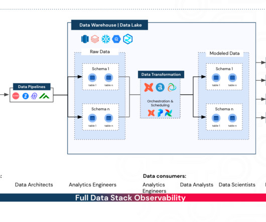
How to Identify Your Business-Critical Data Practical steps to identifying business-critical data models and dashboards and drive confidence in your data Source: synq.io This article has been co-written with Lindsay Murphy Not all data is created equal. There’s a good reason for this. Source: synq.io
Monitor metrics such as engagement rates, content reach, and donor response. Explore how the strategic integration of SWOT analysis, audience mapping, SMART communication targets, channel identification, content strategy, execution and evaluation, and high-level communications planning can shape a successful digital transformation.
Data Entropy — More Data, More Problems? How to navigate and embrace complexity in a modern data organisation. Business users are unable to find and access data assets critical to their workflows. Data engineers spend countless hours troubleshooting broken pipelines. Every “minor” change upstream results in mayhem.
Taken together, these data points make it clear: your website can play a significant role in building meaningful, long-term supporter relationships. This makes it easier for the agency to map out intuitive navigation. These metrics can then guide layout decisions, calls-to-action, and content structure.
After the session, I sat down with VolunteerMatch’s President Greg Baldwin to learn more about how they use data, measurement, and learning to measure and improve impact. It is a live data trail of interactions and connections on the site.
Struggling to articulate the value of your data team? Learn how to calculate your data team’s return with the Data ROI Pyramid. As recently as a year ago, about half of the data leaders I spoke with felt the business value of their team sold itself. Calculating data ROI Image by author. Image by author.
A unifying vision The message, goals, and metrics that both define your top-line digital future and give you a means for tracking its progress. The result is a digital ecosystem plan : a map of complementary digital products and services aligned with your mission goals. Your mission depends upon it. Forum One can help.
For health data to impact health outcomes and related policies, the data must be made accessible to policymakers, health advocates, and other interested parties. Too often, health data is locked in massive datasets that are opaque to all but epidemiologists and statisticians.
The answer: craft your own strategy that uses your data, is customized to your audience, and won’t overwhelm your team (or yourself). Here is how you can craft a road map to social media success. Instead of turning to expert advice, look at your own social media data from the past year. This is your road map.
Collecting data and surfacing insights are essential to meeting customer expectations. The ability to combine data generated by customer interactions helps organizations better anticipate needs and deliver more integrated and personalized experiences. Accelerate data prep without a connector. Anirudh Sridhar. Bronwen Boyd.
By Kurt Voelker, CTO, Forum One Data is the new black. Data is so much more than a stack of numbers or a server filled with client outputs. One effective way to transform your data from an afterthought into a powerful communications product is through visualizations that help tell your story. And for good reason.
Collecting data and surfacing insights are essential to meeting customer expectations. The ability to combine data generated by customer interactions helps organizations better anticipate needs and deliver more integrated and personalized experiences. Accelerate data prep without a connector. Anirudh Sridhar. Bronwen Boyd.
It’s also a chance to adjust processes, staff skill sets, and align with the future road maps of your technology partners.” But failure to use data effectively can also be dangerous. If you don’t have a data governance strategy , a technology assessment can be a good way to launch this process.
As COVID accelerates innovative uses of AI in many areas, we are also seeing more development of AI-powered datamapping tools for philanthropic advising and to support donor investment decisions. Machine learning is most likely being used to help with the data coding and categorization in the underlying databases.
Websites are loaded with eye candy these days — from slick user interfaces to interactive maps to cool photo slideshows — all achieved without Flash, just HTML, CSS and Javascript. In this 2-part series, I'm going to focus on the rapidly changing world of interactive tools for data visualization, or dataviz.
According to the European Data Portal , “without data we can’t build information, and without information there is no new knowledge.” Open data is integral to understanding the impacts of COVID-19. The GovLab notes the following areas where open data can provide quantifiable value: . Data perspectives in the Netherlands.
Nimble Intelligence According to Community Brands research, 55% of associations say investing in business intelligence and data analytics is a top priority. Nimble Intelligence is a new offering from Nimble AMS designed to help associations gain better insights into their data.
Many human services agencies struggle to share program outcomes with funders and use data to understand how their programs are performing. They share how they are scaling service delivery using data to gain a holistic view of their clients and programs. Breaking Down Data Silos & Using Automation.
The $199 Form goggles were released last year, and offered a unique method of tracking swimming metrics by using motion sensors and an AR display built into the goggles itself. The goggles can also show additional information pulled from the paired watch, like your current heart rate, something they were unable to do before.
Three Zero-Cost Solutions That Take Hours, NotMonths A data quality certified pipeline. Source: unsplash.com In my career, data quality initiatives have usually meant big changes. Whats more, fixing the data quality issues this way often leads to new problems. Create a custom dashboard for your specific data qualityproblem.
We collect more and more diverse data types, and we’re not always sure how we can turn this data into real value. Or even if we have a pretty good understanding of the problem, there is not enough data to run a successful project and deliver impact back to the business. Who Can Benefit from the Visual Data? Submit Data.
Team USA has built a world-class organization where good decisions are made with a data-first mindset, and where data is the common language that unites and empowers everyone to collaborate with confidence and achieve great things. Today, nearly 20% of the employees are using Tableau to see and understand their data.
Google Maps will soon show users in the US the most fuel-efficient route. The new services focus on reducing planet-heating greenhouse gas emissions and are primarily found on Search, Maps, Travel, and Nest. Starting Wednesday, people in the US can see which driving routes are the most fuel-efficient when using Google Maps.
Use your donor data to add a personal touch; this could mean congratulating them for winning a highly sought-after auction item or letting them know how their donation during your appeal will make an impact on your mission. Track these metrics using your nonprofit constituent relationship management system (CRM) and fundraising software.
Three specific examples that are very different include: Connectipedia : a wiki-based platform that allows anyone interested in philanthropy or social impact in the Pacific Northwest (or beyond) to share research, resources, information, or data about people, places and topics. The crowd decides and creates everything that it is.
We organize all of the trending information in your field so you don't have to. Join 12,000+ users and stay up to date on the latest articles your peers are reading.
You know about us, now we want to get to know you!
Let's personalize your content
Let's get even more personalized
We recognize your account from another site in our network, please click 'Send Email' below to continue with verifying your account and setting a password.


Let's personalize your content