This site uses cookies to improve your experience. To help us insure we adhere to various privacy regulations, please select your country/region of residence. If you do not select a country, we will assume you are from the United States. Select your Cookie Settings or view our Privacy Policy and Terms of Use.
Cookie Settings
Cookies and similar technologies are used on this website for proper function of the website, for tracking performance analytics and for marketing purposes. We and some of our third-party providers may use cookie data for various purposes. Please review the cookie settings below and choose your preference.
Used for the proper function of the website
Used for monitoring website traffic and interactions
Cookie Settings
Cookies and similar technologies are used on this website for proper function of the website, for tracking performance analytics and for marketing purposes. We and some of our third-party providers may use cookie data for various purposes. Please review the cookie settings below and choose your preference.
Strictly Necessary: Used for the proper function of the website
Performance/Analytics: Used for monitoring website traffic and interactions
Beth’s blog shares Ann Emry’s tips for creating charts with your nonprofit’s data. Charts can turn plain text into a visually, expressive piece of information, which is great for persuading donors to donate or showing your supporters your organization’s impact. Chart diversity. Visual communication.
You may have inherited a vast pool of web content written before your time, or you frequently receive lengthy “expert” articles and other contributed pieces to add to the web site you now manage. Not every expert who contributes to a web site is also an expert in writing for the web. Web writing is often too verbose.
It is ubiquitous in our digital life in the form of iconography, infographics, tables, plots, and charts, extending to the real world in street signs, comic books, food labels, etc. In light of these challenges, we propose “ MatCha: Enhancing Visual Language Pretraining with Math Reasoning and Chart Derendering ”.
Source: Juice Lab Chart Chooser. Last month, Stephanie Evergreen wrote an awesome guest post called “ Six Steps to Great Charts ” with lots of practical tips for using the Excel chart feature to visualize your social media measurement data. The six steps: Step 1: Which Chart is Best? Step 6: Annotate.
Here these questions are rhetorical, but you’ve likely all seen and responded to similar survey questions as you’ve traversed the web. Rosario Gauna and Donna Coles both wrote tutorials on the heels of the challenge, detailing how they approached the main requirements: donut charts, bar charts, divergent bar charts, and heatmaps.
Welcome to Best of Tableau Web! Tableau Stunning Charts Series?Radial Radial Column Chart. Chart Chat Live — Round 24. Understanding Index Charts and Log Scales. How to build an interactive line chart comparing across quarters. I hope you've enjoyed this edition of Best of the Tableau Web!
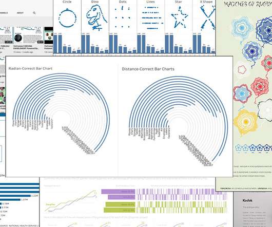
And Best of the Tableau Web is, of course, part of it! Luke Stanke, Circular Bar Charts: Why you should make them but never share them. Luke Stanke, Circular Bar Charts: Why you should make them but never share them. Pierre Hansquine, Bar Charts: The Good, the Bad, and the Ugly. Largely, I’d agree. Tips and Tricks.
With that, let’s dive into this month’s Best of the Tableau Web and see just what the #DataFam was up to in September! For updates throughout the month, follow me Twitter and LinkedIn , and check out the list of blogs that Andy Cotgreave and I follow for Best of the Tableau Web. New Viz* The Cost of Data: One sheet, two chart.
” Energy These Four Charts Sum Up the State of AI and Energy Casey Crownhart | MIT Technology Review “Sure, youve probably read that AI will drive an increase in electricity demand. ” The post This Weeks Awesome Tech Stories From Around the Web (Through April 19) appeared first on SingularityHub.
National Priorities Project : They offer three unique web-based tools that nonprofits can use to help educate the masses about the U.S. budget, taxes, and spending: Income Tax Chart , Cost Of War.com and budget charts. oneforty : A gallery of over 2,500 (and counting) Twitter Apps.
Making your report web-based unlocks interactive opportunities to recap your achievements and connect with your stakeholders. Infographics, charts, and visuals can also help make complex information more digestible and showcase the difference your organization makes. To do that, it needs to live where your audience lives: online.
Fresh off of Tableau Conference , we are back with the Best of the Tableau Web! With that, let’s dive into this month’s Best of the Tableau Web and see just what the #DataFam was up to in November! How to Make a Radar Chart in Tableau. Rounded Bar Charts in Tableau. Gauge Chart (With Arrow). Bronwen Boyd.
Beautiful Business Dashboards: The How and the Why : Samuel Parsons and Simon Beaumont are masters at their craft, and it was so cool to see how these two took ordinary charts and made them absolutely beautiful, sharing some tips and tricks along the way. Don't forget to check out the list of blogs we follow for Best of the Tableau Web.
And a special thank you to those who have had work featured in Best of the Tableau Web over the years. . Let’s see what the community is laying down with this month’s Best of the Tableau Web. Charting "Top N and Others" via Table Calculations in Tableau. How to build and interpret an index chart using Tableau.
With that, enjoy Best of the Tableau Web with tips, tricks, inspiration and more produced by the Tableau community. For updates throughout the month, follow me on Twitter and LinkedIn , and check out the list of blogs I follow for Best of the Tableau Web. How to Create a Variation Chart. How to Build a Rank Chart in Tableau?
Welcome to Best of Tableau Web! The mix of design with storytelling is well balanced; the story [they’re] telling is very clear and so we have charts that are easy to read … Any decisions to go off the beaten track feel like they've been made with intent.” . — Tableau Stunning Charts Series?Radial Radial Column Chart.
Whether you’re just building your organization’s first website or are considering redesigning your existing one, you’ve come to the right place for a crash course in visual web design. When you get started with web design, it’s easy to get caught up in all of the bells and whistles you can add to various pages. Let’s dive in!
Here these questions are rhetorical, but you’ve likely all seen and responded to similar survey questions as you’ve traversed the web. Rosario Gauna and Donna Coles both wrote tutorials on the heels of the challenge, detailing how they approached the main requirements: donut charts, bar charts, divergent bar charts, and heatmaps.
With that, let’s dive into this month’s Best of the Tableau Web for January! For updates throughout the month, follow me on Twitter and LinkedIn , and check out the list of blogs that Andy Cotgreave and I follow for Best of the Tableau Web. Part 2 The Build: An Annual Sunburst Chart Template. Tableau Coxcomb Chart Template.
With that, let’s dive into this month’s Best of the Tableau Web for January! For updates throughout the month, follow me on Twitter and LinkedIn , and check out the list of blogs that Andy Cotgreave and I follow for Best of the Tableau Web. Part 2 The Build: An Annual Sunburst Chart Template. Tableau Coxcomb Chart Template.
Welcome to the Best of the Tableau Web! Functional Aesthetics goes far beyond charts to look at how we can make our visuals more effective and impactful. Don't forget to check out the list of blogs we follow for Best of the Tableau Web. Area Chart in a Reference Band? How to Create a Dendrogram Chart.
Welcome to the Best of the Tableau Web! Functional Aesthetics goes far beyond charts to look at how we can make our visuals more effective and impactful. Don't forget to check out the list of blogs we follow for Best of the Tableau Web. Area Chart in a Reference Band? How to Create a Dendrogram Chart.
And a special thank you to those who have had work featured in Best of the Tableau Web over the years. . Let’s see what the community is laying down with this month’s Best of the Tableau Web. Charting "Top N and Others" via Table Calculations in Tableau. How to build and interpret an index chart using Tableau.
Fresh off of Tableau Conference , we are back with the Best of the Tableau Web! With that, let’s dive into this month’s Best of the Tableau Web and see just what the #DataFam was up to in September! How to Make a Radar Chart in Tableau. Rounded Bar Charts in Tableau. Gauge Chart (With Arrow). Bronwen Boyd.
Hello, and welcome to the Best of the Tableau Web! Check out the list of Tableau community blogs Andy Cotgreave and I follow for Best of the Tableau Web, and if you don’t see yours on the list, add it here. Right, and with that I’m happy to present the Best of the Tableau Web! How to Build an XmR Chart in Tableau.
I’m Caroline Yam, Tableau Community Manager based down under in Sydney, Australia, and I’m thrilled to join the ranks of the Best of Tableau Web authors. . To connect with the Community, tag your posts with the #DataFam, and I invite you to add it here to be featured in a future edition of Best of Tableau Web. . September 7, 2022.
I’m Caroline Yam, Tableau Community Manager based down under in Sydney, Australia, and I’m thrilled to join the ranks of the Best of Tableau Web authors. . To connect with the Community, tag your posts with the #DataFam, and I invite you to add it here to be featured in a future edition of Best of Tableau Web. . September 7, 2022.
In the marketing world, the challenges are usually most pronounced for me with things like color-coded spreadsheets, charts or graphs using vague pastel shades. Depending on the chart or graph you show me, I may or may not know what it’s trying to communicate. Color blindness and the web.
I come across so many great conversations, ideas, and resources all over the web every day. fact that I can often be found laying in bed at 6am and digging through client web reports. No wonder than, I am commonly asked; “What are the top web analytics reports and tools every nonprofit should know?&#."
With that, let’s dive into this month’s Best of the Tableau Web and see just what the #DataFam was up to in May! For updates throughout the month, follow me Twitter and LinkedIn , and check out the list of blogs that Andy Cotgreave and I follow for Best of the Tableau Web. Brandi Beals: Up Your Game with a Tableau Style Guide.
With that, enjoy Best of the Tableau Web with tips, tricks, inspiration and more produced by the Tableau community. For updates throughout the month, follow me on Twitter and LinkedIn , and check out the list of blogs I follow for Best of the Tableau Web. How to Create a Variation Chart. How to Build a Rank Chart in Tableau?
I come across so many great conversations, ideas, and resources all over the web every day. Here are some of the most interesting things I’ve found recently (as of July 1st). You can join the conversations in the comments, or click through to the original posts to find what others are saying.
Beautiful Business Dashboards: The How and the Why : Samuel Parsons and Simon Beaumont are masters at their craft, and it was so cool to see how these two took ordinary charts and made them absolutely beautiful, sharing some tips and tricks along the way. Don't forget to check out the list of blogs we follow for Best of the Tableau Web.
I come across so many great conversations, ideas, and resources all over the web every day. " Where does Social Media belong on the Org Chart? Here are some of the most interesting things I’ve found recently (as of July 29th). " Why Do You Participate in Twitter Chats? We spoke to Ms.
With that, let’s dive into this month’s Best of the Tableau Web and see just what the #DataFam was up to in September! For updates throughout the month, follow me Twitter and LinkedIn , and check out the list of blogs that Andy Cotgreave and I follow for Best of the Tableau Web. New Viz* The Cost of Data: One sheet, two chart.
Welcome to Best of Tableau Web—a monthly highlight of tips, tricks, and inspiration from across the internet on Tableau and data visualization. With that, let’s dive into this month’s Best of the Tableau Web for February. Be sure to check out the list of blogs that we follow for Best of the Tableau Web. Julia Biedry.
When you want to explore, create, and share data visualizations, we're happy to share that you can start creating vizzes directly from a browser on Tableau Public with the web authoring beta. Like in Tableau Desktop, with web authoring you can connect to data in a variety of formats. Now, make some charts. Offer feedback.
With that, enjoy Best of the Tableau Web with tips, tricks, inspiration and more produced by the Tableau community. Don't forget to check out the list of blogs we follow for Best of the Tableau Web. How to Make an Expanding Donut Chart in Tableau. How to Create Horizon Charts in Tableau. Calculations. Brandi Beals.
With that, enjoy Best of the Tableau Web with tips, tricks, inspiration and more produced by the Tableau community. Don't forget to check out the list of blogs we follow for Best of the Tableau Web. How to Make an Expanding Donut Chart in Tableau. How to Create Horizon Charts in Tableau. Calculations. Brandi Beals.
To mark the five-year publish anniversary of my book, The Big Book of Dashboards , we’re celebrating on Chart Chat ( sign up here ), and I also thought it a good time to look at how members of the Tableau Community are talking about dashboards these days. . How to Create an Alternative to a Merimekko Chart. Bronwen Boyd. April 5, 2022.
To mark the five-year publish anniversary of my book, The Big Book of Dashboards , we’re celebrating on Chart Chat ( sign up here ), and I also thought it a good time to look at how members of the Tableau Community are talking about dashboards these days. . How to Create an Alternative to a Merimekko Chart. Bronwen Boyd. April 5, 2022.
I come across so many great conversations, ideas, and resources all over the web every day. – "So in addition to the Air Force Blog Assessment we decided to create a comment escalation flow chart. Here are some of the most interesting things I’ve found recently (as of June 7th). What to do?
Welcome to Best of Tableau Web—a monthly highlight of tips, tricks, and inspiration from across the internet on Tableau and data visualization. With that, let’s dive into this month’s Best of the Tableau Web for February. Be sure to check out the list of blogs that we follow for Best of the Tableau Web. Julia Biedry.
Labster was one of five finalists, which included Wewanttoknow’s DragonBox, a multi-platform math game; Jumpido, a Microsoft Kinect-based math game; EduKey’s Class Charts, a data-based behavioral seating chart app; and Eduvee, a resource for targeted science instruction. This story continues at The Next Web.
We organize all of the trending information in your field so you don't have to. Join 12,000+ users and stay up to date on the latest articles your peers are reading.
You know about us, now we want to get to know you!
Let's personalize your content
Let's get even more personalized
We recognize your account from another site in our network, please click 'Send Email' below to continue with verifying your account and setting a password.


Let's personalize your content