This site uses cookies to improve your experience. To help us insure we adhere to various privacy regulations, please select your country/region of residence. If you do not select a country, we will assume you are from the United States. Select your Cookie Settings or view our Privacy Policy and Terms of Use.
Cookie Settings
Cookies and similar technologies are used on this website for proper function of the website, for tracking performance analytics and for marketing purposes. We and some of our third-party providers may use cookie data for various purposes. Please review the cookie settings below and choose your preference.
Used for the proper function of the website
Used for monitoring website traffic and interactions
Cookie Settings
Cookies and similar technologies are used on this website for proper function of the website, for tracking performance analytics and for marketing purposes. We and some of our third-party providers may use cookie data for various purposes. Please review the cookie settings below and choose your preference.
Strictly Necessary: Used for the proper function of the website
Performance/Analytics: Used for monitoring website traffic and interactions
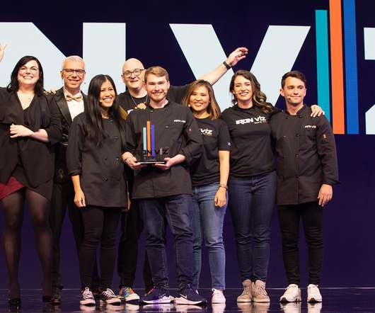
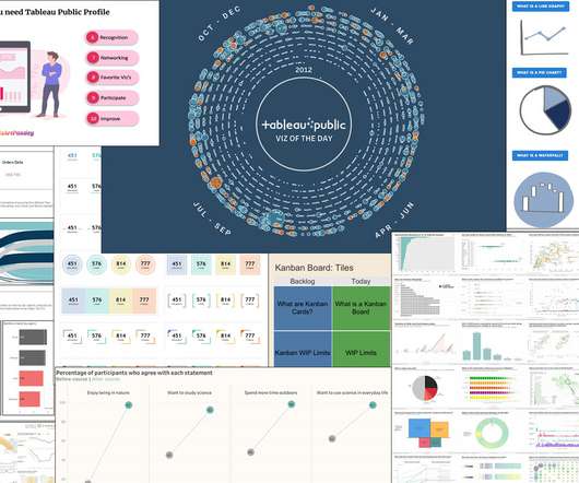
Iron Viz is amazing, not just because of the skill of the people who make it to the top 10, but because of the talent of everyone who enters: win or learn, you can’t lose with Iron Viz. Don’t be afraid of “boring” bar charts. Don’t forget, though, that you have an audience who want to understand your chart.
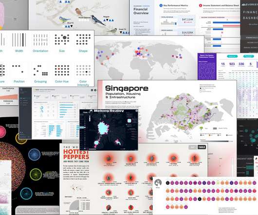
I did a quick scan of data visualization resources to look for practical advice on the process of thinking visually and some technical information on what chart to select and data storytelling. The deck provides specific practical advice on charts, color, and maps. I like the chart advice: Avoid 3d-charts at all costs.
The mix of design with storytelling is well balanced; the story [they’re] telling is very clear and so we have charts that are easy to read … Any decisions to go off the beaten track feel like they've been made with intent,” - An excerpt from my judge’s feedback on one of the winning #Viz4ClimateAction entries. Radial Column Chart.
Iron Viz is amazing, not just because of the skill of the people who make it to the top 10, but because of the talent of everyone who enters: win or learn, you can’t lose with Iron Viz. Don’t be afraid of “boring” bar charts. Don’t forget, though, that you have an audience who want to understand your chart.
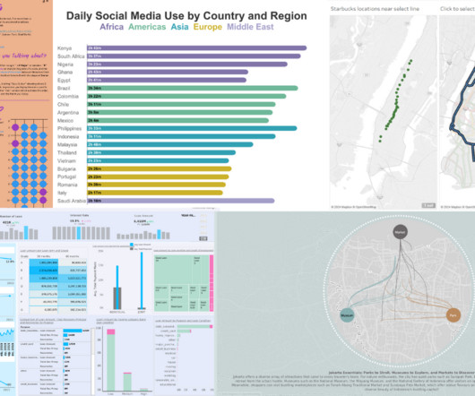
Three fierce contestants took the keynote stage to rock day two with their mad data storytellingskills. The judges evaluated the vizzes based on three criteria: design, analysis, and storytelling. He included a violin chart showing distributions of numeric data for one or more groups using density curves.
Three fierce contestants took the keynote stage to rock day two with their mad data storytellingskills. The judges evaluated the vizzes based on three criteria: design, analysis, and storytelling. He included a violin chart showing distributions of numeric data for one or more groups using density curves.
Rosario Gauna and Donna Coles both wrote tutorials on the heels of the challenge, detailing how they approached the main requirements: donut charts, bar charts, divergent bar charts, and heatmaps. Rosario and Donna provided detailed tutorials on the real-world data storytelling challenges we face as analysts. Ant Pulley.
Some nonprofits make use of their in-house designers to create beautiful and eye-catching infographics. One example is Best Friends Animal Society as profile by John Haydon on his blog in “ Nonprofit Storytelling with Infographics ” which offers some simple tips for getting the most out of your infographic.
The pie chart illustrates proportionately how each contributes to the campaigns’ success. 25% YELLOW: Emotional Storytelling Emotional appeals were crucial for tapping donor heartstrings. Emotional Storytelling Donors want two things: to know they’re donating to a worthy cause and to see how their money is causing change.
Data nerds know how to clean and recode data, look for patterns, calculate key statistics, and then show off the most important information in graphs and charts. You can follow this syllabus to boost your skills at all stages of the data analysis process. My favorite housekeeping skill is freezing panes. Secret #2.
I like how these qualities easily link to networked approaches, storytelling, and iteration, but can also be linked to specific measurable data points. The Playbook also discusses the skillsets that a nonprofit needs to use data successfully, both for staff and for hiring consultants or working with skilled volunteers.
The mix of design with storytelling is well balanced; the story [they’re] telling is very clear and so we have charts that are easy to read … Any decisions to go off the beaten track feel like they've been made with intent.” . — Formatting, Design, Storytelling. Tableau Stunning Charts Series?Radial Radial Column Chart.
Rosario Gauna and Donna Coles both wrote tutorials on the heels of the challenge, detailing how they approached the main requirements: donut charts, bar charts, divergent bar charts, and heatmaps. Rosario and Donna provided detailed tutorials on the real-world data storytelling challenges we face as analysts. .
Each time I get to see an expanding data culture, internal community excitement, and growth of data analysis skills. Themes for Viz Games are typically around a particular topic, dataset, business problem, chart/dashboard type, or feature. Typically large datasets offer more opportunities for deep analysis and storytelling.
Charting "Top N and Others" via Table Calculations in Tableau. Formatting, Design, Storytelling. How to build and interpret an index chart using Tableau. Learn to build a Butterfly Chart in Tableau. Developing Skills Through Having Fun – Adam Green. How to Drill into a Bar Chart Using Sets in Tableau.
Bring the WOW Factor with Tableau Public Portfolios : Ghafar Shah and Chantilly Jaggernauth shared some amazing insights on how you can use Tableau Public to grow your skills, expand your network, and land that dream job. Let’s build a trellis chart! Formatting, Design, Storytelling. Here are just a few: . Inspiration.
Each time I get to see an expanding data culture, internal community excitement, and growth of data analysis skills. Themes for Viz Games are typically around a particular topic, dataset, business problem, chart/dashboard type, or feature. Typically large datasets offer more opportunities for deep analysis and storytelling.
As my skills progressed and I learned about more available resources, I moved on to user group meetings, blog posts, and videos. Even beyond the technical ins and outs of Tableau, the community delivers on all-important soft skills, too. Formatting, Design, Storytelling. How to Build an XmR Chart in Tableau. Inspiration.
This shift in working with data—from a job for the few to a skill for everyone—is actively redefining how the world thinks about analytics.”. Iron Viz winner Lisa Trescott edged past her competition with vibrant charts, animation and storytelling around three breakthrough artists. Closing the gap with the Tableau Economy.
The place where we can show our talents and drive our skills and careers to new heights! It has allowed me to really hone my skills, and it’s led to job opportunities and lots and lots of inquiries about my availability (TL;DR I’m not). Formatting, Design, Storytelling. The place where we can inspire and get inspired.
After all, what better way to test your skills than explaining a technique to others? Charting "Top N and Others" via Table Calculations in Tableau. Formatting, Design, Storytelling. Drawing Line Charts without Axis Offset in Tableau. Spaghetti Charts Suggested Alternative: A Trellis Chart. Nir Smilga.
After all, what better way to test your skills than explaining a technique to others? Charting "Top N and Others" via Table Calculations in Tableau. Formatting, Design, Storytelling. Drawing Line Charts without Axis Offset in Tableau. Spaghetti Charts Suggested Alternative: A Trellis Chart. Nir Smilga.
Web: Back 2 Viz Basics Twitter: #B2VB Week 2: Build a Multiple Line Chart Workout Wednesday Build your skills with a weekly challenge to re-create an interactive data visualization. Web: Workout Wednesday Twitter: #WOW2022 Week 5: Can you build a funnel chart? Not limited just to newbies!
Web: Back 2 Viz Basics Twitter: #B2VB Week 2: Build a Multiple Line Chart Workout Wednesday Build your skills with a weekly challenge to re-create an interactive data visualization. Web: Workout Wednesday Twitter: #WOW2022 Week 5: Can you build a funnel chart? Not limited just to newbies!
Charting "Top N and Others" via Table Calculations in Tableau. Formatting, Design, Storytelling. How to build and interpret an index chart using Tableau. Learn to build a Butterfly Chart in Tableau. Developing Skills Through Having Fun – Adam Green. How to Drill into a Bar Chart Using Sets in Tableau.
They’re trying more tactics, using more social media platforms, growing in their internal knowledge and skills, and focusing on becoming better storytellers. In fact, sixty-six percent of nonprofits are focused on becoming better storytellers and sixty-three percent are working on creating better visual content.
Bring the WOW Factor with Tableau Public Portfolios : Ghafar Shah and Chantilly Jaggernauth shared some amazing insights on how you can use Tableau Public to grow your skills, expand your network, and land that dream job. Let’s build a trellis chart! Formatting, Design, Storytelling. Here are just a few: . Inspiration.
This shift in working with data—from a job for the few to a skill for everyone—is actively redefining how the world thinks about analytics.”. Iron Viz winner Lisa Trescott edged past her competition with vibrant charts, animation and storytelling around three breakthrough artists. Closing the gap with the Tableau Economy.
I was reminded this month of how important “success” in analytics is about much more than one’s skills in the platform. Andy Kriebel #TableauTipTuesday: How to Sort a Chart with a Parameter Action. Bridget Cogley Data Viz Philosophy: Better than Bar Charts. Adam McCann Layering Multiple Charts in Tableau 2020.4.
Spatial Parameter Ann Pregler: Reveal Charts in Stages Dynamic Zones #6 Deepak Holla: Understanding the significance of the ATTR() Attribute Function — Probably the most misunderstood function in Tableau Carl Allchin: Preppin- Data—Salesforce Agent takes over. Not limited just to newbies!
I want to shout out to all the Community members providing content and blogs to the Tableau Community in multiple languages and making data skills more accessible across the world. Formatting, Design, Storytelling. Calculate the AREA of your polygons in Tableau and then create charts to compare the sizes. Anya Prosvetova.
I want to shout out to all the Community members providing content and blogs to the Tableau Community in multiple languages and making data skills more accessible across the world. Formatting, Design, Storytelling. Calculate the AREA of your polygons in Tableau and then create charts to compare the sizes. Anya Prosvetova.
I was reminded this month of how important “success” in analytics is about much more than one’s skills in the platform. Andy Kriebel #TableauTipTuesday: How to Sort a Chart with a Parameter Action. Bridget Cogley Data Viz Philosophy: Better than Bar Charts. Adam McCann Layering Multiple Charts in Tableau 2020.4.
Each time I get to see an expanding data culture, internal community excitement, and growth of data analysis skills. Themes for Viz Games are typically around a particular topic, dataset, business problem, chart/dashboard type, or feature. Typically large datasets offer more opportunities for deep analysis and storytelling.
Are there facilitation skills/techniques that you enjoy and are great at doing? Are there facilitation skills/techniques that you want to improve or work on? This can be done with a flip chart and markers or there might be one graphic facilitator dedicated to this task. Do you have a preferred method?
As my skills progressed and I learned about more available resources, I moved on to user group meetings, blog posts, and videos. Even beyond the technical ins and outs of Tableau, the community delivers on all-important soft skills, too. Formatting, Design, Storytelling. How to Build an XmR Chart in Tableau. Inspiration.
The place where we can show our talents and drive our skills and careers to new heights! It has allowed me to really hone my skills, and it’s led to job opportunities and lots and lots of inquiries about my availability (TL;DR I’m not). Formatting, Design, Storytelling. The place where we can inspire and get inspired.
Thousands of nonprofit pros rely on our annual Best Nonprofit Conferences Calendar to discover skill-building, strategy-slaying, network-enhancing nonprofit events. From communications to fundraising to technology to leadership skills, the conference offers something for everyone. Nonprofit Storytelling Conference. State/Local.
And frankly, analytics can be scary or intimidating to the average employee who likely lacks data skills or isn’t part of a mature Data Culture. . Currently available in Tableau Cloud, this data storytelling feature will bring even more AI-powered insights to CRM Analytics in Summer 2023.
And frankly, analytics can be scary or intimidating to the average employee who likely lacks data skills or isn’t part of a mature Data Culture. . Currently available in Tableau Cloud, this data storytelling feature will bring even more AI-powered insights to CRM Analytics in Summer 2023.
Our Digital Storytelling Challenge. Check out our resources on great nonprofit storytelling and learn more. Read more › Step 2: Setting Up the Chart of Accounts. Find helpful suggestions on building a practical chart of accounts and download a sample chart designed just for nonprofit organizations.
We are just weeks away from Tableau Conference and the ultimate visualization showdown —Iron Viz 2021—where three fierce contestants will take the virtual stage for an intense lightning round of live viz-tastic storytelling. . I’ve always looked at the competition as a proving ground for the skills I am learning.
We are just weeks away from Tableau Conference and the ultimate visualization showdown —Iron Viz 2021—where three fierce contestants will take the virtual stage for an intense lightning round of live viz-tastic storytelling. . I’ve always looked at the competition as a proving ground for the skills I am learning.
Here’s a chart mapping the various game design platforms with recommended age range and beginning to advanced game design skill level: How else can we engage learners? Andrew DeVigal , Multimedia Editor at The New York Times , said: “Tell me something and I will forget. Show me something and I will remember.
We organize all of the trending information in your field so you don't have to. Join 12,000+ users and stay up to date on the latest articles your peers are reading.
You know about us, now we want to get to know you!
Let's personalize your content
Let's get even more personalized
We recognize your account from another site in our network, please click 'Send Email' below to continue with verifying your account and setting a password.


Let's personalize your content