Remove Chart Remove Metrics Remove Research
article thumbnail

Essential Steps for Tracking and Reporting Association KPIs

Association Analytics

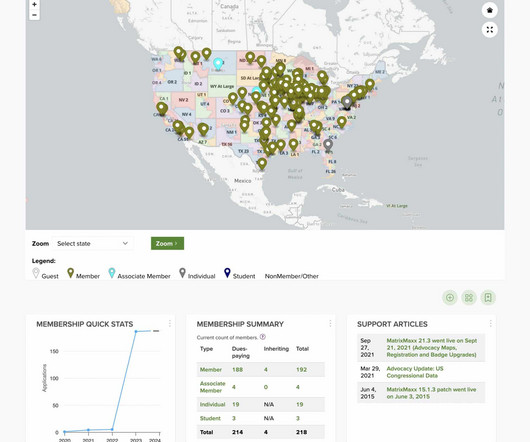
It involves: Defining What to Measure: Identify the specific metrics that align with your strategic goals. It’s important to tailor your metrics and dashboards to meet their needs. Effective dashboards use simple, meaningful visuals like line charts and bar charts to highlight trends and performance.

Track 169
article thumbnail

MatrixMaxx 24.1 Release is Full of Visualizations and Dashboard Enhancements

The MatrixFiles

Membership Churn, in particular, charts members lost over a specific time period, providing a crucial metric alongside membership retention. Charting Churn to measure membership turnover offers a high-impact way to see how well your retention efforts are working.

Widget 130
professionals

Sign Up for our Newsletter

This site is protected by reCAPTCHA and the Google Privacy Policy and Terms of Service apply.

article thumbnail

Information: The Better Half of IT

sgEngage

As a Database Administrator, my world revolves around helping users make sense of the information they receive, from voice-of-the-customer anecdotes and impressions to polished Key Performance Indicator (KPI) graphs, charts, and dashboards. Data gives us context. How do I care for my data? That’s okay!

Chart 91
article thumbnail

Salesforce Winter ’22 Release: What You Need to Know

Cloud 4 Good

Dynamic Gauge Charts in Dashboards (Beta). The dynamic gauge chart is now available to use report metrics and field values to respond dynamically to the displayed business metrics. For example, the gauge chart can display a subtotal of a subsidiary (i.e., Your Account App. Blog: Solving the Salesforce Talent Gap.

Chart 101
article thumbnail

Your Unrestricted Funds Need Stewardship, Too

sgEngage

Trust-Based Philanthropy puts relationships at the center of a donor’s giving and encourages the donor to do the research instead of having the nonprofit jump through hoops for funding. It also simplifies your account string, making your chart of accounts more streamlined and easier to understand.

Fund 99
article thumbnail

Who is sharing nonprofit demographic data with Candid? 

Candid

The chart below compares the proportion of nonprofits by subject area overall (in blue) with that of the subset of nonprofits sharing demographic data (in orange). In the chart below, we compared sharing rates by different staffing levels and demographic categories, including race/ethnicity, gender, sexual orientation, and disability status.

article thumbnail

Integration: The Ultimate Solution for Nonprofit Data Silos

sgEngage

Restricted research: Inconsistent data restricts healthcare teams’ ability to perform meaningful research and problem-solve. There are two solutions for integrating your data — either build an in-house centralized data platform or research an analytics vendor to outsource data collection and analysis.