Remove Chart Remove Metrics Remove Report Remove Trend
article thumbnail

Essential Steps for Tracking and Reporting Association KPIs

Association Analytics

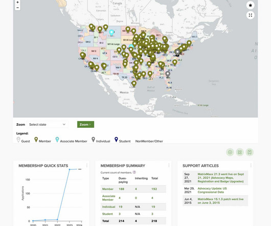
As valuable as data is, though, without a clear and actionable way to track and report across your entire association, it can be difficult to tell what’s actually working. Read on to learn how to best track and report on your key performance indicators (KPIs). It’s important to tailor your metrics and dashboards to meet their needs.

Track 169
article thumbnail

MatrixMaxx 24.1 Release is Full of Visualizations and Dashboard Enhancements

The MatrixFiles

These highly visual dashboard elements will give staff a new perspective on membership data and trends. Membership Churn, in particular, charts members lost over a specific time period, providing a crucial metric alongside membership retention. Not to be left behind, the CRM module has a brand-new feature as well. MatrixMaxx 24.1

Widget 130
professionals

Sign Up for our Newsletter

This site is protected by reCAPTCHA and the Google Privacy Policy and Terms of Service apply.

article thumbnail

How to Prepare Donor Data Reports for Your Board Members

Bloomerang

A major part of connecting with these individuals and optimizing the giving experience is utilizing the data you collect about their giving trends to inform your future fundraising decisions. . As a fundraising coordinator who prepares these reports, you work with this data every day. Donor data to exclude from your report.

Data 124
article thumbnail

5 Tips for Community Health Centers to Transition to New Fund Accounting Software

sgEngage

Your point of contact understands the importance of monitoring patient traffic trends, developing economies of scale, and identifying grants that will shore up revenue streams. They’ll work together to ensure the system is configured to automate board reporting and UDS data so that you have more free time for other priorities.

Fund 99
article thumbnail

How Do I Say It With Charts?

Beth's Blog: How Nonprofits Can Use Social Media

Source: Juice Lab Chart Chooser. Last month, Stephanie Evergreen wrote an awesome guest post called “ Six Steps to Great Charts ” with lots of practical tips for using the Excel chart feature to visualize your social media measurement data. The six steps: Step 1: Which Chart is Best? Step 6: Annotate.

Chart 107
article thumbnail

Nonprofit Finance Leaders: Don’t Miss These bbcon 2023 Sessions

sgEngage

From Chart Organizers to Dashboards, you’ll leave with practical ways you can automate and simplify your fund accounting. Consultant and nonprofit CFO Stephanie Skryzowski will guide you through effective strategies to help your leadership and board actually grasp your financial metrics.

article thumbnail

New year, new social media plan: Using data to inform our strategy 

Candid

As Candid’s manager of digital communications, I’ve been digging through our social media analytics, researching broader trends, and determining our strategy and tactics for 2024. I selected those metrics because our goals for social media are to increase brand awareness and drive traffic to our articles and resources.