This site uses cookies to improve your experience. To help us insure we adhere to various privacy regulations, please select your country/region of residence. If you do not select a country, we will assume you are from the United States. Select your Cookie Settings or view our Privacy Policy and Terms of Use.
Cookie Settings
Cookies and similar technologies are used on this website for proper function of the website, for tracking performance analytics and for marketing purposes. We and some of our third-party providers may use cookie data for various purposes. Please review the cookie settings below and choose your preference.
Used for the proper function of the website
Used for monitoring website traffic and interactions
Cookie Settings
Cookies and similar technologies are used on this website for proper function of the website, for tracking performance analytics and for marketing purposes. We and some of our third-party providers may use cookie data for various purposes. Please review the cookie settings below and choose your preference.
Strictly Necessary: Used for the proper function of the website
Performance/Analytics: Used for monitoring website traffic and interactions
During this time, I’ve help create community maps and strategic plans with my own team and with many other groups. More and more often, I get asked at conferences or on the blog for more information about how to create a community map or content plan. Community Map. Why : Why map your community? Content Map.
I wanted to take a deeper dive into resources out there that provide useful tips about how to do this step for folks who were not data scientists or data nerds. 1) Data Visualization Survival Guide : This resource (including the 176 slides powerpoint deck) was suggested by Devon Smith. Always extend bar charts to zero baseline.
One way to foster innovation to enhance efficiency is to have your team map out their collective “dream future process flow,” and then brainstorm ways to get there. Here are a few ways you can develop a future-focused mindset and keep your organization moving forward, regardless of the hurdles you might face.
See larger image here: Map from: Waddell, Steve. A lot of the ideas resonate with using online social networks and social media effectively for nonprofits, especially in the larger frame of movement building. One of the tools for better understanding networks are visual diagnostics and mapping techniques.
Nonprofit data nerds will love this new resource from Media Impact Funders and Foundation Center called “ Foundation Maps for Media Funding ,” a free, interactive mapping and research tool that shows the full scope of philanthropically funded media projects worldwide since 2009. Click to See Visualization.
During this time, I've help create community maps and strategic plans with my own team and with many other groups. More and more often, I get asked at conferences or on the blog for more information about how to create a community map or content plan. Community Map. Why : Why map your community? Content Map.
Productivity software has been getting a major re-examination this year, and human resources platforms — used for hiring, firing, paying and managing employees — have been no exception. Human resources has never been at the more glamorous end of how a company works, and it can sometimes even be looked on with some disdain.
Data visualization uses graphs, maps, and other graphics to communicate complex information more effectively. Policymakers use the scorecard to see how their LTSS programs compare to other states and to determine where and why they might allocate resources more effectively. Why is data visualization so effective?
I come across so many great conversations, ideas, and resources all over the web every day. To follow more of the things I find online, you can follow @amysampleward on Twitter (which is just a blog and resource feed), or find me on Delicious (for all kinds of bookmarks). "You've got data.
Community Mapping. Community Mapping helps you identify not just the various segments of your audience, but also create a clear picture of which tools/platforms are associated with those groups and which messages are best to target where. Here are two great resources to get you started: unconference and open space technology.
On a flip chart or whiteboard (or if you are working through this by yourself, just use a piece of paper or a spread sheet on your computer) draw 4 vertical lines, creating 5 columns. You may want to turn the flip chart sideways or use separate sheets for each column. #1: 1: Who are “They&#. 5: How it Happens. Stand back!
As a Database Administrator, my world revolves around helping users make sense of the information they receive, from voice-of-the-customer anecdotes and impressions to polished Key Performance Indicator (KPI) graphs, charts, and dashboards. Raw data—such as customer lists with phone numbers and email addresses—is a valuable resource as-is.
Ateken Abla November 14, 2023 - 6:59pm Sue Kraemer Senior Data Skills Curriculum Strategy Manager, Tableau Charts are all around us. When viewing and creating charts, it’s vital that we gain the ability to critically explore and discern the integrity of the information and conclusions shown in charts. Don’t be SCAM’d!
For many, this means following news, blogs or other resources in your topic area and linking to particularly useful resources. We like to use a pie chart, as it provides a tidy circle for each channel that you can then combine into additional diagrams. It’s useful to diagram out the mix for each channel.
U tilize untapped resources. They have all sorts of potential which may go unnoticed; a hidden resource that successful nonprofits learn to access. . Think of it like mapping a route to take. It is more likely that some people are better at hiding their burnout over others. .
I’ve been trying to curate content that offers ideas, tips, and resources to get past that ugly feeling of “content fried.” I liked this map so much that I printed it out and keep at my desk. What are your tips to help you focus in an age of distraction? Are there tips not on the mind map?
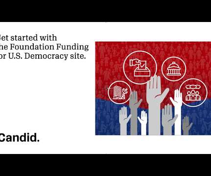
Democracy website is a great resource to help you get started. The website is a publicly available, interactive resource that showcases how funding flows for U.S. Our Foundation Funding for U.S. democracy-related issues from 2011 onward.
I've been accumulating resources about how to make presentations better (more interactive). My process is analog, but I have to start with a mind map of the ideas (sometimes several versions of it), then do a linear outline, and finally sketch out a storyboard with image ideas. to persuade, sell, or inform ??? is very much analog."
A beautiful combination of research, theory, and practice, it provides a resource to understand the perception, cognition, and consumption of visual analytics. Functional Aesthetics goes far beyond charts to look at how we can make our visuals more effective and impactful. Area Chart in a Reference Band? Tableau Desktop .
A beautiful combination of research, theory, and practice, it provides a resource to understand the perception, cognition, and consumption of visual analytics. Functional Aesthetics goes far beyond charts to look at how we can make our visuals more effective and impactful. Area Chart in a Reference Band? Tableau Desktop .
The first webinar in this series, Mapping Philanthropy: How You Can Use Data Visualization to Do Good , was held on March 29. If you attended, you already know that the Foundation Center's George Ford and Jake Garcia packed the event with useful information, strategies, and resources. Still Have Questions?
” The e-book, which at 32 pages, is definitely long-form content provides context, best practices, examples, tools, and resources. Not just infographics, but a snippet from an infographic or a chart or graph to illustrate a statistic. A great way of inviting your readers to dive into your post is to create a mind map.
They are also a powerful tool for grantmakers who want to quickly and easily tailor their grantmaking system to streamline their processes, save time and resources, and scale with their needs. You can use APIs to create dashboards, reports, and charts that show your grantmaking performance, impact, and trends. What is a Modern API?
It will help you envision the ease of an optimized structure for your chart of accounts and the business rules that will be most beneficial. This enables the vendor to account for everything and map your history to a new and optimized chart of accounts.
I've been in Washington, DC for the Network Effectiveness and Social Media Strategy Map working session for Packard Foundation Grantees convened by Monitor Institute. This is a post to help me identify what I don't know about social network analysis and mapping tools with the hope that you'll fill in the gaps in the comments.
Each day we’ll be sharing tips, resources, and nonprofit success stories that will should save you time and help you get better results. Come join us. My LinkedIn Network Map – a set on Flickr. This month’s theme: Practical and Tactical Social Media for Nonprofits. What does that mean?
I’m in Austin, TX, today engaging with librarians, digital curators, and technologists working at the nexus of communities and knowledge at the Electronic Resources and Libraries annual conference. We can provide a map, the vehicle, and even the road snacks, but the community needs to be the driver.
In philanthropy, there can also be worries of time commitment, grantee burden, complicated methods and, frankly, resources circling the drain without adding any function or value. Visualizing Where Meaning Making Can Happen “Mapping” activities are often the starting point of identifying data collection opportunities.
Andy Kriebel #TableauTipTuesday: How to Sort a Chart with a Parameter Action. Luke Stanke Beyond Dual Axis: Using Multiple Map Layers to create next-level visualizations in Tableau . Marc Reid Tableau Map Layers. Bridget Cogley Data Viz Philosophy: Better than Bar Charts. Inspiration. Formatting, Design, Storytelling.
By aligning social media to organizational objectives and using measurement, you can answer the question: of all the ways we could be investing our resources, is social media the best choice to see the social change results that we want to see? ROI is as an acronym for a business term, Return on Investment. How It Works.
Beautiful Business Dashboards: The How and the Why : Samuel Parsons and Simon Beaumont are masters at their craft, and it was so cool to see how these two took ordinary charts and made them absolutely beautiful, sharing some tips and tricks along the way. Let’s build a trellis chart! Data visualisation/Design resources.
So here is a 7 step road map to get started: Find and study the data Google Analytics for web traffic Email database CRM Donor database Other program/services data Course: Understanding Google Analytics. Steal this chart and use it to frame where your digital work/investments are going.
DIAGRAM stands for Digital Image and Graphics Resources for Accessible Materials. Poet will give readers with vision impairments access to fully described images which is especially important for textbooks that contain lots of charts, graphs, and maps.
Geographic information systems (GIS) and online mapping applications continue to become more powerful and easier to use every year. Mapping applications that used to require sophisticated software and time-intensive training to create can now be completed in a matter of minutes with user-friendly tools. Jim Craner , MapTogether.
Beautiful Business Dashboards: The How and the Why : Samuel Parsons and Simon Beaumont are masters at their craft, and it was so cool to see how these two took ordinary charts and made them absolutely beautiful, sharing some tips and tricks along the way. Let’s build a trellis chart! Data visualisation/Design resources.
Or maybe you’re just finishing that first brainstorm meeting to map out your December plans? Either way, I thought a little roundup of my favorite end of year fundraising resources for Luminate Online clients could be helpful. This is an important resource to consider as you craft your end of year strategy.
Maybe you have a data-related question, or you’re interested in creating content and becoming more active on social media—Social Ambassadors are a resource to help support you throughout your data journey, wherever you are. Now she makes maps and all the other charts and graphs in Tableau (on a Mac, naturally!)
Whether you own a pet-care business , bookstore, or flower shop, these five tips will help put your small business on the digital map. Remember to choose the communication channels your audience is already familiar with, and chart a customer journey that moves each prospect carefully down the sales funnel.
This calendar is a result of mapping out your fundraising strategy into a fundraising plan. And, of course, an employee organizational chart, staff contact sheet, and important community partners should also be routed. We have a wealth of resources, guides, and webinars available for free. Your fundraising team!
They’re often seen as a drain on time and resources. When well crafted, this resource can be a vital tool to retain and grow donor support. A nonprofit annual report is an externally-facing resource that recaps an organization’s accomplishments and challenges within a year. Let’s get started. What is a nonprofit annual report?
You can also get an hourly forecast and a weather map. FlowX offers data maps for weather nerds. It’s immediately apparent that FlowX (once known as WeatherBomb) is for weather nerds: when you first install it, it opens to a weather map and temperature / humidity charts rather than the usual text-based weather summary.
By using shaded maps, clear data points, and red/yellow/green indicators, users can easily identify areas in need of improvement. Users can expand each factor to get significantly more data including a narrative description, map, and data source. While some people can easily interpret charts and graphs, others would rather read words.
Your nonprofit business plan helps you figure out the direction for your nonprofit, the resources you need, and the shortest path to success. What resources do you have and what resources will you need? Management and Organizational Charts. Break up the sections for easy reading, and use graphs and charts where you can.
If you’d like to support organizations working to address this global crisis, here are a few useful resources I’ve found: UNHCR UN Refugee Agency , Flexport , and World Central Kitchen. Travel/Drive-Time Maps in Tableau by Marc Schønwandt. Calculate the AREA of your polygons in Tableau and then create charts to compare the sizes.
We organize all of the trending information in your field so you don't have to. Join 12,000+ users and stay up to date on the latest articles your peers are reading.
You know about us, now we want to get to know you!
Let's personalize your content
Let's get even more personalized
We recognize your account from another site in our network, please click 'Send Email' below to continue with verifying your account and setting a password.


Let's personalize your content