This site uses cookies to improve your experience. To help us insure we adhere to various privacy regulations, please select your country/region of residence. If you do not select a country, we will assume you are from the United States. Select your Cookie Settings or view our Privacy Policy and Terms of Use.
Cookie Settings
Cookies and similar technologies are used on this website for proper function of the website, for tracking performance analytics and for marketing purposes. We and some of our third-party providers may use cookie data for various purposes. Please review the cookie settings below and choose your preference.
Used for the proper function of the website
Used for monitoring website traffic and interactions
Cookie Settings
Cookies and similar technologies are used on this website for proper function of the website, for tracking performance analytics and for marketing purposes. We and some of our third-party providers may use cookie data for various purposes. Please review the cookie settings below and choose your preference.
Strictly Necessary: Used for the proper function of the website
Performance/Analytics: Used for monitoring website traffic and interactions
Beth’s blog shares Ann Emry’s tips for creating charts with your nonprofit’s data. Charts can turn plain text into a visually, expressive piece of information, which is great for persuading donors to donate or showing your supporters your organization’s impact. Chart diversity. Visual communication.
Last week I was down in Austin, TX, for the 2012 South by Southwest Interactive Festival. We’ve all experienced videos, blogs, photos, or topics “going viral” online before our eyes – the number of views increases, our Facebook timeline fills with reposts of the story, or a hashtag rises up the trending charts.
The dashboard uses interactive, searchable, sortable fields, charts, and graphs to present information about Albertas registered nonprofits, including: name type of organization current […] The post Alberta Nonprofit Listing Dashboard: Information about nonprofit organizations registered in Alberta appeared first on CharityVillage.
But being a nonprofit data is not just about being an Excel ninja, it is also about visualizing data and being a chart master. When Ann told me she has lots of secrets and time saving tips for charts and offered to write this guest post, I was thrilled. Charts can be one of your strongest communication tools. Secret #10.
Making your report web-based unlocks interactive opportunities to recap your achievements and connect with your stakeholders. Infographics, charts, and visuals can also help make complex information more digestible and showcase the difference your organization makes. To do that, it needs to live where your audience lives: online.
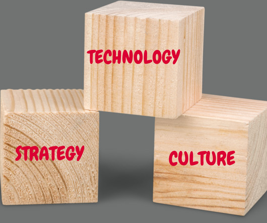
Strategy: Charting the Course to Thrive A well-crafted strategy isnt just a planits the compass that guides your association toward sustainable success. Case Study Highlight: A global association in the environmental conservation sector sought to enhance their member interactions and streamline administrative processes.
If you’re looking to dispel any nervousness about your tech options, check out our Tech Setup Guide for Virtual Fundraising Events , where we break it all down for you into simple, easy-to-use terms and flow charts. 5) Your Nonprofit Can Still Meaningfully Interact with Supporters. 6) Sponsors are Supporting Virtual Events.
Have you ever wondered if there was a way to gauge and chart your user’s behaviors while they’re on your WordPress website? One of the most popular available currently is Crazy Egg, a tool that allows users to create heatmaps that chart very specific elements of user interaction.
If youd like to further examine the monthly state inventory figures, use the interactivechart below. Below is another version of the table abovebut this one includes every month since January 2017. You can also find more information here on the ongoing softness and weakness across Florida.)
inZOI debuted on March 28 at $40 and quickly climbed to the top of Steams most wishlisted and bestseller charts. Unlike The Sims , which embraces cartoonish characters and lightheartedness, inZOI opts for lifelike graphics and a slower-paced gameplay experience centered on everyday interactions.
Despite launching in 2018, Among Us has become arguably the biggest game of 2020, regularly topping Twitch charts and even luring politicians to the world of streaming. The rest of the charts are somewhat less surprising, though the consistently-popular social space Roblox does make an appearance.
And if a new CEO comes on, they dont want to have to get the feel of the organization for a few months, thats what a dashboard and a few trend charts are for. Thats hard – if not impossible – when all thats fed to them is anecdote and qualitative judgement.
Designing Charts and Color to Communicate Quickly How do you simplify a text- and data-heavy scorecard while still accurately and quickly conveying the complex information policy-makers seek? Our goal for the new AARP LTSS Scorecard website was to design a chart anyone could look at and understand immediately how a state was doing.
Your organization’s impact data will be much easier for website visitors to understand and contextualize if you present it using charts, tables, and graphs. Depending on your website builder, you may even be able to make these infographics interactive to engage users more effectively. Video embeds.
Dynamic Interactions (Pilot). The Winter ’22 Release is introducing even more interactive pages with Dynamic Interactions. Through these Dynamic Interactions, users can now update multiple components on an app page. Dynamic Gauge Charts in Dashboards (Beta). Your Account App.
If your boss is acting like this, you can normalize small breaks and occasional team check-ins, where theres more opportunity for casual interactions. Chamorro-Premuzic also says you can be supportive in subtle ways, like offering to help with tasks or expressing appreciation for their work. Being a manager can feel thankless.
We've covered bar charts, line charts, scatter plots, and maps in Beyond the Pie Chart. We finish the series by explaining the only time a pie chart actually is the right choice. When to Use a Pie Chart. As we state in our white paper, Which Chart or Graph is Right for You? Pro Tips for Pie Charts.
The principles suggested that registration should be required if: if you use an interactive webpage such as a “Donate Now” button that allows donors anywhere to give to you, if you send targeted emails to a specific person you know is in a given state, or generally encourage people in that state to donate to you, or.
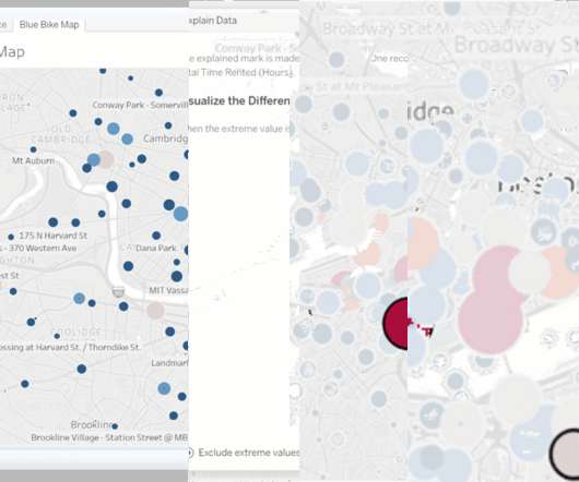
Here, I can customize aspects of the Explain Data experience and provide the necessary guardrails to promote positive and useful interactions for my users. When users interact with Explain Data they will encounter a completely redesigned UI. The next section shows me an interactivechart along with a generated caption.
The nice folks at Wolfram Blog have created a set of charts identifying how people talk on Facebook as they age. That’s not too surprising but some of the other charts might be of interest to you and your organization. used social media would you interact with them differently? source: Wolfram Blog. source: Wolfram Blog.
Create a chart – either on a whiteboard, a flipchart, or even a document on your computer. The 3rd column is your goal for the interaction with that group, and again you want to keep it pretty high level. The 3rd column is your goal for the interaction with that group, and again you want to keep it pretty high level.
The mix of design with storytelling is well balanced; the story [they’re] telling is very clear and so we have charts that are easy to read … Any decisions to go off the beaten track feel like they've been made with intent,” - An excerpt from my judge’s feedback on one of the winning #Viz4ClimateAction entries. Radial Column Chart.
This year, another Chinese phone brand Vivo is charting a new path by entering the robotics sector with its newly launched Robot Lab, demonstrating how phone companies are increasingly looking for new expansion opportunities. In March, Vivo announced the establishment of its Robot Lab at the Boao Forum for Asia.
On December 6, Alibaba-owned gaming brand Lingxi Interactive held a ceremony for employees who had served at the company for five years. Fan said he will reflect further on his actions, and spend three months worth of his salary on team building for Lingxi Interactive. billion [$140 million or $210 million]? Fan reportedly asked.
Chart is interactive; click to see yearly revenue broken for each company. Apple notched over $350 billion in revenue last year, close to $100 billion over its 2020 revenue and an increase of about 33 percent year over year.
For example, you can take a chart of average visit duration and segment it into New Visitors and Returning Visitors, and see an interesting comparison on the engagement of your repeat traffic versus new traffic. Interactive Mobile Online Fundraising Search Engine Optimization Social Media'
A chart of accounts (COA) is the foundation for all financial reporting. 3 Steps to Create a Chart of Accounts When it comes to creating your nonprofit’s COA, there are generally three steps you’ll need to follow: Decide how you’ll categorize financial data. Audit Your COA Over Time.
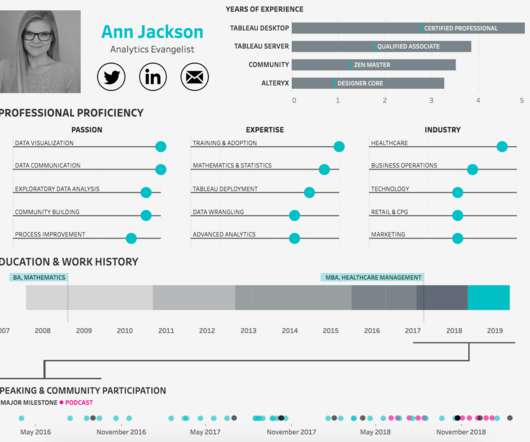
Use Gantt Charts as a Timeline of Your Work Experience. Gantt charts make your timeline quick and easy to understand. Unlike lists, Gantt charts call attention to the most important items on your timeline. Imagine the impact of seeing an interactive resume, in a sea of PDFs. Viz by Julia Biedry Gonzalez.
Design and implement data visualizations, including everything from simple static charts and maps to custom interactive visualizations on the web. Familiarity with python, R, and JavaScript libraries for charting, mapping, and vis is helpful.
Follow Tristan Guilleven’s step-by-step demonstration on how to create an interactive Tableau viz resume. Use Gantt Charts as a Timeline of Your Work Experience. . Gantt charts make your timeline quick and easy to understand. Imagine the impact of seeing an interactive resume, in a sea of PDFs.
Follow Tristan Guilleven’s step-by-step demonstration on how to create an interactive Tableau viz resume. Use Gantt Charts as a Timeline of Your Work Experience. Gantt charts make your timeline quick and easy to understand. Imagine the impact of seeing an interactive resume, in a sea of PDFs.
Give me an interactive map, a pivot table, even a plain old pie chart and I’m happy. This post originally appeared on the NTEN blog – you can also read the full post and join the conversation on the NTEN.org website. —– I love data as much as the next person.
Click to see Darragh's full interactive viz on Tableau Public. Part 2 The Build: An Annual Sunburst Chart Template. Tableau Coxcomb Chart Template. Sizing a Trellis Chart in Tableau. How (& Why) To Build a Diverging Bar Chart in Tableau. How to Build a Slope Chart in Tableau. Darragh Murray. Calculations.
Click to see Darragh's full interactive viz on Tableau Public. Part 2 The Build: An Annual Sunburst Chart Template. Tableau Coxcomb Chart Template. Sizing a Trellis Chart in Tableau. How (& Why) To Build a Diverging Bar Chart in Tableau. How to Build a Slope Chart in Tableau. Darragh Murray. Calculations.
How to Make a Radar Chart in Tableau. Rounded Bar Charts in Tableau. Build an Interactive Tableau Resume to Get Noticed. Gauge Chart (With Arrow). Tableau Coaches’ Favourite Challenges Advent Calendar. Donna Coles , Donna + DataViz. Felicia Styer , Playfair Data. Show only Selected Countries in a Background Map.
Creating an Interactive Calendar in Tableau. Charting "Top N and Others" via Table Calculations in Tableau. Drawing Line Charts without Axis Offset in Tableau. Spaghetti Charts Suggested Alternative: A Trellis Chart. A 7-step Guide to a Tableau Interactive Resume. Sunburst Chart Tableau Prep Template.
Creating an Interactive Calendar in Tableau. Charting "Top N and Others" via Table Calculations in Tableau. Drawing Line Charts without Axis Offset in Tableau. Spaghetti Charts Suggested Alternative: A Trellis Chart. A 7-step Guide to a Tableau Interactive Resume. Sunburst Chart Tableau Prep Template.
The mix of design with storytelling is well balanced; the story [they’re] telling is very clear and so we have charts that are easy to read … Any decisions to go off the beaten track feel like they've been made with intent.” . — Tableau Stunning Charts Series?Radial Radial Column Chart. Chart Chat Live — Round 24.
The pie chart illustrates proportionately how each contributes to the campaigns’ success. Success Factors: Social Media: Extensive use of platforms like TikTok and Instagram, popular among younger demographics, to share impactful stories and engage with interactive content like filters and hashtags. Check it out here. View it here.
For deeper dives into topics, users can then have an interactive discussion with the AI-powered podcast hosts. The PDF to podcast AI Blueprint will transform documents into audio content so users can learn on the go. By extracting text, images and tables from a PDF, the workflow uses AI to generate an informative podcast.
This session is my first interactive keynote based on the content of my book, “ Measuring the Networked Nonprofit ,” co-authored with KD Paine. It also requires an institutionalized process beyond having a staff person (or an intern) quickly generate a couple of charts and graphs from a spreadsheet brimming full of trivial data.
In recent weeks, my interactions with various organizations have echoed a shared sentiment: the imperative to pause and delve into the strategic planning process. With a shared vision, the organization can confidently chart its course. At its core, this success hinges on the active participation of the board in stakeholder engagement.
See chart below.) This chart highlights the exponential growth in training compute requirements for notable machine learning models since 2012. One paper catalogs and classifies more than 50 major transformer models alone (see chart below). The field continues to move fast.
Leadership interaction is important for Millennials. You can get the full report, review charts and data, and more at: [link]. Share the challenges and the problems we want to tackle and asking them to join us in the whole process instead of just asking them to fund something. Get the full Millennial Donor Report.
We organize all of the trending information in your field so you don't have to. Join 12,000+ users and stay up to date on the latest articles your peers are reading.
You know about us, now we want to get to know you!
Let's personalize your content
Let's get even more personalized
We recognize your account from another site in our network, please click 'Send Email' below to continue with verifying your account and setting a password.


Let's personalize your content