This site uses cookies to improve your experience. To help us insure we adhere to various privacy regulations, please select your country/region of residence. If you do not select a country, we will assume you are from the United States. Select your Cookie Settings or view our Privacy Policy and Terms of Use.
Cookie Settings
Cookies and similar technologies are used on this website for proper function of the website, for tracking performance analytics and for marketing purposes. We and some of our third-party providers may use cookie data for various purposes. Please review the cookie settings below and choose your preference.
Used for the proper function of the website
Used for monitoring website traffic and interactions
Cookie Settings
Cookies and similar technologies are used on this website for proper function of the website, for tracking performance analytics and for marketing purposes. We and some of our third-party providers may use cookie data for various purposes. Please review the cookie settings below and choose your preference.
Strictly Necessary: Used for the proper function of the website
Performance/Analytics: Used for monitoring website traffic and interactions
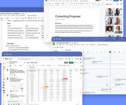
The @ mention is the key to Google’s Office competitor Google is launching a slate of new features for its Workspace productivity suite today, starting with new “smart chips” that connect Google Docs to other products. It dynamically resizes the doc to the size of your web browser the way a web app ought to. x 11 piece of paper.
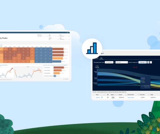
In short, the charts that Google makes available are slick, especially in the way they animate data. In our case, Google's chart animation allowed us to clearly communicate the increase over time in autism diagnoses, as compared to other special education diagnoses.
Plus charts! There were some pie charts, and regular bar charts. It’s quite good, and there are some useful docs to see it at work on the CiviCRM wiki. Well, that problem is about to go away with the release of CiviReport in 2.3. There will be a number of canned reports, and some really nice ways to create reports.
Link cards, for instance, can now display previews if they contain a link to a third-party service like Dropbox, Google Docs, and YouTube. The new cards include both mirror cards and link cards, which the company hopes will make it easier to manage other apps and services from within Trello.
As of now, Glean supports all of the standard visualizations (think pivot tables, line charts, bar charts, etc.). ” Looking ahead, the team wants to build more collaboration features to bring an almost Google Docs-like experience to these dashboards — and that is, in part, what the team is going to use the new funding for.
It uses a low-code approach to prototype the dashboard using natural language prompts to an open source tool, which generates Plotly charts that can be added to a template dashboard. Chart generation withVizro-AI In the first step, I use a hosted version of Vizro-AI, found at [link]. Plot a chart with the title Sequence of reading.
Some companies won’t risk it: With one of my clients, I had to get a new email address on their domain to share their Google Docs. We’ve all seen the news stories where a database or collection of documents fell into the wrong hands because someone failed to apply the appropriate security. Many of these are free or nearly so for minimal use.
Contracts and briefs in legal work, leases and agreements in real estate, proposals and releases in marketing, medical charts, etc, etc. Not to mention the various formats: Word docs, PDFs, scans of paper printouts of PDFs exported from Word docs, and so on.
Reconciling the transactions could be easier, but you can download the data from your online Square sales record into an Excel doc. I’d like to see the next version be able to track inventory, apply discounts, and run more complex reports that manifest as really cool, colored charts. And make me a cup of coffee. (It
It renders documents well on the screen, nearly as well as on a laptop, and allows users to do a surprising amount of formatting, particularly within Word docs. It is also well-integrated and can store documents in the cloud to several services including Google Docs, Dropbox, Box.net, Evernote, Huddle, and several others.
It uses a low-code approach to prototype the dashboard using natural language prompts to an open source tool, which generates Plotly charts that can be added to a template dashboard. Chart generation withVizro-AI In the first step, I use a hosted version of Vizro-AI, found at [link]. Plot a chart with the title Sequence of reading.
The team uses tools such as Huddle and Zoho to list and assign tasks, Google Docs and Wikispaces to share documents and other resources, and ReadyTalk and GoToMeeting for internal team training. Collaboration Tools Chart. Microsoft Office. Microsoft Lync Server. Wikispaces. Citrix Online products including GoToMeeting and GoToWebinar.
Dropbox sits nicely between formal, full featured project communications tools such as Basecamp (which we also use), Central Desktop , or Google Apps and Docs. Gliffy has smart-looking templates for flow charts, database diagrams, system, business processes, and so on. Box.net does a lot of this and is a worthy competitor.
Google Drive Mobile is a free app for viewing and editing Google Docs on an Android phone or tablet. Google Drive for iOS is a free app that allows you to view and edit Google Doc office documents on iPhones and iPads. Kingsoft Office is a free office app that allows you to view and edit Word and Excel documents.
Dbt became so bloated it took minutes for the data lineage chart to load in the dbt docs website, and our GitHub Actions for CI ( continuous integration ) took over an hour to complete for each pull request. This led to 100s of dbt models needing to be generated, all using essentially the same logic.
Collaboration Tools Chart. And be sure and check out the great online video, Google Docs in Plain English. Additional Resources. Online Project Management Tools. Online Collaboration NPLive Recap. Eight Tools to Keep Your Team Connected. Related Discussions. Project management tools for remote teams.
Count up the number of questions you responded with a "yes" and then see how information overloaded you are using this chart. Is your email, google docs or hard drive filled with "virtual piles" of information or ???drafts??? And, if you want, take the quiz, it is easy. Answer yes or no to the questions below.
With Live Predictions with Snowflake , we’re making it faster and easier to gather the data needed for the trusted, transparent predictions and recommendations you rely on to chart a path forward. . IDC Whitepaper, Sponsored By Tableau, How Data Culture Fuels Business Value In Data-Driven Organizations , Doc. US47605621, May 2021. .
With Live Predictions with Snowflake , we’re making it faster and easier to gather the data needed for the trusted, transparent predictions and recommendations you rely on to chart a path forward. . IDC Whitepaper, Sponsored By Tableau, How Data Culture Fuels Business Value In Data-Driven Organizations , Doc. US47605621, May 2021. .
Whylogs can create graphs and charts to help you see what’s going on in your data, making it more accessible, especially for those who are not data experts. For example, if you know a certain column should only have positive numbers, you can set a rule for that. If something doesn’t match your rules, you’ll know there might be an issue.
Monday.com Platform overview: Monday.com enables workflows based on your organization’s needs, including views like Gantt charts, Kanban, and more. This includes Gmail, Calendar, Drive, Docs, Slides, Meet, and more. Top feature: Analyze your data using charts that are updated in real-time.
Even simple tools like Google Docs means your organization can report real time data, online, anytime. You can see the administration gets that -- from the jobs map and the chart of how money is being spent. You can do it, too! In our work, we need to apply the same lesson.
az aks get-credentials --resource-group <your-resource-group> --name <cluster-name> --overwrite-existing Add remote helm repository and search for the Airbyte chart. fZ This is the output format suggested by the API docs. az login Set the cluster credentials. I called it dev-airbyte.
With Live Predictions with Snowflake , we’re making it faster and easier to gather the data needed for the trusted, transparent predictions and recommendations you rely on to chart a path forward. . IDC Whitepaper, Sponsored By Tableau, How Data Culture Fuels Business Value In Data-Driven Organizations , Doc. US47605621, May 2021. .
And, hey, here’s a Google doc parking lot that we set up that we want anybody who’s got issues or ideas about our technology, you can put them in here. People love to see like the run charts or, you know, the circle getting filled in. Start with five that you should be paying attention to regularly.
You fill flip chart after flip chart with ideas. So for some groups Zoom and a google doc, and the occasional Jamboard, will be a perfect match. Something as simple as asking them to open a google doc and write their name at the top of the document. You process lots of information, discuss, debate and brainstorm.
Uber Technologies Revenue 2017–2022 | UBER,” Macrotrends, accessed May 24, 2022, net/stocks/charts/UBER/uber-technologies/revenue. Steve Lohr, “Economists Pin More Blame on Tech for Rising Inequality,” New York Times , last modified January 20, 2022, com/2022/01/11/technology/income-inequality-technology.html. economy/archives/82578.
Via NTEN blog Google moves one step closer to making desktop applications obsolete with the release of the Google Chart API. Speaking of Google, check out this new doc uploader and this bookmark service that aggregates all social bookmarking sites in one click (for those of us tool fondlers who need more than one tool for each type.
Here’s a simple little chart where all you do is you just look at the next 10 years and you project what your revenue is going to be, all things being equal, based on how you’re fundraising and how your sales, etc., So I like to document a projected revenue gap between expenses and income over a 10-year period.
Docs, Sheets, Chat, Meet and newcomer Vids are among the tools that are getting new AI capabilities that perhaps some folks will find useful. Google is taking a cue from audio overviews in NotebookLM to bring new Gemini-powered audio features to Docs. A similar feature is coming to Sheets later this year.
We also have a shared Google Doc and Notes app. We were influenced by magazines from when we were younger, full of quizzes, graphs, and charts. Of course, we have to make [business] decisions, but we don’t have a scheduled time during the week for that. We call ourselves low-maintenance friends.
Out of the film's premiere at Sundance 2025, critics cheered Questlove's vision as a director and the engaging energy of the doc. The metaphor doesn't get old; over the course of rousing musical numbers that chart William's rise to fame, fall from grace, and finding himself, it opens Better Man up to embrace the surreal and sensational.
We organize all of the trending information in your field so you don't have to. Join 12,000+ users and stay up to date on the latest articles your peers are reading.
You know about us, now we want to get to know you!
Let's personalize your content
Let's get even more personalized
We recognize your account from another site in our network, please click 'Send Email' below to continue with verifying your account and setting a password.


Let's personalize your content