This site uses cookies to improve your experience. To help us insure we adhere to various privacy regulations, please select your country/region of residence. If you do not select a country, we will assume you are from the United States. Select your Cookie Settings or view our Privacy Policy and Terms of Use.
Cookie Settings
Cookies and similar technologies are used on this website for proper function of the website, for tracking performance analytics and for marketing purposes. We and some of our third-party providers may use cookie data for various purposes. Please review the cookie settings below and choose your preference.
Used for the proper function of the website
Used for monitoring website traffic and interactions
Cookie Settings
Cookies and similar technologies are used on this website for proper function of the website, for tracking performance analytics and for marketing purposes. We and some of our third-party providers may use cookie data for various purposes. Please review the cookie settings below and choose your preference.
Strictly Necessary: Used for the proper function of the website
Performance/Analytics: Used for monitoring website traffic and interactions
It remains all too common for associations to ignore vital data points as they strategize for the future. The inertia of decades of existence often precludes a data-informed state, instead relying on anecdote, trusting in the gut feeling of longtime employees or volunteers, and the way things have always been done.
Unfortunately, social sector data has also been impacted. Staff working long hours responding to multiple crises have little time and energy for data collection and dissemination. This creates a data/crisis catch-22: While it’s important to have recent data when managing a crisis, it’s also harder to get.
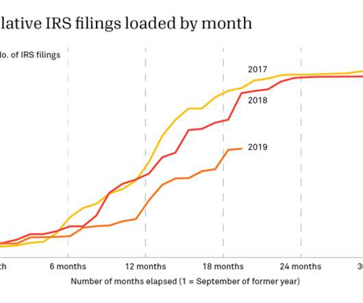
There’s no universal date for filing 990s; instead, the end of an organization’s fiscal year determines when its 990 is due at the IRS. Add in six-month filing extensions and IRS processing time, and it can be two years before we receive all the returns for a specific year. To be sure, Candid doesn’t depend exclusively on IRS data.
You don’t have to wait for your music streaming service to provide that for you anymore—you can see and learn from your listening data at any point in the year using Tableau. Whether this is your first Tableau visualization or your 100th, let this be a chance to practice and grow your viz-building skills using your own personal data!
You don’t have to wait for your music streaming service to provide that for you anymore—you can see and learn from your listening data at any point in the year using Tableau. Whether this is your first Tableau visualization or your 100th, let this be a chance to practice and grow your viz-building skills using your own personal data!
Airbnb filed to go public yesterday, offering the world a look into its financial performance over the past several years. These five questions should help us better understand how Airbnb managed to survive some tough months and still file to go public before 2020 ran out. Here’s the chart: Where does the decline begin?
In February 2010, The Economist published a report called “ Data, data everywhere.” Little did we know then just how simple the data landscape actually was. That is, comparatively speaking, when you consider the data realities we’re facing as we look to 2022. What does that mean for our data world now?
Fitbit activity analysis with DuckDB Photo by Jake Hills on Unsplash Wearable fitness trackers have become an integral part of our lives, collecting and tracking data about our daily activities, sleep patterns, location, heart rate, and much more. What insights are buried within my archive of personal fitness activity data?
Since 2014, Candid has been collecting demographic data about the people who work at U.S. To date, over 54,000 organizations have shared some data about how their staff and/or board identify by race/ethnicity, gender, sexual orientation, and/or disability status. Demographic data sharing varies by nonprofit subject category.
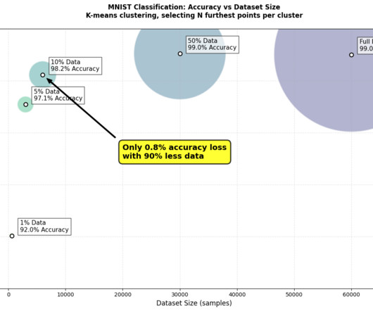
Building more efficient AI TLDR : Data-centric AI can create more efficient and accurate models. I experimented with data pruning on MNIST to classify handwritten digits. What if I told you that using just 50% of your training data could achieve better results than using the fulldataset? Image byauthor.
Your organization’s impact data will be much easier for website visitors to understand and contextualize if you present it using charts, tables, and graphs. Compress and properly size image and video files to allow them to load quickly, creating a better user experience. Infographics.
In service of this, in this blog, we’re highlighting five things we’ve heard about our grants data that aren’t quite accurate. Myth 1: “Candid grants data” is the same as “990 data.” tax exempt nonprofit organizations must file various Forms 990 with the Internal Revenue Service (IRS) each year. Many of the largest U.S.
One of the most common reasons people analyze Candid’s grant data is to understand year-over-year giving trends in the sector. To do so, it’s easy to assume that the best place to start is with as much data as possible. Instead, we rely on a data set called the Foundation 1000. foundations in a given year (see chart below).
Streamline Data Pipelines: How to Use WhyLogs with PySpark for Effective Data Profiling and Validation Photo by Evan Dennis on Unsplash Data pipelines, made by data engineers or machine learning engineers, do more than just prepare data for reports or training models. It lets you log all sorts of data.
Today, Candid released our latest research manual, Analyzing Candid’s demographic data. nonprofits currently share some demographic data about their staff and board with Candid. In fact, about 1,000 nonprofits are now adding demographic data to their Candid profiles every month. Over 62,000 U.S. For example, U.S.
Last night Affirm filed to go public, herding yet another unicorn into the end-of-year IPO corral. The consumer installment lending service joins DoorDash and Airbnb in filing recently, as a number of highly valued, venture-backed private companies look to float while the public markets are more interested in growth than profits.
Scientist / Data Analysis Engineer / General Techie Want to help save the world with your code? We're Benetech's Human Rights Data Analysis Group, and we're hiring right now ! What you will do: Write computer programs for human rights data analysis projects. Process, clean, and transform data.
Bringing AI models from research to the PC requires curation of model variants, adaptation to manage all of the input and output data, and quantization to optimize resource usage. With these tools, users can create personalized AI assistants and integrate their own documents and data, helping automate tasks and enhance productivity.
We didn’t need to give sharing files much thought. But now that we’re scattered across the landscape, securely sharing important files can take careful planning. Here’s why you might want to use powerful file-sharing services to share sensitive files safely, so you can collaborate better no matter where you’re working.
By Kurt Voelker, CTO, Forum One Data is the new black. Data is so much more than a stack of numbers or a server filled with client outputs. It's hidden away in project output reports and research excel files. Here are 6 ways to tell your stories with data that you can apply to your own web and communications work: 1.
After digging into the Rent the Runway IPO filing this morning, we’re turning to Udemy. billion, per Crunchbase data. We’re going to break our general rule of not including marketing-friendly charts in our S-1 teardowns for the following exception: Revenue mix.
Many nonprofits struggle to maximize their data usage. In fact, when surveyed, 97% of nonprofit professionals expressed an interest in learning how to use their data more effectively, and only 5% reported using data in every decision they make. So, how do healthcare organizations overcome these data silos?
Data sharing has become a critical part of collaboration and will continue to do so as we are able to access and create more data. There are many sites that allow you to upload data, as well as download other data, for free. The site hosts a wealth of data searchable by agency, category, topic, or geographically.
Data hygiene projects This can range from cleaning and completing Salesforce, spreadsheet, CRM or other databases for stakeholders. The safest way to have interns participate in social media is to have them analyze the data and then come up with sample posts for the platform.
Experts from venture capital, Snowflake, and more discuss how generative AI will benefit data teams and the challenges they must solve. Still, generating a recipe for lasagna is an entirely different process than infusing generative AI capabilities across a business or integrating large language models (LLMs) into data engineering workflows.
Learn from Software Engineers and Discover the Joy of ‘Worse is Better’ Thinking source: unsplash.com Recently, I have had the fortune of speaking to a number of data engineers and data architects about the problems they face with data in their businesses. The data industry should not be afraid to to think the same way.
Rahil Sondhi has been coding since he was 10 years old, and even when his career took him in the direction of an engineer, he was still writing a lot of SQL and working with data. Other business teams that need to work with data are also taking notice of PopSQL, like marketing, finance and support, Sondhi said. PopSQL raises a $3.4M
Candid’s grants data set currently includes comprehensive information about over 30 million grants and other philanthropic transactions, such as pledges, in-kind gifts, program-related investments, etc. This data powers tools like Candid’s Foundation Directory , allowing users to see who’s giving what, where, and to whom.
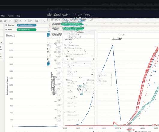
Senior Data Skills Curriculum Strategy Manager, Tableau. According to the National Institutes of Health (NIH), “Data visualization is becoming an increasingly common method of presenting large and complex data sets, but the principles of visual communication are not widely understood or practiced.” Sue Kraemer. Bronwen Boyd.
When you want to explore, create, and share data visualizations, we're happy to share that you can start creating vizzes directly from a browser on Tableau Public with the web authoring beta. We believe that focus should be on data exploration, analysis, and storytelling, and not on installations and updates. Now, make some charts.
This report is not just your father’s PDF file! The technology trend that caught my eye was “Learning Analytics,” which is big data applied to the field of education. It also has benefits to students themselves who can use the data to customize their participation in the class. Learning and Knowledge Analytics.
It wouldn't be Tableau Conference without the world’s ultimate data showdown—Iron Viz. Their excitement was contagious as they introduced this year's data rockstars, Pradeep Kumar G , Lisa Trescott , and Samuel Parsons , who earned their place by rising to the top from hundreds of incredible Data + Joy submissions. Ateken Abla.
It wouldn't be Tableau Conference without the world’s ultimate data showdown—Iron Viz. Their excitement was contagious as they introduced this year's data rockstars, Pradeep Kumar G , Lisa Trescott , and Samuel Parsons , who earned their place by rising to the top from hundreds of incredible Data + Joy submissions. Ateken Abla.
Senior Data Skills Curriculum Strategy Manager, Tableau. According to the National Institutes of Health (NIH), “Data visualization is becoming an increasingly common method of presenting large and complex data sets, but the principles of visual communication are not widely understood or practiced.” Sue Kraemer. Bronwen Boyd.
Think very carefully Creating and maintaining a data platform is a hard challenge. Data connectors are an essential part of such a platform. Of course, how else are we going to get the data? Maintaining complex code for every single data connector. Data flowing like cars in a highway. I called it dev-airbyte.
For four weeks this summer, we got a crash course in data transparency. Entrants built useful applications incorporating at least one data feed from Data.gov , in an effort to make government data accessible and usable. Everyone on the team -- and at Forum One -- is committed to data transparency. Enhances your mission.
Data is the new black. Data is so much more than a stack of numbers or a server filled with client outputs. It's hidden away in project output reports and research excel files. One effective way to transform your data from an afterthought into a powerful communications product is through visualizations that help tell your story.
And finally, we’ll remind ourselves of how Coinbase talked about Robinhood in its S-1 filing. Kicking off with Coinbase, The Block’s Frank Chaparro got us thinking this morning by tweeting the following chart: You can see why the chart caught our eye. Let’s tinker. An argument called forever.
It connects with the databases, CRMs and SaaS tools that you already use so that you can build dashboards and generate reports without having to manually import data. Once you have created your spreadsheet, you’ll have to export data from various SaaS products and then import those CSV files into Excel. The startup raised a $3.9
Several Android weather apps have been found to ask for more permissions than they need and to have shared location data with advertisers and other third parties. Carrot offers a reasonable amount of data on current and upcoming weather. It has been using the Dark Sky API for its data, which will disappear by the end of 2021.
It is a technical handshake that allows one system to request pre-determined data from another system and get a response in a standardized format. They can handle complex queries, large amounts of data, and real-time updates. You don’t have to download files, upload them to your system, or manually enter data.
A chart of accounts (COA) is the foundation for all financial reporting. It is a list that details your nonprofit’s financial accounts to organize your most essential financial data. Once you’ve developed the structure of the COA, all that’s left is to fill it in with your nonprofit’s financial data. Audit Your COA Over Time.
If you’re like most nonprofits, the average age of the donors in your file is 64. You can run a date of birth append on your files to find your donors’ birthdays. A public demographic information database sources this data. The chart below shows the latest fundraising results from Giving USA. Most nonprofits don’t.
Data is the new black. Data is so much more than a stack of numbers or a server filled with client outputs. It's hidden away in project output reports and research excel files. One effective way to transform your data from an afterthought into a powerful communications product is through visualizations that help tell your story.
We organize all of the trending information in your field so you don't have to. Join 12,000+ users and stay up to date on the latest articles your peers are reading.
You know about us, now we want to get to know you!
Let's personalize your content
Let's get even more personalized
We recognize your account from another site in our network, please click 'Send Email' below to continue with verifying your account and setting a password.


Let's personalize your content