This site uses cookies to improve your experience. To help us insure we adhere to various privacy regulations, please select your country/region of residence. If you do not select a country, we will assume you are from the United States. Select your Cookie Settings or view our Privacy Policy and Terms of Use.
Cookie Settings
Cookies and similar technologies are used on this website for proper function of the website, for tracking performance analytics and for marketing purposes. We and some of our third-party providers may use cookie data for various purposes. Please review the cookie settings below and choose your preference.
Used for the proper function of the website
Used for monitoring website traffic and interactions
Cookie Settings
Cookies and similar technologies are used on this website for proper function of the website, for tracking performance analytics and for marketing purposes. We and some of our third-party providers may use cookie data for various purposes. Please review the cookie settings below and choose your preference.
Strictly Necessary: Used for the proper function of the website
Performance/Analytics: Used for monitoring website traffic and interactions
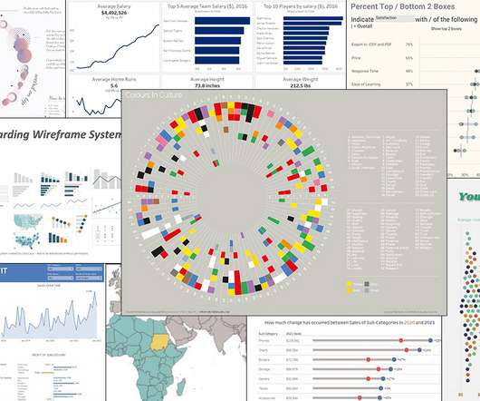
I did a quick scan of data visualization resources to look for practical advice on the process of thinking visually and some technical information on what chart to select and data storytelling. The deck provides specific practical advice on charts, color, and maps. I like the chart advice: Avoid 3d-charts at all costs.
Designing Charts and Color to Communicate Quickly How do you simplify a text- and data-heavy scorecard while still accurately and quickly conveying the complex information policy-makers seek? Our goal for the new AARP LTSS Scorecard website was to design a chart anyone could look at and understand immediately how a state was doing.
As this side-by-side comparison clearly demonstrates, too many colors makes it difficult to identify a specific sub-category at a glance. Formatting, Design, Storytelling. New Viz* The Cost of Data: One sheet, two chart. Creating Custom Gauge & Needle Charts in Tableau. Place Bar Chart Labels Above Bars in Tableau.
Don't do this (left); Do this (right): As this side-by-side comparison clearly demonstrates, too many colors makes it difficult to identify a specific sub-category at a glance. Formatting, Design, Storytelling. New Viz* The Cost of Data: One sheet, two chart. Creating Custom Gauge & Needle Charts in Tableau.
To mark the five-year publish anniversary of my book, The Big Book of Dashboards , we’re celebrating on Chart Chat ( sign up here ), and I also thought it a good time to look at how members of the Tableau Community are talking about dashboards these days. . Build a Selected vs. Comparison Date Period Filter in Tableau. Bronwen Boyd.
To mark the five-year publish anniversary of my book, The Big Book of Dashboards , we’re celebrating on Chart Chat ( sign up here ), and I also thought it a good time to look at how members of the Tableau Community are talking about dashboards these days. . Build a Selected vs. Comparison Date Period Filter in Tableau. Bronwen Boyd.
“Material Comparison” — product slide. I also love how this chart illustrates the tremendous scale of the issue as part of the problem itself. Slide 6] Showing how the tech could be applied is great storytelling. . “First gen solution” — solution slide. “Market size” — market slide.
WayRay Team — R&D departments org chart. Storytelling is an important part of turning that story into reality, and WayRay does a great job at showing off the world it wants to live in. AR Marketplace — For the passenger. WayRay Team — Team slide 2. WayRay Team — Team slide 3. WayRay Team — Chemistry team slide.
Five Tips for Nonprofit Data Storytelling by Matthew Scharpnick. Not every organization has the staff or budget to professionally design every graphic or chart it produces. Give people points of comparison to understand how the data relates to larger trends, other geographies, etc.
Eileen Smith of Spokesmith, on empathy: “A great way to demonstrate you have values in common is through storytelling. Give your audience a real-life comparison to your statistic so they can grasp it immediately.”. And when your audience has these positive feelings, they can authentically connect with you and your organization.
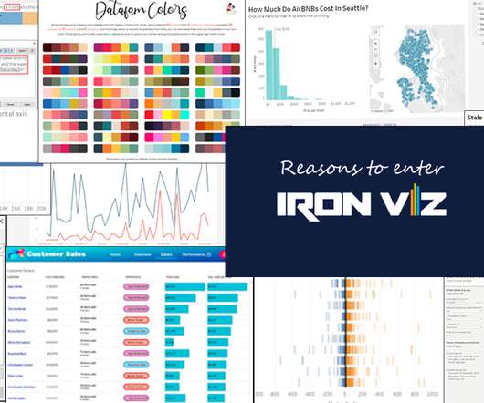
By entering, you’re developing your data literacy and data storytelling skills. The Data School blogs are always a good source of quick and useful tips, too—I liked Henry Mak’s Barcode chart post this month. Harry Osborne, The Data School : How to build a Control Chart in Tableau. Formatting, Design, Storytelling.
Eileen Smith of Spokesmith, on empathy: “A great way to demonstrate you have values in common is through storytelling. Give your audience a real-life comparison to your statistic so they can grasp it immediately.”. And when your audience has these positive feelings, they can authentically connect with you and your organization.
By entering, you’re developing your data literacy and data storytelling skills. The Data School blogs are always a good source of quick and useful tips, too—I liked Henry Mak’s Barcode chart post this month. Harry Osborne, The Data School : How to build a Control Chart in Tableau. Formatting, Design, Storytelling.
As a point of comparison, the U.S. It’s in our org charts. Augmented Reality will take storytelling to an immersive level that allows donors to see the impact of their giving like never before. Can you read a chart? of total fundraising revenue. of total sales. Donor behavior is keeping pace with consumer behavior.
They help you see where you stand and chart where you could go. Ongoing communication: Use email and SMS to guide fundraisers from signup to success Encourage social storytelling: Help fundraisers post on social platforms with pre-built templates and tips Action Step: Think beyond signups.
Like the Tolan itself, its an element deeply rooted in storytelling and emotional resonance. Image: Portola] That comparison wasnt accidental. Image: Portola] A different approach to AI Other AI companions often drift into unsettling territory, but Tolan aims to chart a different course.
We organize all of the trending information in your field so you don't have to. Join 12,000+ users and stay up to date on the latest articles your peers are reading.
You know about us, now we want to get to know you!
Let's personalize your content
Let's get even more personalized
We recognize your account from another site in our network, please click 'Send Email' below to continue with verifying your account and setting a password.


Let's personalize your content