This site uses cookies to improve your experience. To help us insure we adhere to various privacy regulations, please select your country/region of residence. If you do not select a country, we will assume you are from the United States. Select your Cookie Settings or view our Privacy Policy and Terms of Use.
Cookie Settings
Cookies and similar technologies are used on this website for proper function of the website, for tracking performance analytics and for marketing purposes. We and some of our third-party providers may use cookie data for various purposes. Please review the cookie settings below and choose your preference.
Used for the proper function of the website
Used for monitoring website traffic and interactions
Cookie Settings
Cookies and similar technologies are used on this website for proper function of the website, for tracking performance analytics and for marketing purposes. We and some of our third-party providers may use cookie data for various purposes. Please review the cookie settings below and choose your preference.
Strictly Necessary: Used for the proper function of the website
Performance/Analytics: Used for monitoring website traffic and interactions
Source: Gemma Correll – I Love Charts. Note from Beth: I just knew that I was going to start obsessing about charts and graphs after my Excel spreadsheet obsessions started. What better way than in Excel. Step 1: Which Chart is Best? If your data adds up to 100%, you might choose a pie chart.
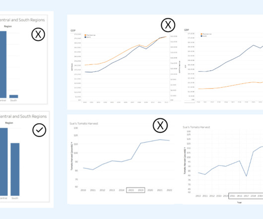
Alyssa Jenson November 14, 2023 - 6:59pm Sue Kraemer Senior Data Skills Curriculum Strategy Manager, Tableau Charts are all around us. When viewing and creating charts, it’s vital that we gain the ability to critically explore and discern the integrity of the information and conclusions shown in charts. Chart Design.
Source: Juice Lab Chart Chooser. Last month, Stephanie Evergreen wrote an awesome guest post called “ Six Steps to Great Charts ” with lots of practical tips for using the Excel chart feature to visualize your social media measurement data. The six steps: Step 1: Which Chart is Best? Step 6: Annotate.
Dashboards are a nonprofit’s best friend because they can be powerful tools in communicating your organization’s important measurement data at a glance. 4) Choose the Right Measure. Stare at your charts and graphs and numbers. Step B: Identify the comparison. Step C: Select the right chart. (5)
As part of my work as Visiting Scholar at the Packard Foundation this year, I’m facilitating a peer learning group based on “ Measuring the Networked Nonprofit ” and the next session we are focusing on the sense-making step of measurement. The deck provides specific practical advice on charts, color, and maps.
AARP helps policymakers by providing a digital scorecard that measures how states nationwide perform across different categories, such as nursing home costs or long-term care insurance. Our goal for the new AARP LTSS Scorecard website was to design a chart anyone could look at and understand immediately how a state was doing.
Ateken Abla November 14, 2023 - 6:59pm Sue Kraemer Senior Data Skills Curriculum Strategy Manager, Tableau Charts are all around us. When communicating with data, viewing a chart instead of a table of numbers helps us quickly understand data, make comparisons, see patterns, and make better decisions. Be aware of the SCAM!
Ateken Abla November 14, 2023 - 6:59pm Sue Kraemer Senior Data Skills Curriculum Strategy Manager, Tableau Charts are all around us. When viewing and creating charts, it’s vital that we gain the ability to critically explore and discern the integrity of the information and conclusions shown in charts. Don’t be SCAM’d!
Ateken Abla November 14, 2023 - 6:59pm Sue Kraemer Senior Data Skills Curriculum Strategy Manager, Tableau Charts are all around us. When communicating with data, viewing a chart instead of a table of numbers helps us quickly understand data, make comparisons, see patterns, and make better decisions. Be aware of the SCAM!
Ateken Abla November 14, 2023 - 6:59pm Sue Kraemer Senior Data Skills Curriculum Strategy Manager, Tableau Charts are all around us. When communicating with data, viewing a chart instead of a table of numbers helps us quickly understand data, make comparisons, see patterns, and make better decisions. Be aware of the SCAM!
That's why we've partnered with TechSoup to offer basic data visualization tips in Beyond the Pie Chart. Part 1 covered some basic terminology and why you shouldn't use a pie chart. Use Line Charts and Area Charts to Track Trends over Time. First, let's look at the line chart below. Explore Tableau.
We also measured how long it takes to back up games to each kind of drive, throwing in a Seagate external HDD for comparison, since Sony now allows you to archive PS5 games and play PS4 games from an traditional hard drive. For instance, take a look at our load times for Final Fantasy VII Remake in the chart above. The verdict?
Since Tableau's first release in 2004, all visualizations created inside Worksheets have been rendered using VizQL , a breakthrough technology that allows you to create a chart with a simple drag-and-drop. Shipping sankey chart by Tristan Guillevin. Say hello to complex charts, as easy as drag and drop. What are Viz Extensions?
You need to measure nonprofit impact, according to McKinsey and communicate value in a visually-appealing manner so that it draws readers in and keeps them engaged. Use charts to present statistics and financial figures. Make comparisons (use bar charts, pie charts, stacked bar charts). Source: Venngage.
The chart below compares the proportion of nonprofits by subject area overall (in blue) with that of the subset of nonprofits sharing demographic data (in orange). In the chart below, we compared sharing rates by different staffing levels and demographic categories, including race/ethnicity, gender, sexual orientation, and disability status.
Scaling is about increasing three main things during training, which typically need to grow together: The amount of data used for training the AI; The models size, measured in parameters; Computational resources, often called “compute” in AI. You can find this data point in the chart; it is the first one. billion words.
A year ago, he said that measuring outcomes for social media is, "an evolving art (not quite a science yet) and you have to be up to the challenge of both thinking a bit differently and be ok with leveraging several different tools. Measuring the success of social media efforts can't be done with a single metric. Technorati ???Authority???
These proactive measures will not only keep your SOA in line with the latest accounting standards but also ensure your organization’s financial health is accurately represented, fostering trust among stakeholders and supporting the sustainability of your mission. Engage with accounting professionals who specialize in nonprofit finance.
Check out the comparisonchart below. Check out some more statistics from the Cone study: 41% of Americans say they have bought a product because it was associated with a cause or issue in the last year – doubling since they first began measuring this in 1993 (20%). Another words, 278+ million people in the U.S.
Here are four common mistakes my team and I see made by social, government, and nonprofit organizations trying to measure their impact, and tips on how to avoid them: 1. Measuring Too Much. By far the most common problem we see is that most organizations try to measure too much. Little or nothing happened as a result.
Much like a developing human, our data collections have gotten bigger over time (see chart below), undergone developmental changes, and experienced the associated growing pains. as measured by total giving. 2013-2014 – Tweens A decade in, the importance of consistent year-over-year comparisons grew.
Doing so can be as simple as sharing a chart with these metrics from the past year: Total dollars raised: overall dollars acquired through fundraising initiatives. This will provide a frame of reference for this year’s performance in comparison to the previous year, allowing your board to pinpoint key areas they should focus on going forward.
As far as heat’s concerned, it’s a toss-up: both GPU sensors measured 72 degrees Celsius in the middle of a looped benchmark. If you take a close look at my performance chart above, you may notice that some of those frame rates seem a bit too low to play. Not only is it a full inch shorter than the RX 6800 (9.5 inches versus 10.5
A few things jump out in the chart. As a few points of comparison, here are the rated capacities we were able to find for other phones and devices by consulting iFixit’s teardowns: Samsung Galaxy S21 Ultra : 18.84Wh. By Apple’s measure, if your iPhone 12 tapped out at 9:30PM, it expects the iPhone 13 will make it to midnight.
As a point of comparison, in 2016 the median offline gift less than $1,000 was $20. Median Gift Sizes are a better measure than Average Gift Sizes: We know that it is common for nonprofits to receive online gifts of $1,000, $5,000 or more. Compare your own online median gift size trends to the chart above. How are you trending?
And, it also includes measurement - not just qualitative information. It uses metrics to measure your results and help you improve your strategy over time. ROI had it origins as an accounting term and was originally a measure of return on the total investment in the entire business. Use of metrics to measure your results.
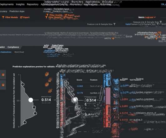
In the model-fitting procedure, the modeler is then able to measure the impact of each factor against the outcome. Within DataRobot, each model created in the model leaderboard contains a feature impact visualization, which makes use of a mathematical technique called permutation importance to measure variable importance.
The push by CATL is the latest example of China charting its own path in the electric vehicle transition, as major economies such as Germany grapple with a near-term global slowdown for EVs. The #25 batteries measure 1.6 meters in length, 1.3 meters in width, and 120 millimeters in height, based on Yangs presentation.
Smartwatches measure blood oxygen from the wrist, though, which may not be as accurate as the fingertip. Pulse oximeters use wavelengths of light to measure how much oxygen is in the blood — oxygenated and non-oxygenated blood absorb different wavelengths. They’re usually just measuring time at rest, though.
To establish benchmarks for measuring success of our design efforts. see the Traffic Sources pie chart on the right for an example of this data). For a more in-depth Analytics review, we might also establish some Goal Tracking to measure conversions on the website via email sign-up and/or donations. Methodology. Deliverables.
This is a chart of Facebook’s monopoly — 91% of the personal social networking market. Boasberg believes revenue is not an apt metric to calculate personal networking: “The overall revenues earned by PSN services cannot be the right metric for measuring market share here, as those revenues are all earned in a separate market — viz.,
Here’s a little chart for casual reference: Image Credits: Devin Coldewey / TechCrunch. But Attar explained that the way they measure it, it’s even more. Glass’s prototype uses a sensor that’s about 24×8 mm: about 192 square mm, 5-6 times larger, with a commensurate increase to megapixels.
And while those balls did dive into the ground when I fired flat, I measured ranges of up to 150 feet with my distance measuring wheel after I angled shots up into the air. As you can see in the chart, the Rush’s maximum range absolutely dwarfs the Kronos, but at the expense of range when shot flat. It’s tricky.
These are: Goals to measure: Goals not only motivate your team to work hard and put their best foot forward, but they also allow you to measure your progress over time and set you up to make improvements to your fundraising strategy in the future. Your goals should be specific, measurable, achievable, relevant, and time-based.
“I’ve never seen so many people so fixated on a cluster of charts,” notes Amanda Makulec. “At And as the pandemic dominated every aspect of our lives in 2020, there seemed to be a corresponding chart to go with it. Don’t rely on any single measure to tell the full story.
Kulash, an astute observer of music videos, used it as a point of comparison. Ross and Nordwind spend a solid hour shifting their feet by millimeters and balancing on slivers of wood, while Duffy holds a measuring tape to the floor, just so they are lined up in the exact sweet spot of head-swapping mirrors that theyll need to hit from a jog.
In the first full quarter measuring earnings during the pandemic, Amazon, Apple, Facebook, Google, and Microsoft reported making truckloads of cash. If you want to see just how vast the disparity can be between profits and racial justice pledges, we charted that out, too. IBM earned $9.4 billion, while Samsung earned $18.7
“I’ve never seen so many people so fixated on a cluster of charts,” notes Amanda Makulec. “At And as the pandemic dominated every aspect of our lives in 2020, there seemed to be a corresponding chart to go with it. Don’t rely on any single measure to tell the full story.
Horacio unsurprisingly pushed back on these comparisons — citing a range of statistics from Spotify’s Loud and Clear website that lays out exactly how and how much it pays artists around the world. So the measure cannot be, has the market share come down. The measure needs to be, are you creating space for competition?
pounds and measures 8.19 Take a look at the results in the chart below: As you can see, these frame rates are respectable. To illustrate why, I’ll pull out a few comparisons. For comparison, we can look to the Razer Blade Pro 17, a GeForce RTX 2080 Super Max-Q system in the same price neighborhood as the Flow X13 bundle.
I previously tested the RTX 3080 on an older Core i7-7700K , so I’ve gone back and tested Nvidia’s flagship on this new system to provide a comparison between the RTX 2080, RTX 3070, and RTX 3080. As you can see in the benchmark chart below, you won’t often need an RTX 3080 to max out today’s games with a 1440p monitor.
As a point of comparison, the U.S. It’s in our org charts. People will manage, monitor, and measure their philanthropic activity primarily on a mobile device. Can you read a chart? Based on research from the Blackbaud Institute’s Charitable Giving Report , online giving in the United States represents 8.5% of total sales.
And I will say, the role wasn’t very high up in the org chart. Just for comparison, Samsung, which is a huge competitor to Apple, rotates their executives every couple of years. That flattening of an org chart is like a big piece of the Slack puzzle here. So that’s the first thing that happens. Your two years are up.
If you want to play demanding games at high speeds (measured in frames per second, or fps), or if you need some extra power for rendering video or 3D models, you can configure a laptop with a dedicated GPU like NVIDIA's RTX 40-series hardware or AMD's Radeon RX 7000. hours Up to 10.5
We organize all of the trending information in your field so you don't have to. Join 12,000+ users and stay up to date on the latest articles your peers are reading.
You know about us, now we want to get to know you!
Let's personalize your content
Let's get even more personalized
We recognize your account from another site in our network, please click 'Send Email' below to continue with verifying your account and setting a password.


Let's personalize your content