This site uses cookies to improve your experience. To help us insure we adhere to various privacy regulations, please select your country/region of residence. If you do not select a country, we will assume you are from the United States. Select your Cookie Settings or view our Privacy Policy and Terms of Use.
Cookie Settings
Cookies and similar technologies are used on this website for proper function of the website, for tracking performance analytics and for marketing purposes. We and some of our third-party providers may use cookie data for various purposes. Please review the cookie settings below and choose your preference.
Used for the proper function of the website
Used for monitoring website traffic and interactions
Cookie Settings
Cookies and similar technologies are used on this website for proper function of the website, for tracking performance analytics and for marketing purposes. We and some of our third-party providers may use cookie data for various purposes. Please review the cookie settings below and choose your preference.
Strictly Necessary: Used for the proper function of the website
Performance/Analytics: Used for monitoring website traffic and interactions
See larger image here: Map from: Waddell, Steve. A lot of the ideas resonate with using online social networks and social media effectively for nonprofits, especially in the larger frame of movement building. One of the tools for better understanding networks are visual diagnostics and mapping techniques.
Data visualization uses graphs, maps, and other graphics to communicate complex information more effectively. Designing Charts and Color to Communicate Quickly How do you simplify a text- and data-heavy scorecard while still accurately and quickly conveying the complex information policy-makers seek?
I did a quick scan of data visualization resources to look for practical advice on the process of thinking visually and some technical information on what chart to select and data storytelling. The deck provides specific practical advice on charts, color, and maps. I like the chart advice: Avoid 3d-charts at all costs.
Ateken Abla November 14, 2023 - 6:59pm Sue Kraemer Senior Data Skills Curriculum Strategy Manager, Tableau Charts are all around us. When viewing and creating charts, it’s vital that we gain the ability to critically explore and discern the integrity of the information and conclusions shown in charts. Don’t be SCAM’d!
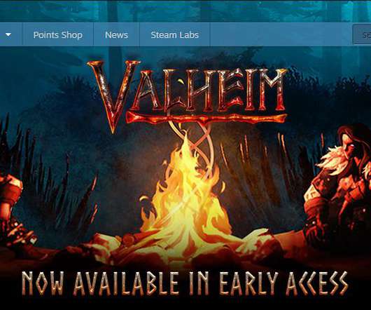
The other day, I saw a game named Valheim atop the Steam Early Access sales charts, with overwhelmingly positive reviews. It’s already set a top-ten record for concurrent players on Steam with roughly 392,000 on Monday, knocking Grand Theft Auto V off that top 10 chart. Valheim , by comparison, is slow and methodical.
That's why TechSoup has partnered with Tableau on a new blog series called "Beyond the Pie Chart." Tried to create a report and couldn't find a chart or graph that would clearly illustrate your point? Now think about making a chart comparing donation amounts for the past three years. But what about bar charts?
Since Tableau's first release in 2004, all visualizations created inside Worksheets have been rendered using VizQL , a breakthrough technology that allows you to create a chart with a simple drag-and-drop. Shipping sankey chart by Tristan Guillevin. Say hello to complex charts, as easy as drag and drop. What are Viz Extensions?
Map the data journey: Determine how each audience segment interacts with your data by mapping their workflows and identifying key touchpoints. This could include noting different points of data exploration, such as filtering data views or comparing specific charts.
If you’re mapping a continent, 30-meter resolution is overkill, but if you’re checking the margins of a lake for harmful chemicals or a field for dehydration, you want to get as exact as you can. In the chart above, more slices mean the curves are more precise and likely more accurate.
“Material Comparison” — product slide. Road map slide. Innovation — product road map slide. I also love how this chart illustrates the tremendous scale of the issue as part of the problem itself. “Applications” — product slide. “Awards” — traction slide. Case study slide. Team slide.
WayRay Team — R&D departments org chart. Super clear road map. Slide 26] The WayRay road map shows its plans clearly. Image Credits: WayRay (opens in a new window) I loved the way the company presents its plans and its milestones to date in a really simple road map (pun intended). AR Marketplace — For the passenger.
By comparison, investors flowed $4.8B To get a holistic sense of the opportunities for investors and entrepreneurs, he crafted a market map that charts professional learning startups. to Canadian fintech startups in the first half of the year.
Plus, once you set it up and map the fields (i.e. A simple report with a pie chart can easily show you that. A report showing comparisons can help you see this increase. So set up your Chart of Accounts right from the get-go. Set It Up Right From the Beginning Trust me, it’s a PAIN to have to clean up a Quickbooks file!
Or maybe you’re just finishing that first brainstorm meeting to map out your December plans? Year over Year Comparison. ” You’ll end up with some pretty well formatted charts and graphs to showcase your findings, too! .” Perhaps you’re almost done with your end of year fundraising prep.
To use a reductive comparison, Supernatural is sort of like Beat Saber meets Peloton. Almost every song turns you around 360 degrees at least once, and the note charts really do feel like dancing more than most other VR music games. Beat Saber , to draw the most obvious comparison, costs $29.99 I’ve been using VR.
This is a chart of Facebook’s monopoly — 91% of the personal social networking market. Facebook, by comparison, announced just weeks ago a paltry $1 billion program over a year and change. Image Credits : Snapchat. The gray blob looks awfully like a vast oil deposit, successfully drilled by Facebook’s Standard Oil operations.
ASU Home ASU A-Z Index My ASU Colleges & Schools Directory Map About Blog Academics Organizational Assistance Emerging Leaders Professional Development Philanthropy Research News & Events You are here: Home → Blog Pages Blog Home Write for us! Disclaimer Friday, March 18, 2011 Research Friday: "Really, How Many People Volunteer?"
While in theory you could organize fundraising campaigns as needs come up and cross your fingers for good results, mapping out your strategy ahead of time is a much better move. Why is it important to have a fundraising strategy? Here are some of the benefits of having a thorough (yet flexible!)
We organize all of the trending information in your field so you don't have to. Join 12,000+ users and stay up to date on the latest articles your peers are reading.
You know about us, now we want to get to know you!
Let's personalize your content
Let's get even more personalized
We recognize your account from another site in our network, please click 'Send Email' below to continue with verifying your account and setting a password.


Let's personalize your content