This site uses cookies to improve your experience. To help us insure we adhere to various privacy regulations, please select your country/region of residence. If you do not select a country, we will assume you are from the United States. Select your Cookie Settings or view our Privacy Policy and Terms of Use.
Cookie Settings
Cookies and similar technologies are used on this website for proper function of the website, for tracking performance analytics and for marketing purposes. We and some of our third-party providers may use cookie data for various purposes. Please review the cookie settings below and choose your preference.
Used for the proper function of the website
Used for monitoring website traffic and interactions
Cookie Settings
Cookies and similar technologies are used on this website for proper function of the website, for tracking performance analytics and for marketing purposes. We and some of our third-party providers may use cookie data for various purposes. Please review the cookie settings below and choose your preference.
Strictly Necessary: Used for the proper function of the website
Performance/Analytics: Used for monitoring website traffic and interactions
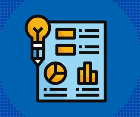
Beth’s blog shares Ann Emry’s tips for creating charts with your nonprofit’s data. Charts can turn plain text into a visually, expressive piece of information, which is great for persuading donors to donate or showing your supporters your organization’s impact. Chart diversity. Visual communication.
To do that, it needs to live where your audience lives: online. By knowing your audience, telling the right stories, and using digital tools, you can revolutionize your reports, inspiring stronger connections and future giving. Identify Your Audience One of the most elemental steps of digital reporting is identifying your audience.
Simple infographics employ just a few visual elements (pictures or charts), words, and numbers. Too many and you’ve lost your audience. In my experience, the most effective infographics have the following three characteristics: 1. Are simple. I’ve seen many infographics which are a jumble of clip art or icons labeled with numbers.
By Beth Singer , Principal at Beth Singer Design, LLC – a design firm that specializes in creating digital slide decks with editorial clarity and design that enable nonprofits to connect with audiences and move them from interest to action. Be succinct: The less you have on a slide, the more your audience will remember. 3) First slide.
Source: Juice Lab Chart Chooser. Last month, Stephanie Evergreen wrote an awesome guest post called “ Six Steps to Great Charts ” with lots of practical tips for using the Excel chart feature to visualize your social media measurement data. The six steps: Step 1: Which Chart is Best? Step 6: Annotate.
The Australian Broadcast Company’s ABC News app shot to the top of Apple’s App Store charts in Australia over the course of the last few days, not long after Facebook banned Australian news sources on its platform. 1 in the news app charts. Image: ABC News. ABC News currently sits at No. it became the most downloaded app in Australia.
” My answer is: ”Don’t ask me, ask your audience.” ” That to say that you need to know your audience and how they get their information. Even more importantly, what motivates them. So, was delighted when Darren Barefoot asked if he share a guest post about how to do audience analysis.
To share your mission with a wide audience. To recognize important people (volunteers, donors, major funders, partners). To provide an account of your organization's work for the past year. To generate new donations, retain donors and grow partnerships.
Using a fund accounting system with a segmented chart of accounts requires fewer clicks and selections to track an expense, which reduces the potential for errors and helps to ensure your data integrity. And high-level overviews in an annual report won’t cut it for many of your engaged audiences.
Post consistent content that your audience loves and your social media will be successful. What does the visual look like? This past week, my Facebook insights chart of reach and engagement looked like a pregnant woman lying on her back or maybe a wide and steep mountain. What’s going on here? Is it that simple?
Retain audience attention by making the information lively, accessible, understandable, clear, compelling, and useful. Keep it simple Cut through the noise and do not overload your audience with data. You can create a simple infographic by doing such things as using minimal colors and making simple charts.
To make your site accessible for all audiences, always ensure there is adequate contrast between text and background colors (at least a 4.5:1 Your organization’s impact data will be much easier for website visitors to understand and contextualize if you present it using charts, tables, and graphs. Typography. Infographics.
Successful website owners and administrators all have one thing in common: they know their audience. So how does one begin to seek out an understanding of their target audience? The post Know Your Audience: How to Use Google Analytics With Your WordPress Site appeared first on Byte Technology’s Web Design Insights Blog.
When pie charts about pie detract from your story: how to hold content as the star and design as the back-up singer. Samihah Azim. Product Design Manager. Bluenose Analytics. I work to weave the story of customer success into the core of the product.
Every year, Spotify releases Spotify Wrapped —a year-end roundup of the top music that its tunes-loving audience listened to that year. Topping the charts of most-read Candid blogs of 2022: the overhead myth. The post Topping the charts in 2022: The 10 most-read Candid blogs appeared first on Candid Blog.
inZOI debuted on March 28 at $40 and quickly climbed to the top of Steams most wishlisted and bestseller charts. Designed with a broader audience in mind, inZOI stands out through subtle cultural details. Now, theres a new life-simulation game on the block hoping to expand beyond the American market.
Imagine the impact your nonprofit could have if audiences better recalled its stories and messages or made better use of your organizations tools and services. Towards a Solution: User Research To understand how the Scorecard could better resonate with users, AARP took a step familiar to the best content creators: audience research.
The pie chart illustrates proportionately how each contributes to the campaigns’ success. By sharing genuine, personal stories, nonprofits could connect more deeply with their audiences, encouraging more substantial and sustained giving. Partnerships of any size help extend nonprofit audience reach and giving campaign awareness.
With this new virtual-only audience segment, they launched a new online course that resulted in nearly $300,000 of additional revenue. You won’t get this time back when the economy is booming and sales are off the charts. Read more about their story. What Can You Be the Best At? Plus, your future self/team will thank you.
If you’re looking to dispel any nervousness about your tech options, check out our Tech Setup Guide for Virtual Fundraising Events , where we break it all down for you into simple, easy-to-use terms and flow charts. 4) Online Registration for Virtual Events Has Many Benefits.
This advice is especially relevant for anyone looking to attract a younger audience. Thought leadership is a powerful way to engage an audience that prefers to be educated versus sold to. Companies often make the mistake of trying to sell through the lens of what’s best for them, versus what’s best for their audience.
At each of these phases, understanding exactly who your audience is and how you should connect with them will be essential, especially after a year of pandemic challenges and distractions. Let’s walk through each of these audiences, when you’ll need to connect with them, and a few tips for making those connections as impactfully as possible.
When it comes to fundraising, though, one of the areas of most interest is motivation – this can help fundraisers and organizations align their message and delivery with the points of interest and the channels that are the most influential to the target audience. But, on the top of the chart: a compelling cause.
They’re great for nonprofits to tell a story that will resonate with your audience. Infographics make it possible to tell a complex story in a few words, that people can grab right away. Infographics are a communication trend that illustrate data in an attractive, easily digestible format.
In “ The Power of Infographics ” Mark Smickilas offers some good recipes for creating your own infographics. You need to start with data, audience, and time allocation. For inspiration, check out this Pinboard of nonprofit infographics which will lead you to many more examples. Now, comes the perspiration part.
Don’t be afraid of “boring” bar charts. It can be tempting to go a long way and hack Tableau to create non-standard charts with deep visual appeal and a significant “wow” factor. Don’t forget, though, that you have an audience who want to understand your chart. although sometimes elaborate charts impress in other ways.
Rumours now ranks seventh on the Billboard 200 chart, the publication announced last night , the album’s first appearance in the top 10 since 1978, a year after it debuted. Billboard ’s chart measures album “units” moved each week in terms of sales, track purchases, and streams. Billboard says it counted 30.6
From successfully converting non-member audiences into members, to your membership engagement strategy, to events and non-dues revenue, data can inform every step along the way. Understanding the Audience: Who will use the data and for what purpose? It’s important to tailor your metrics and dashboards to meet their needs.
I did a quick scan of data visualization resources to look for practical advice on the process of thinking visually and some technical information on what chart to select and data storytelling. The deck provides specific practical advice on charts, color, and maps. I like the chart advice: Avoid 3d-charts at all costs.
To share your mission with a wide audience. To recognize important people (volunteers, donors, major funders, partners). To provide an account of your organization's work for the past year. To generate new donations, retain donors and grow partnerships.
Spitfire’s useful SMART chart planning tool has been used by many nonprofits and was adapted for social media for nonprofits by NTEN’s WeAreMedia project several years ago. Increase audience connections through Facebook to 1000 by June 1, 2012. Using SMART objectives for nonprofit communications strategies is not new idea.
Don’t be afraid of “boring” bar charts. It can be tempting to go a long way and hack Tableau to create non-standard charts with deep visual appeal and a significant “wow” factor. Don’t forget, though, that you have an audience who want to understand your chart. although sometimes elaborate charts impress in other ways.
James and Oliver will be live on the December Chart Chat. I interviewed Tim for an episode of If Data Could Talk , and he joined my co-hosts for a geeky dive into his favorite charts on Chart Chat. Have you noticed that 99% of books about data visualization are aimed at the people who build charts? Living in Data.
It causes the audience to pay attention. A couple of tricks to consider when creating a Pecha Kucha style presentation include: using strong images, using timely information, and if you use text and or chart, make sure the audience can read them in 20 seconds or less. You can do Pecha Kucha with a live audience.
We are breaking the audience and database into manageable groups for the purpose of communicating with them. This is typically accomplished by defining portions or segments of your audience who have similar characteristics or interests. The worst thing you can do: not segment your audience. Additional Tips.
Unless we design for international audiences, it’s easy to overlook how different colors are perceived in different countries around the world. . New Viz* The Cost of Data: One sheet, two chart. Creating Custom Gauge & Needle Charts in Tableau. Place Bar Chart Labels Above Bars in Tableau. Felicia Styer, , Playfair Data.
James and Oliver will be live on the December Chart Chat. I interviewed Tim for an episode of If Data Could Talk , and he joined my co-hosts for a geeky dive into his favorite charts on Chart Chat. Have you noticed that 99% of books about data visualization are aimed at the people who build charts? Living in Data.
Instead, your visuals should work to create a cohesive picture of your organization that represents your values, mission, and audience. . Charts and graphs work best when paired with writing that contextualizes them. When creating your graphics, be sure they are accessible for your entire audience.
Then I build out the content and discussion questions. In reviewing the data and themes from the audience input, some terrific questions about engagement popped out: How can we become better at using social media so that our channels experience more engagement and convert people to get involved? How can we get people to talk to us?
If you’d like to start with the basics, read Intro to Google Analytics or Understanding your Audience through Analytics. For example, you can take a chart of average visit duration and segment it into New Visitors and Returning Visitors, and see an interesting comparison on the engagement of your repeat traffic versus new traffic.
Know your audience You’re probably used to supporting stakeholders who aren’t financial professionals reach an understanding of your organization’s financials. Consider also the level of detail that will be helpful to your audience. Or do they want raw data for creating the pie chart themselves? That Variance column?
Dixie, Charli’s sister, released a debut single in June that quickly jumped onto Billboard ’s Emerging Artists chart. (To Heidi and Marc, their parents, have started building an audience, too. The D’Amelio crew has been quick to build out an ecosystem of media around not just Charli, but the whole family.
But, it isn’t enough to create a wordy report or bombard your audience with numbers. A better way to present this information would be to start by telling the audience how many people lack access to clean. You can educate your audience about the cause by using illustrations. and safe drinking water. Source: Venngage.
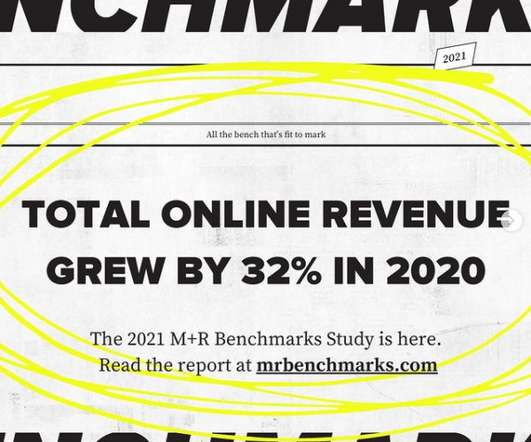
Go explore the findings, charts, and analysis at mrbenchmarks.com. . Audiences grew across all digital channels. Email list sizes were up by 3%, Twitter followers increased by 25%, and mobile audiences by 26%. Read time: 2 minutes. We are excited to report that the 2021 M+R Benchmarks Study is ready for you.
We organize all of the trending information in your field so you don't have to. Join 12,000+ users and stay up to date on the latest articles your peers are reading.
You know about us, now we want to get to know you!
Let's personalize your content
Let's get even more personalized
We recognize your account from another site in our network, please click 'Send Email' below to continue with verifying your account and setting a password.


Let's personalize your content