This site uses cookies to improve your experience. To help us insure we adhere to various privacy regulations, please select your country/region of residence. If you do not select a country, we will assume you are from the United States. Select your Cookie Settings or view our Privacy Policy and Terms of Use.
Cookie Settings
Cookies and similar technologies are used on this website for proper function of the website, for tracking performance analytics and for marketing purposes. We and some of our third-party providers may use cookie data for various purposes. Please review the cookie settings below and choose your preference.
Used for the proper function of the website
Used for monitoring website traffic and interactions
Cookie Settings
Cookies and similar technologies are used on this website for proper function of the website, for tracking performance analytics and for marketing purposes. We and some of our third-party providers may use cookie data for various purposes. Please review the cookie settings below and choose your preference.
Strictly Necessary: Used for the proper function of the website
Performance/Analytics: Used for monitoring website traffic and interactions
Last month I had the pleasure of taking the Luma Institute Train the Trainers workshop where I got a chance to immerse in practicing facilitation techniques based on human centered design principles. The workshop instructor Peter Maher is founder and CEO, of Luma Institute , and a Jedi Master. ” What is Human Centered Design?
We used some Human Centered Design techniques from their “ Innovating for People ” design methods recipe book. It was the most stimulating web platform strategy session that I have ever experienced! Technique #1: Rose, Bud, Thorn (Understanding). Technique 2: Affinity Mapping. Technique 3: Creative Matrix.
About a year ago, I came across David Sibbet’s book, “ Visual Meetings ” I have known of his work for years, but always thought graphic recording was for “real artists who can draw.’ Rachel, a virtuoso technologist and artist, used a drawing tablet and Sketchbook pro.
Imagine this scenario: instead of staring at a wall map of foreign lands, students can don some hi-tech headgear and be transported to those places in a 360-degree virtual world of images. —it makes sense that, finally, designers would begin to look past the frivolous and fun aspects of their gear and towards truly worthwhile applications.
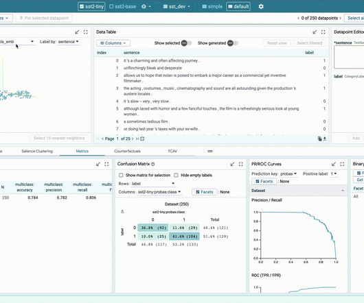
It’s my opportunity to give back to the community—whether that’s by showing people how to create basic charts or use different Tableau techniques—or just by helping beginners get started.”. He spends a lot of his time creating tutorials on Tableau and finding artistic ways of visualizing data on his YouTube channel, Data Viz Canvas.
The museum curator does research, is an expert in the artistic style, selects the best examples, puts them together in an exhibit, provides important context with the annotation on the labels, and so on. Not too long ago content curators used to be called journalists! You”ll find them linked here. The Practice.
Poly’s first tool in its planned web-based suite generates 3D textures with physically-based rendering maps. In modeling, “physically-based rendering” refers to a technique that aims to render images in a way that mimics the flow of light in the real world. Image Credits: Poly. ” Image Credits: Poly.
Do not only provide an interactive map of the venue and call it a day. The scenes might not be in order and might look more artistic. Video that uses classic editing techniques so that proper tone and context are provided. Why Does Video Style Matter? The video is shot and then cut and edited to look like a movie.
Last night we attended a performance of Sandglass and Sovanna Phum ( Here too)- the culmination of these two artists working together from different cultures, puppetry traditions , and language. We were in such a rush to leave, that I forgot the google map for the location. What they produced was gorgeous, brilliant, and exceptional.
Why is a photography contest an example of "crowd sourcing" wheres a community drawing contest is an example of "audience-as-artist"? What's the relationship between the goals of participation and the techniques employed?
All the technique, training, and "PowerPoint" tricks are useless if the talk doesn't come from your gut, from your heart and soul. My process is analog, but I have to start with a mind map of the ideas (sometimes several versions of it), then do a linear outline, and finally sketch out a storyboard with image ideas.
Generative AI research Generative AI is creating a lot of excitement, and PAIR is involved in a range of related research, from using language models to simulate complex community behaviors to studying how artists adopted generative image models like Imagen and Parti. a gingerbread house in a forest in a cartoony style").
.&# Ushahidi is an open source platform that facilitates crowdsourcing through the use of SMS/cellphones and online mapping. It has been used in disaster relief, for example, in Pakistan , and other scenarios from London Tube strike to election monitoring to mapping crime incidents Atlanta. (2) 2) Crowd Creation.
The artists come from all over (though many are based in the Midwest), and anyone can enter. Artprize invited me to talk about art with artists, families, security guards, friends, people old and young, sophisticated and novice, drunk and sober. Then get yourself to Grand Rapids for Artprize. It's the social experience.
It’s my opportunity to give back to the community—whether that’s by showing people how to create basic charts or use different Tableau techniques—or just by helping beginners get started.”. He spends a lot of his time creating tutorials on Tableau and finding artistic ways of visualizing data on his YouTube channel, Data Viz Canvas.
It’s my opportunity to give back to the community—whether that’s by showing people how to create basic charts or use different Tableau techniques—or just by helping beginners get started.”. He spends a lot of his time creating tutorials on Tableau and finding artistic ways of visualizing data on his YouTube channel, Data Viz Canvas.
Haje ‘s piece on Carv details the startup’s ski-tracking insert for ski boots, which measures and analyzes technique and beams the data to an app where a virtual coach can give feedback. That’s different — and piqued my interest, I must say, as a lover of snow sports. The new label — available to merchants in the U.S.
OpenAI proposes new moderation technique: OpenAI claims that it’s developed a way to use GPT-4, its flagship generative AI model, for content moderation — lightening the burden on human teams. On Tuesday, the AI posted its own Story to the app and then stopped responding to users’ messages, which some Snapchat users found disconcerting.
Do not only provide an interactive map of the venue and call it a day. The scenes might not be in order and might look more artistic. Video that uses classic editing techniques so that proper tone and context are provided. Why Does Video Style Matter? The video is shot and then cut and edited to look like a movie.
Create custom maps, charts, and graphs in clicks. Tableau Public is like an art gallery to an artist. I can find pieces that resonate with my style and interests and others that inspire me to learn a new skill or technique. It’s an inspirational place for everyone to explore and connect.". .
Create custom maps, charts, and graphs in clicks. Tableau Public is like an art gallery to an artist. I can find pieces that resonate with my style and interests and others that inspire me to learn a new skill or technique. It’s an inspirational place for everyone to explore and connect.". .
Welcome to Pine Point is a kind of virtual museum exhibition about the town, told from the perspective of Michael Simons, an artist who grew up in the nearby town of Yellowknife and visited Pine Point as a boy. Pine Point was a single-industry town, and when the mine closed in 1988, the town closed along with it.
We experimented with many different forms of visitor participation throughout the building, trying to balance social and individual, text-based and artistic, cerebral and silly. We used this technique to develop the prompt. This post focuses on one aspect of the exhibition: its participatory and interactive elements. A DIY wedding!
Elements to include when studying techniques that inspire immediate action and applying those lessons: Analyze effective ad appeals – what motivates rapid response? The ads were hailed as beautiful, artistic, and innovative. Use surveys and donor journey mapping to understand how people engage initially and over time.
And while there's lots of good stuff in these sections (including an introduction for me to some wild net artists ), it's the last chunk that interests me most, where Karen explores the question of how and where Internet art should be exhibited. At the info desk with the maps? Let's examine the case for each of Karen's techniques.
Writers everywhere rolled their eyes at the new technology, much like artists did with OpenAI’s DALL-E model , but the latest chat-style iteration seemingly broadened its appeal and audience. Rich visuals mean pictures for now, but later can include maps, charts and other items. FAQs: What is ChatGPT? How does it work?
For artists and creators looking to experiment with generative AI workflows, Black Forest Labs FLUX.1-dev 1-Depth-dev, which adds depth map guidance for more structure and spatial control FLUX.1-Canny-dev, In addition, the April NVIDIA Studio Driver, designed to optimize creative apps, will be available for download next week.
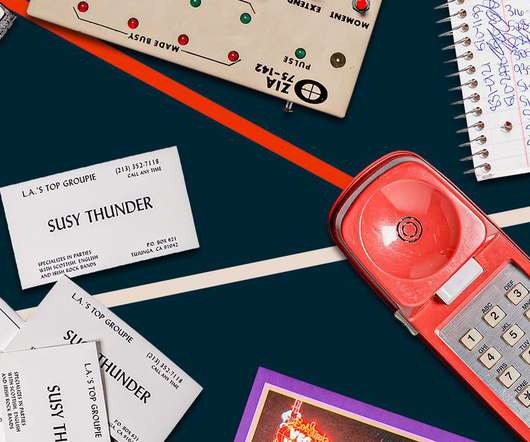
I tell Scott that Susan practiced, even pioneered, techniques still widely used by hackers. When those artists came to town, she’d call venues pretending to be, say, “Delilah from the P and Q Management agency,” requesting some last-minute additions to the guest list. I follow up with Scott, my only lead, relentlessly.
Yes, I know that every platform is different, and that the captive attention we afford to radio, TV, and written material doesn't map perfectly to a free-choice wander through an exhibition. Why are exhibitions, which have huge potential as immersive, multi-platform narrative devices, so rarely used to that effect? It's unforgettable.
As part of the session, Tom led live drawing ( click for high-res image ), and we invited the audience to add their own “can’t dos” to a large map of things that are “safe,” “iffy,” and “no way”--more on that later. Here are the words that came up on the comfort zone map: And here is the complete transcription of the post-its.
We organize all of the trending information in your field so you don't have to. Join 12,000+ users and stay up to date on the latest articles your peers are reading.
You know about us, now we want to get to know you!
Let's personalize your content
Let's get even more personalized
We recognize your account from another site in our network, please click 'Send Email' below to continue with verifying your account and setting a password.


Let's personalize your content