This site uses cookies to improve your experience. To help us insure we adhere to various privacy regulations, please select your country/region of residence. If you do not select a country, we will assume you are from the United States. Select your Cookie Settings or view our Privacy Policy and Terms of Use.
Cookie Settings
Cookies and similar technologies are used on this website for proper function of the website, for tracking performance analytics and for marketing purposes. We and some of our third-party providers may use cookie data for various purposes. Please review the cookie settings below and choose your preference.
Used for the proper function of the website
Used for monitoring website traffic and interactions
Cookie Settings
Cookies and similar technologies are used on this website for proper function of the website, for tracking performance analytics and for marketing purposes. We and some of our third-party providers may use cookie data for various purposes. Please review the cookie settings below and choose your preference.
Strictly Necessary: Used for the proper function of the website
Performance/Analytics: Used for monitoring website traffic and interactions
Seeing which way people’s actions are trending, seeing what younger members want versus older members and how they engage, this is where analytics can be the dowsing rod for your organization. Don’t just ask the question, look at the responses, and file it away somewhere. …But Don’t Forget To Listen!
By using the absolute go-to tool for digesting feedback: Google Analytics. By having the ability to track your traffic by geographical locations, knowing what type of browser they’re using and even charting their screen resolutions, JavaScript and Flash support, language etc. Now it’s time to install Google Analytics on your site.
Learning Analytics comes from a report about the impact of emerging technologies for practitioners in a field. Two or three years to adoption: Learning Analytics (K-12/Higher Ed), Open Content (K-12), Games and Gamification (Higher Ed). This report is not just your father’s PDF file!
Chart Your Course webinars available on demand To get started, it helps to have in mind a problem you think might be solved by AI. Predictive analytics, AI, and machine learning remained strictly academic from the 1940s until the 1980s, when computer power started to become available for commercial applications.
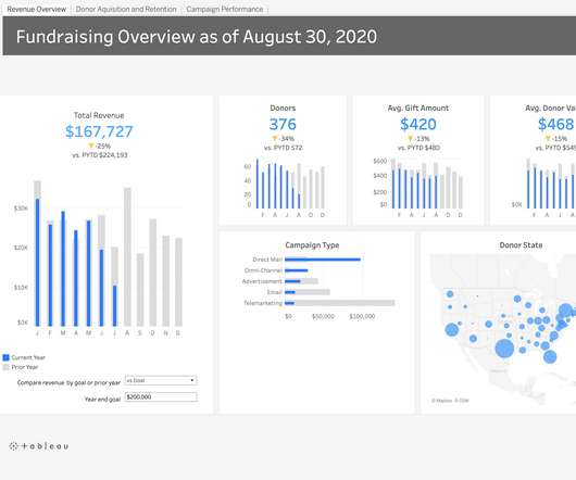
Tableau is a visual analytics platform that empowers all people and organizations to make the most of their data with an easy-to-navigate interface, no coding skills necessary. The first step will be to combine your streaming history files if you received more than one. I use this site to combine my JSON-type files. .
Operating in over 100 countries, IQVIA has built the largest global healthcare network and is uniquely connected to the ecosystem with the most comprehensive and granular set of information, analytics and technologies in the industry. Announced today at the J.P.
Tableau is a visual analytics platform that empowers all people and organizations to make the most of their data with an easy-to-navigate interface, no coding skills necessary. The first step will be to combine your streaming history files if you received more than one. I use this site to combine my JSON-type files. .
As you may know, Google Analytics is deprecating support for the 13+-year-old Universal Analytics. As the clock runs out on the year, consider the types of requests you start getting for historical data from Universal Analytics. More details on this from Google: Export and share reports – Analytics Help.
Have your interns take the Whole Whale Be Your Own Social Media Guru course to better understand the theory and analytics behind major platforms. Social media analytics report Have your intern review the past year of posts and data from your major platforms. Online file spaces on the cloud also have a tendency to devolve into a mess.
. “Operational analytics” Fast-forward to April 2021, and the commercial MergeStat company was officially born, with DeVivo going on to lure Josue Lopez from cloud giant Equinix to serve as chief operating officer (COO), as well as official cofounder. Competitive landscape.
I proudly represented Team Tableau at the virtual BI Bake-Off to face off against other analytics platforms. After joining Salesforce, we expanded our platform to include Tableau CRM (formerly Einstein Analytics) and exciting functionality. Let AI do the heavy lifting . The best part? No code or algorithms needed.
DoorDash filed to go public on Friday, meaning we’ll have at least one more unicorn IPO before 2020 comes to a close. When Airbnb filed to go public in August , it seemed like a solid plan. Before DoorDash filed, we were going to talk about Brex today in this space after Airbnb. You can sign up for the email here. Market Notes.
To start exploring I needed a good approach for performing data analysis over thousands of poorly documented JSON and CSV files … extra points for analysis that doesn’t require my data to leave my laptop. Enter DuckDB — a lightweight, free yet powerful analytical database designed to streamline data analysis workflows — that runs locally.
28% of sites have Google Analytics. *5% Danny Sullivan, a search engine expert analyzed another chart by Factual that showed additional stats but without exact percentages. After reviewing the charts he estimated about: *20% of sites use Flash. *19% 6% of sites show a sitemap file. *1% 6% of sites show a sitemap file. *1%
Lack of shared storage, inaccessible files, and the desire to avoid changing existing data platforms all worsen these existing data silo challenges. There are two solutions for integrating your data — either build an in-house centralized data platform or research an analytics vendor to outsource data collection and analysis.
We got an enormous increase in “data exhaust” — byproducts of exponentially growing computation in the form of log files — but only a modest increase in standardized data. There are some situations where you can Google for a quantitative question and get back a little table or chart, but that’s only if you ask just the right questions.
You ascertain averages, browse benchmarks , and create charts. You detail donations, edit estimates, and fetch files. Make data analytics work for your organization – download the Blackbaud Institute’s free Analytics Toolkit. If you’re like most peer-to-peer fundraising (P2P) staff, you’re drowning in data.
Since Tableau's first release in 2004, all visualizations created inside Worksheets have been rendered using VizQL , a breakthrough technology that allows you to create a chart with a simple drag-and-drop. Shipping sankey chart by Tristan Guillevin. Say hello to complex charts, as easy as drag and drop. What are Viz Extensions?
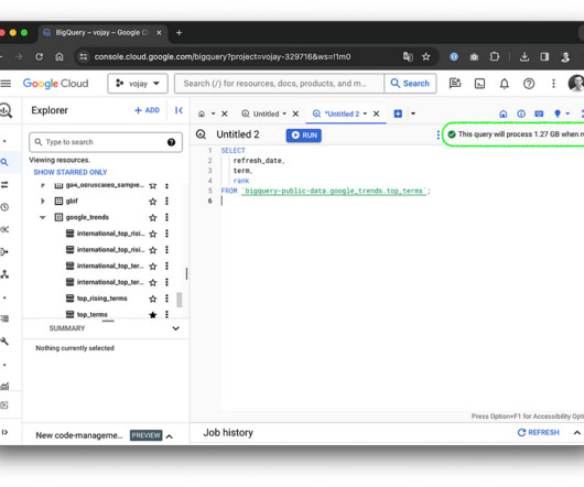
At its core, BigQuery is a serverless Data Warehouse for analytical purposes and built-in features like Machine Learning ( BigQuery ML ). The storage system is using Capacitor, a proprietary columnar storage format by Google for semi-structured data and the file system underneath is Colossus, the distributed file system by Google.
We’re talking full-color charts and graphs. It’s mail that doesn’t automatically get filed for action – like bills or my kids’ school permission slips. It’s mail that doesn’t automatically get filed for action – like bills or my kids’ school permission slips. No narrative. No images aside from graphs. In mail purgatory.
The features of Fundraise Up’s nonprofit software include: AI-driven donation optimization Upsell and matching gifts Integrated analytics Personalized donor experience Pricing Visit Fundraise Up’s website for pricing. This platform offers a suite of tools that make it easy for donors to give more and for nonprofits to engage them effectively.
Have your interns take the Whole Whale Be Your Own Social Media Guru course to better understand the theory and analytics behind major platforms. Social media analytics report Have your intern review the past year of posts and data from your major platforms. Online file spaces on the cloud also have a tendency to devolve into a mess.
I proudly represented Team Tableau at the virtual BI Bake-Off to face off against other analytics platforms. After joining Salesforce, we expanded our platform to include Tableau CRM (formerly Einstein Analytics) and exciting functionality. Let AI do the heavy lifting . The best part? No code or algorithms needed.
The quality and accuracy of the datasets you’re working with increase when you present them in attractive graphs, charts, shapes, and plots. Tableau supports a wide range of data sources, including local files, spreadsheets, relational and non-relational databases, data warehouses, big data, and on-cloud data.
Plus, tag expenses for fundraising, programming, and administration in order to make filing your Form 990 at tax time that much easier. Google Analytics — Top Fundraising App for Nonprofit Websites Where’s the first place your supporters go to learn more about your organization, its mission, and your upcoming opportunities for involvement?
Data analytics and technology are revolutionizing the healthcare industry. AI technology adoption can improve decision-making across the following processes and more: Predictive analytics: As a major reason for AI adoption, predictive analytics can help clinicians leverage care insights and provide effective early patient intervention.
Today, an increasing number of business users and analysts without formal data science training are harnessing the predictive power of AI through what’s become known as augmented analytics. Then use Tableau’s powerful visual analytics technology to dive deeply into those insights. The result: faster analysis and better decision-making.
Tableau can connect to various data sources, including Excel, CSV files, SQL databases, and cloud-based data warehouses and services like Google Analytics, Salesforce, and Amazon Redshift, allowing for comprehensive data analysis.
With customizable analytics dashboards , nonprofits can build beautiful charts and graphs of their digital, fundraising, advocacy, and organizing data to paint a better picture of their work. #9. Have easy access to the voter file. Visualize your data like never before.
Today, an increasing number of business users and analysts without formal data science training are harnessing the predictive power of AI through what’s become known as augmented analytics. Then use Tableau’s powerful visual analytics technology to dive deeply into those insights. The result: faster analysis and better decision-making.
Top feature: Users gain insight into online traffic, transaction times, website visits by device type, and conversion rates with real-time analytics. Monday.com Platform overview: Monday.com enables workflows based on your organization’s needs, including views like Gantt charts, Kanban, and more.
For analytics workloads, this results in additional overhead when reading, modifying, or moving files as the whole container has to be scanned. az aks get-credentials --resource-group <your-resource-group> --name <cluster-name> --overwrite-existing Add remote helm repository and search for the Airbyte chart.
He checked Google Analytics and saw, at first, that 150 people were playing the game at one time. Threes even charted well in the App Store, hitting the number one spot, where it remained for over a week. It immediately took the top spot on the games chart. “I The web game ended up on Hacker News, and spread from there.
A great tool to see how different companies make their product the hero is by looking through swipe files curated by sites like [link]. For example, long-form storytelling may still convert better than short snippets – the current long-form podcasts that top business charts are showing this.
Create an audio versio n of your article and post it as a podcast episode or just upload as a SoundCloud file that you can then embed in the article to increase engagement. . Infographic version – create a Canva infographic of the main charts and take-aways from a template.
that specializes in SEO, email marketing and analytics. regarding traffic and analytics, and subsequently makes suggestions. about providing feedback at every turn – they are sticklers for data and statistics that you can toggle into charts or hard numbers to find out. constituents and effectively market their missions.
The 20-person department pulls the information from scanned PDFs of the filings, enter the information into their database, and classify the information in the Foundation Center taxonomy. We had to use optical character recognition scans on five decades of Billboard Charts, get them into a database, and categorize all the entries.
Power BI — transforms your nonprofit's data into visuals including graphs and charts from your own CRM or from your website using Google Analytics. Box — a robust online document and file-sharing service with good content management and collaboration tools for your entire organization. No programming necessary.
Photo by Ian Taylor on Unsplash This tutorial guides you through an analytics use case, analyzing semi-structured data with Spark SQL. GitHub - sarthak-sarbahi/data-analytics-minio-spark Imagine you’re a captain setting sail across a vast ocean. Fetching data with Python : Now, it’s time to chart our course.
Integrations with Quickbooks, HelloSign, and Google Apps allow staff to easily manage invoicing its customers, storing associated contracts and files, and new signups from its website contact form. Salesforce Einstein and dashboards surface valuable member information in easy-to-view charts for steering growth. Destiny Rescue.
Fortunately, buildOn’s ongoing investment in their digital transformation helped the organization shift gears smoothly and chart a course of action during the early days of the pandemic. . We were spreadsheet-based, with simple, digestible KPIs presented to main stakeholders in a basic Excel file,” shared Dayton.
2- Extracting insights from data and chart analysis Charting and analysis may soon be done by Gen AI. ChartGPT is a specialized product focused just on charting data. And it was all produced just by fracking this information with lots of text files,” he said. So let’s take a look at some of the recurring themes.
Fortunately, buildOn’s ongoing investment in their digital transformation helped the organization shift gears smoothly and chart a course of action during the early days of the pandemic. . We were spreadsheet-based, with simple, digestible KPIs presented to main stakeholders in a basic Excel file,” shared Dayton.
May 30, 2023 Texas judge orders all AI-generated content must be declared and checked The Texas federal judge has added a requirement that any attorney appearing in his court must attest that “no portion of the filing was drafted by generative artificial intelligence,” or if it was, that it was checked “by a human being.”
We organize all of the trending information in your field so you don't have to. Join 12,000+ users and stay up to date on the latest articles your peers are reading.
You know about us, now we want to get to know you!
Let's personalize your content
Let's get even more personalized
We recognize your account from another site in our network, please click 'Send Email' below to continue with verifying your account and setting a password.


Let's personalize your content