This site uses cookies to improve your experience. To help us insure we adhere to various privacy regulations, please select your country/region of residence. If you do not select a country, we will assume you are from the United States. Select your Cookie Settings or view our Privacy Policy and Terms of Use.
Cookie Settings
Cookies and similar technologies are used on this website for proper function of the website, for tracking performance analytics and for marketing purposes. We and some of our third-party providers may use cookie data for various purposes. Please review the cookie settings below and choose your preference.
Used for the proper function of the website
Used for monitoring website traffic and interactions
Cookie Settings
Cookies and similar technologies are used on this website for proper function of the website, for tracking performance analytics and for marketing purposes. We and some of our third-party providers may use cookie data for various purposes. Please review the cookie settings below and choose your preference.
Strictly Necessary: Used for the proper function of the website
Performance/Analytics: Used for monitoring website traffic and interactions
Explore how the strategic integration of SWOT analysis, audience mapping, SMART communication targets, channel identification, content strategy, execution and evaluation, and high-level communications planning can shape a successful digital transformation. With ChatGPT’s analytical prowess, the process can be augmented.
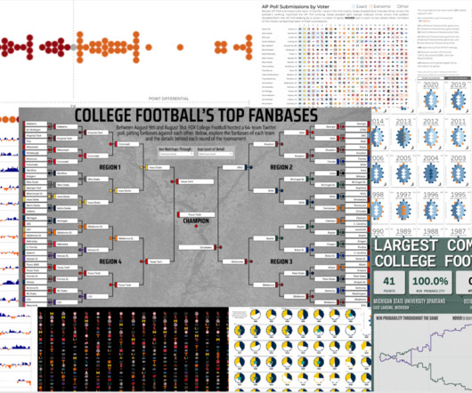
Explore heated rivalries, conference realignment, Heisman Trophy winners, stadium capacity, fan maps, game predictions—the topics are endless! From fierce rivalries that ignite stadiums to the intricacies of conference realignment, the visualizations presented here offer fresh perspectives on familiar and fascinating topics.
Well, from the planning and analysis side, that is. We covered how to do Community Mapping (identifying the segments and goals of the community), Content Mapping (creating a plan for which content goes where, and why), and Data Tracking (pulling all the numbers together). Community Mapping. >> Content Mapping. >>
Conversational analysis. HDIP can generate charts, graphs, and maps to help users visually interpret data, making it easier to understand and communicate insights in a way that supports planning and coordination. Transparency and human-in-the-loop verification. There are thousands of humanitarian datasets that don’t have metadata.
Audience Analysis. You have a site map that resonates with the way your audience accesses information. Then, you can use Google Analytics to start understanding trends – how long are users spending on your website? One that every nonprofits should think about from time to time. View the Session Recording | Download the Slides.
Across channels and platforms, we end up with answers about what is working and what’s not, trends in nonprofit strategies, and insight into supporter behavior. . with data from dozens of other nonprofits to create a set of averages, trends, and key metrics. That’s the destination.
Spatial analysis platform Carto has raised a $61 million Series C round. Carto lets you display that data on interactive maps so that you can more easily compare, optimize, balance and take decisions. You can move around a map, select and unselect layers and see the real numbers. Insight Partners is leading today’s round.
Google Trends. See what the world is searching for and how interest in concepts has changed over time with Google Trends. I input those terms into Google Trends and it looks like there is a sudden new interest in the concept. These tools help you maximize your Twitter presence, from timing to sharing to analysis.
This week, the call for data measurement in the social sector heightens with the proposition of a Social Progress Index and ways that NGOs can use data maps to increase effectiveness. Five trending Big Data technologies are also identified. How NGOs Are Using Data Maps to Communicate Problems. Data Measurement.
Nonprofit data nerds will love this new resource from Media Impact Funders and Foundation Center called “ Foundation Maps for Media Funding ,” a free, interactive mapping and research tool that shows the full scope of philanthropically funded media projects worldwide since 2009. Click to See Visualization.
Explore heated rivalries, conference realignment, Heisman Trophy winners, stadium capacity, fan maps, game predictions—the topics are endless! From fierce rivalries that ignite stadiums to the intricacies of conference realignment, the visualizations presented here offer fresh perspectives on familiar and fascinating topics.
seeing examples of movie reviews with “positive sentiment” and “negative sentiment” as labels and performing sentiment analysis using prior knowledge). Learning the input-label mappings in context from the presented examples (e.g., We test five language model families, PaLM , Flan-PaLM , GPT-3 , InstructGPT , and Codex.
The Social Media Strategy Map and Worksheet 1. And while surveys, focus groups and other services can give you an analysis of what your current audience is doing online, direct observation is works best. Jeremiah Owyang, Social Network Sites Use Analysis - Compilation of Research Facts. What else might you add or change?
Watch for long-term trends, not just what is popular that week or month. Community Mapping. Community Mapping helps you identify not just the various segments of your audience, but also create a clear picture of which tools/platforms are associated with those groups and which messages are best to target where.
Does anyone else miss paper maps? : A gaggle of companies, including Meta, Microsoft, AWS and TomTom, have partnered with the Linux Foundation to form the Overture Maps Foundation to do a few things: develop interoperable open map data and knock Google’s map dominance down a few pegs. — Christine and Haje. Paul has more.
Google Maps has new features that should make it easier for users to see wildfires, tree canopy, and locations without formal addresses. A new wildfire layer on Maps will begin rolling out globally this week, Google announced today. The map is updated about every hour. Google plans to roll out a new wildfire layer on Maps.
Social network analysis can help you determine whether you are making an impact in these areas and help you more effectively target your efforts. Using network analysis strategically can you help you stretch your budget -- and enhance your effectiveness. Mapping the Network. Mapping the Network. Diagram 1. Diagram 2.
Also think about the data and analysis that a development professional would perform on the donor data base to analyze multi-channel fundraising campaigns. Tools that mash up public data allow nonprofit fundraisers to do benchmarking and a better analysis of market conditions. I could compare it at the county level.
Data visualization uses graphs, maps, and other graphics to communicate complex information more effectively. AARP conducted focus groups that included users already knowledgeable about LTSS issues and affiliated data and trends, as well as users who had no connection to LTSS or related concepts. Why is data visualization so effective?
In this blog, I share what Candid’s data tells us about philanthropic trends for Asian American Pacific Islander (AAPI) communities in general and in reaction to recent anti-Asian hate crimes specifically as well as what to look for in the future. Foundation funding trends for AAPI communities. Additional trends in 2021.
In June, Tides partnered with Rhiza on a data mapping pilot using their Insight software. After doing some research and testing out some of the data mapping tools, we started with just making basic maps of where grants were made and partners are located, from which initial story threads emerged. and "to what ends?"
From this project, I saw a really great post from Darragh Murray about the importance of exploratory data analysis. The importance of exploratory data analysis: Exploring the first B2VB challenge. Increase your Data Culture by Embracing these Trends. Advanced Tableau Mapping Series: Calculating Weighted “Center of Gravity”.
From this project, I saw a really great post from Darragh Murray about the importance of exploratory data analysis. The importance of exploratory data analysis: Exploring the first B2VB challenge. Increase your Data Culture by Embracing these Trends. Advanced Tableau Mapping Series: Calculating Weighted “Center of Gravity”.
In Zambia’s North Luangwa National Park, rangers study the map on their screen to see if there are any places they haven’t checked. It took one presentation of that map from Tableau with EarthRanger data and everyone knew where to look,” said Ed Sayer, the program manager at Frankfurt Zoological Society’s North Luangwa Conservation Programme.
Charts and graphs are useful, but when you have any kind of location data — whether it's postal codes, state abbreviations, country names, or your own custom geocoding — you've got to see your data on a map. You wouldn't leave home to find a new restaurant without a map (or a GPS anyway), would you?
From speaking with attendees at the Paxata exhibit booth, partaking in networking events, and attending sessions, we observed three major trends: 1) Convergence of technologies. A Senior Director of Data Science for a marketing / advertising tech company is charged with television programming, content, creative, and message testing analysis.
market, but all the same, MomentFeed has built some specific technology that will enrich the wider platform, such as a particularly strong tool for measuring sentiment analysis. As we saw the market trending towards consolidation, we considered several potential companies to merge with. omni channel brands.
Many in philanthropy now have titles or job descriptions that include creative words like knowledge insights, grants and learning, information systems, data discovery, or relational analysis. I suggest three prompts for mapping out the nature of a question. What is the history in the question? What is the history in the question?
These are just a handful of nonprofit-focused data sharing sites to get you started: National Center for Charitable Statistics: NCCS provides data, as well as analysis tools and reports, on Nonprofits around the US. You can learn about other organizations in your area, analyze giving trends, and download data directly from their site.
Quick LODs make it easier for analysts to create calculations, bringing some extra speed to their analysis. If you love flexible, cloud database schemas and analyzing maps, then Tableau offered you a lot in 2021. and multiple data source support in map layers with 2021.4. Einstein Discovery in Tableau. Collections.
This data is then made available in Candid’s Foundation Directory and Foundation Maps , as well as for use in research. Below, we outline some of the most important things to know about this data—especially for journalists, researchers, and others seeking to leverage real-time data to identify funding trends. . Call to action .
When the market seems to be trending downward, it’s an opportunity for founders to take control of the narrative and reframe how investors view market conditions based on a deep analysis of their sector. Reframe the macro view.
Quick LODs make it easier for analysts to create calculations, bringing some extra speed to their analysis. If you love flexible, cloud database schemas and analyzing maps, then Tableau offered you a lot in 2021. and multiple data source support in map layers with 2021.4. Einstein Discovery in Tableau. Collections.
Put your top content through each of the following questions and see where trends emerge. Once you have laid out your top posts and examined their tone, content and format, use any themes that emerged to map out your future posts. Pull your top posts and see if any trends emerge in the timing of those with the most interaction.
Aggregating all of your data can help streamline your tasks and encourage analysis across multiple sources. Then map out your technology and data ecosystem so you know what you use and how it connects. Augment your reporting with data analysis. Open technology connects you to the information you need faster.
Fitbit activity analysis with DuckDB Photo by Jake Hills on Unsplash Wearable fitness trackers have become an integral part of our lives, collecting and tracking data about our daily activities, sleep patterns, location, heart rate, and much more. GPS Mapping Fitbit stores GPS logged activities as TCX (Training Center XML) files.
There can be as much value in the blink of an eye as in months of rational analysis.”. ? You’ll quickly get a grasp of what’s currently trending. These actually map out where the user’s mouse goes, so you can see if most users stay on the top fold (i.e. He likes getting things done fast and is deeply in love with pizza.
Bins Easily group data points to simplify analysis Bins in Tableau group continuous data into discrete intervals, making it easier for you to visualize and analyze data through histograms and other distribution displays. If you want to look at your data geographically, you can plot it on a map in Tableau. Included with Data Management.
Are you looking at a map or the rearview mirror? While these basic figures can be informative from a year-over-year trend perspective, they do a poor job answering questions like: Why did these metrics change? What you really need are metrics that provide you with a plan of action, or a map, to help bolster your fundraising efforts. .
To jumpstart analysis in minutes—regardless of skill level—visit the Tableau Exchange to get Dashboard Extensions, Connectors, and Accelerators that help you quickly create use cases and visualizations for a variety of industries, departments, and applications. . Democratize advanced analysis with intuitive AI.
You carefully analyze and map your legacy data, populating your new system until it’s full of your organization’s history. But it also has key limits when it comes to parsing large volumes of data, analyzing trends over time, or supporting complex queries across multiple entities and engagement points.
She has published vizzes on a variety of topics including Artificial Intelligence , K-POP , and internet trends during the pandemic , her most popular being about cherry blossoms in Japan. DataFam content Jim Dehner: Spatial Parameters Dive into content created by the Tableau Community: Kevin Flerlage: Tableau 2024.3:
One strategy that emerged as a popular trend during the digital period was the “ask for forgiveness, not permission” approach. From another perspective, there’s the side of our data that translates into APIs, maps, and info graphics. In the social period, we began exploring the network – mapping it, evaluating it, testing it.
And we’ll continue this trend for social networking, social action, and commerce. The next step is for these apps to add greater purpose by encouraging more meaningful checkins and offering corresponding badges and stamps, thus mapping the cause universe. We’ve decentralized media production and distribution.
We organize all of the trending information in your field so you don't have to. Join 12,000+ users and stay up to date on the latest articles your peers are reading.
You know about us, now we want to get to know you!
Let's personalize your content
Let's get even more personalized
We recognize your account from another site in our network, please click 'Send Email' below to continue with verifying your account and setting a password.


Let's personalize your content