This site uses cookies to improve your experience. To help us insure we adhere to various privacy regulations, please select your country/region of residence. If you do not select a country, we will assume you are from the United States. Select your Cookie Settings or view our Privacy Policy and Terms of Use.
Cookie Settings
Cookies and similar technologies are used on this website for proper function of the website, for tracking performance analytics and for marketing purposes. We and some of our third-party providers may use cookie data for various purposes. Please review the cookie settings below and choose your preference.
Used for the proper function of the website
Used for monitoring website traffic and interactions
Cookie Settings
Cookies and similar technologies are used on this website for proper function of the website, for tracking performance analytics and for marketing purposes. We and some of our third-party providers may use cookie data for various purposes. Please review the cookie settings below and choose your preference.
Strictly Necessary: Used for the proper function of the website
Performance/Analytics: Used for monitoring website traffic and interactions
Designing Charts and Color to Communicate Quickly How do you simplify a text- and data-heavy scorecard while still accurately and quickly conveying the complex information policy-makers seek? We knew the value of the website wasnt providing the number, but providing the interpretation, in the analysis, of that number.
Scientist / Data Analysis Engineer / General Techie Want to help save the world with your code? We're Benetech's Human Rights Data Analysis Group, and we're hiring right now ! This technology and analysis is used by truth commissions, international criminal tribunals, and non-governmental human rights organizations around the world.
This is a post to help me identify what I don't know about social network analysis and mapping tools with the hope that you'll fill in the gaps in the comments. How would you describe Virgin America in social networking analysis and mapping terminology? . I flew back from DC last night on Virgin America. Source: Monitor Institute.
I created Excel for Evaluation , a series of more than 25 video tutorials with real examples from nonprofits, to share my favorite techniques with nonprofit leaders like you. Data analysis is a process, not a one-time thing. You can follow this syllabus to boost your skills at all stages of the data analysis process.
After helping my kids with math homework (they had to represent some data in a chart), I found this awesome, free chart maker at the National Center for Education Statistics. But the bonus was the tutorial to help you better understand and apply charts. That’s the most important thing to me, anyway.
Conferences are a great opportunity to take workshops and observe the facilitator’s techniques. Many of us do this and take content notes, but it is also great to take notes about instructional design and facilitation techniques. Others have also documented and used the technique or taught others how to do it.
Last month I had the pleasure of taking the Luma Institute Train the Trainers workshop where I got a chance to immerse in practicing facilitation techniques based on human centered design principles. The workshop instructor Peter Maher is founder and CEO, of Luma Institute , and a Jedi Master.
One of the tools for better understanding networks are visual diagnostics and mapping techniques. He agreed to write a four-part primer on a visual diagnostics, mapping, and social networking analysis primer and how nonprofits might use these tools for social change. If you missed it, you can read Part 1: Systems Mapping for Nonprofits.
Spitfire’s useful SMART chart planning tool has been used by many nonprofits and was adapted for social media for nonprofits by NTEN’s WeAreMedia project several years ago. Finally, allocating time for a reflection about what worked, what didn’t based on an analysis of the data is critical.
Mine includes markers , sticky notes , index cards, and flip chart paper. Post-It Note Facilitation of A Network Map - 2012 Pakistan NGOs. What’s in your facilitation toolkit? But wait, paper??? And, I’m not alone. Project Planning: Includes two methods, one for agile planning and the other for complex projects.
” Well, here is are some ways to find some data nerds to help you with your measurement and analysis: 1. Get Free Help with Your Google Analytics: The Analysis Exchange has a goal to “dramatically increase the number of people on Earth doing web analytics the right way.” from MIT in rocket science.
One of the tools for better understanding networks are visual diagnostics and mapping techniques. He agreed to write a four-part primer on a visual diagnostics, mapping, and social networking analysis primer and how nonprofits might use these tools for social change. This is part 1 of a series of social networking analysistechniques.
There may be someone in another department who is a data nerd with expert excel or data analysis skills. Ask around. Get Free Help with Your Google Analytics: The Analysis Exchange has a goal to “dramatically increase the number of people on Earth doing web analytics the right way.”
It does close-ended questions and displays a bar chart or can also create a word cloud. Help the participants narrow down topics to discuss or work in small group exercises (replaces sticky dot voting and visualize the vote technique). see above) It is designed to be used in face-to-face workshops and conferences.
DataPlusMusic 2022 | 02 | MIDI Music Analysis. Ten Table Tips & Techniques - Round 4. Calculate the AREA of your polygons in Tableau and then create charts to compare the sizes. Neil Richards , Questions in Dataviz. Inspiration. Sean Miller , HipsterVizNinja. Our Top Ten Favorite Tableau Vizzes of 2021. Nir Smilga.
Bringing these powerful predictive models into Tableau Prep will help people closer to the business to use advanced analytics techniques to uncover practical insights, inform proactive decisions, and solve problems faster. Finally, output the results for analysis in Tableau.
The judges evaluated the vizzes based on three criteria: design, analysis, and storytelling. Passionate about colors, he created a default custom palate and used optimization techniques to ensure he got the image he wanted. The judges all agreed that her combination of vibrant charts, animation and narrative crafting was powerful.
The judges evaluated the vizzes based on three criteria: design, analysis, and storytelling. Passionate about colors, he created a default custom palate and used optimization techniques to ensure he got the image he wanted. The judges all agreed that her combination of vibrant charts, animation and narrative crafting was powerful.
Since Tableau's first release in 2004, all visualizations created inside Worksheets have been rendered using VizQL , a breakthrough technology that allows you to create a chart with a simple drag-and-drop. Shipping sankey chart by Tristan Guillevin. Say hello to complex charts, as easy as drag and drop. What are Viz Extensions?
But it missed the ability to expand and explore data through charts, tables, and reports that organizations needed to glean important insights and take action. But they also needed the ability to look deeper into the data and conduct more elaborate analysis in order to become a more data-driven organization.”.
The practices for self-care that we describe in the book are based on insights that we gleaned from putting the techniques into practice over the past few years. I realized that I was in front of my computer monitor, trying to squeeze out one more email or just one more bar chart.
Datamaking can enhance capacity building efforts through group questioning and analysis. We are taught to create an organizational chart or a program activity graphic or a network diagram of organizations needed to address an issue like homelessness or educational equity. These are opportunities for meaning making.
DataPlusMusic 2022 | 02 | MIDI Music Analysis. Ten Table Tips & Techniques - Round 4. Calculate the AREA of your polygons in Tableau and then create charts to compare the sizes. Neil Richards , Questions in Dataviz. Inspiration. Sean Miller , HipsterVizNinja. Our Top Ten Favorite Tableau Vizzes of 2021. Nir Smilga.
I don't get an opportunity to do this workshop with a large group, so this was fabulous learning experience to work out some techniques to make it scale. It makes me wonder about the various techniques for getting people to shift attention from small group to large group. Ant Trails As Learning Opportunities. Photo by Nelson Layag.
Last week, I helped launch a peer exchange Webinar for Packard Foundation for Children’s Health Insurance grantees with Spitfire Communications (creators of the SMART chart ). Jeremiah Owyang has a good analysis of what features Google + needs to go mainstream. Wait for maturation? What are the potential uses for nonprofits?
In The Art of Charts: Choosing the Right Visualizations to Tell Your Story , Alicia Eastvold from Your Part-Time Controller, LLC, will share tips, techniques, and examples of effective storytelling graphics. They’ll show you how you can use organization-specific coding to analyze your finances and make data-driven decisions.
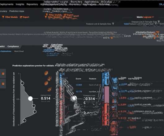
SR 11-7 further goes to detail the components of an effective validation, which includes: Evaluation of conceptual soundness Ongoing monitoring Outcomes analysis. To deploy these models into production with confidence, modelers and validators need to adopt new techniques to ensure the validity of the model.
Binning is a technique applied to categorize data values or to see distributions of data. Selecting the correct number of bins for a chart or map is often portrayed as a tradeoff. December 9, 2022. So as we see here, it’s the same underlying data, but the patterns could be interpreted quite differently.
Binning is a technique applied to categorize data values or to see distributions of data. Selecting the correct number of bins for a chart or map is often portrayed as a tradeoff. December 9, 2022. So as we see here, it’s the same underlying data, but the patterns could be interpreted quite differently.
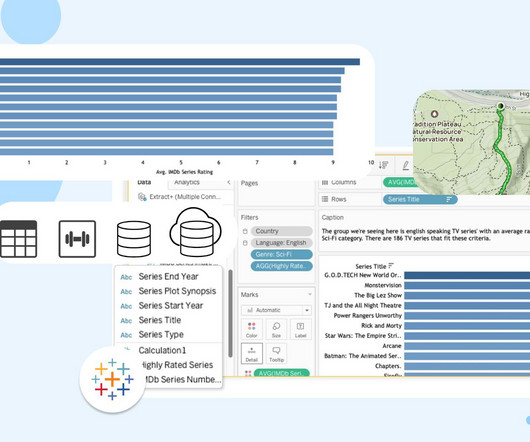
If I was trying to figure out what was causing a problem, I’d use the 5 whys technique developed by Toyota Motors founder Sakichi Toyoda. Chart showcasing a list of English speaking movies with an average IMDB rating higher than 8 in the Sci-Fi genre which is the population for this analysis.
The session kicked off with a Spectragram exercise involving the full group. I learned this technique from Allen Gunn from Aspiration over ten years ago at 2007 Penguin Day. My colleague, Dirk Slater , has written about how he applies the Spectragram technique in his technology/activist trainings. Opening Exercise.
The visual shows the results of a pattern analysis of the 100 most popular Facebook applications (video of lecture here ). What's noted: "Adapted patterns are also cross-cutting techniques for increasing engagement and revenue." According to this analysis, Causes probably falls in the Adapted Patterns/Competition.
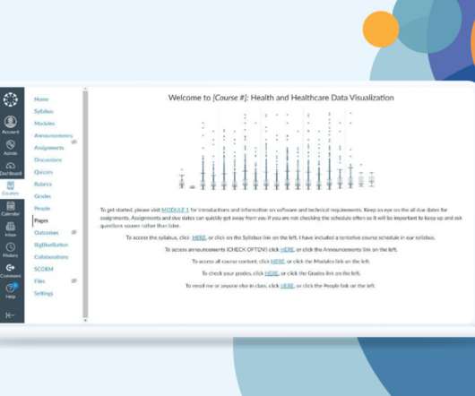
Fundamental statistics and analysis. Search for ideas and techniques that follow best practices, then visualize the data. . Using the textbook Visualizing Health and Healthcare Data, the course will help students understand best practices for creating charts. Data visualization, design, and user interface core best practices.
Get a quick look at tools and techniques of this dynamic data visualization platform, and uncover tips, tricks, and strategies that will propel how you work with data to create impactful visualizations and make informed decisions. You can leverage our best practices to address 100+ use cases today. Included with Data Management.
These strategic plans chart out campaign dates and strategies, donor-tracking and retention plans , special event details, and a targeted communication schedule. If you dont have access to this data or are a new organization, use your estimated budget or research the financial trends of similar organizations to guide your analysis.
Fundamental statistics and analysis. Search for ideas and techniques that follow best practices, then visualize the data. . Using the textbook Visualizing Health and Healthcare Data, the course will help students understand best practices for creating charts. Data visualization, design, and user interface core best practices.
How to do it Create a separate account for each fund in your segmented chart of accounts and assign each transaction to the appropriate fund. Scenario budgeting is a technique that allows you to create different versions of your budget based on different assumptions and contingencies.
Spitfire’s useful SMART chart planning tool has been used by many nonprofits and was adapted for social media for nonprofits by NTEN’s WeAreMedia project several years ago. Benchmarking comparing your organization’s past performance to itself or doing a formal or informal analysis of peer organizations can help. How many by when?
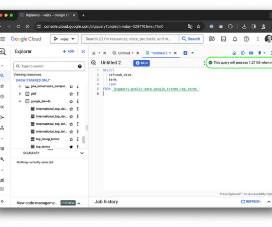
Make the most out of your BigQuery usage, burn data rather than money to create real value with some practical techniques. · ? When using cluster columns in your query filter, this technique will speed up the execution since BigQuery can determine which blocks to scan. Introduction · ? BigQuery Studio If it says 1.27
You may learn that customers who were grouped together using a traditional approach to market segmenting look very different after a machine learning assisted analysis. As you upload your data, DataRobot will do some initial exploratory data analysis to get a deeper understanding of the dataset prior to model training.
Definition: An analysis that looks at the benefits, costs, and value of a technology project over time. It is a flow chart that calculates business performance taking into account not only whether the company had a profit, but whether that profit was good enough relative to the assets it took to generate it. Return on Investment.
But it missed the ability to expand and explore data through charts, tables, and reports that organizations needed to glean important insights and take action. But they also needed the ability to look deeper into the data and conduct more elaborate analysis in order to become a more data-driven organization.”.
Typically, I have two groups of participants and as the chart above indicates, this group is no different - except that I probably have a greater number of people in Group 2. (1) I did a content analysis of the burning questions and a lot have to do with strategic use and understanding the benefits.
Bringing these powerful predictive models into Tableau Prep will help people closer to the business to use advanced analytics techniques to uncover practical insights, inform proactive decisions, and solve problems faster. Finally, output the results for analysis in Tableau.
We organize all of the trending information in your field so you don't have to. Join 12,000+ users and stay up to date on the latest articles your peers are reading.
You know about us, now we want to get to know you!
Let's personalize your content
Let's get even more personalized
We recognize your account from another site in our network, please click 'Send Email' below to continue with verifying your account and setting a password.


Let's personalize your content