This site uses cookies to improve your experience. To help us insure we adhere to various privacy regulations, please select your country/region of residence. If you do not select a country, we will assume you are from the United States. Select your Cookie Settings or view our Privacy Policy and Terms of Use.
Cookie Settings
Cookies and similar technologies are used on this website for proper function of the website, for tracking performance analytics and for marketing purposes. We and some of our third-party providers may use cookie data for various purposes. Please review the cookie settings below and choose your preference.
Used for the proper function of the website
Used for monitoring website traffic and interactions
Cookie Settings
Cookies and similar technologies are used on this website for proper function of the website, for tracking performance analytics and for marketing purposes. We and some of our third-party providers may use cookie data for various purposes. Please review the cookie settings below and choose your preference.
Strictly Necessary: Used for the proper function of the website
Performance/Analytics: Used for monitoring website traffic and interactions
Cohort analysis is a way of evaluating your business that involves grouping customers into “cohorts” and observing how they behave over time. Cohort analysis gives you a multivariable, forward-looking view of your business compared to more simple and static values like averages or totals.
Designing Charts and Color to Communicate Quickly How do you simplify a text- and data-heavy scorecard while still accurately and quickly conveying the complex information policy-makers seek? AARPs data set presented an interesting information design challenge: the numbers and percentages for the various metrics didnt use a consistent scale.
You might answer this question with metrics like the number of new donors or the number of donations. While these basic figures can be informative from a year-over-year trend perspective, they do a poor job answering questions like: Why did these metrics change? I consider those basic metrics to be “rearview mirror” metrics.
This panel will discuss realistic metrics and benchmarks any organization can use in their campaigns and ensure that your using the right strategies and tools to listen and engage your audiences on different social networks. Over those 80 years, the chart has been polished, refined and so deeply embedded in business thinking.
Social media metrics mavens know that both qualitative and quantitative data is needed. Quantitative is counting or the numbers — all those pretty charts and graphics. KD Paine offers a great framework for matching tools with data collection and analysis tasks. Content Analysis Tools: Radian 6 and Netvibes.
Spitfire’s useful SMART chart planning tool has been used by many nonprofits and was adapted for social media for nonprofits by NTEN’s WeAreMedia project several years ago. It is also important to think about what specific metrics are needed to measure along the way.
When configured correctly, Tableau dashboards can support your fundraising team members through greater self-service access to reports and data analysis, distributing the understanding of your key metrics across the organization far more efficiently. .
In this short article, I’ll discuss when to start measuring diminishing returns and how to use a simple regression analysis to find optimal spending levels. A spreadsheet with those metrics laid out on a weekly basis will help you identify large upticks in costs, which can then guide your future budget allocations.
Use charts and diagrams to help them visualize your organization’s impact. Improving your donor retention metrics even a few percentage points can make a world of difference in your long term fundraising success … and stability. Are you using program outcomes data to tell better stories? 5 – Donor retention.
These are the practice indicators for measurement – for three different areas – analysis, tools, and sense-making. I think if I were to sum up social media metrics for nonprofits, I would say that best examples of social media practice and measurement are when social media is used for engagement with a purpose.
The process of linking results to key performance indicators and associated metrics it is like hooking up a big TV. Step 5: Define your metrics. The process of linking results to key performance indicators and associated metrics it is like hooking up a big TV. I use the chart below, which comes from Chapter 5 of our book.
In an analysis accompanying the new report, they point out data showing that some companies see their enterprise value increase much faster than the competition. Just look at this chart: Nowhere is this more apparent, the authors claim, than when you look at public B2B SaaS companies. ” OpenView Partners. Measuring up.
Our data might be the most metrically driven data you’ve seen. That’s right, we are metrics freaks. Visual Humor: Don’t just use numbers, bar charts, and graphs. Metrics the Musical: Perhaps this was just a fun answer, but reporting in song! We measure EVERYTHING, all the time. Data is plentiful.
After we published that piece, however, some folks reached out suggesting that we were not looking at the right metrics to back our claim that the NFT slump was real. Let’s add the latter two to our analysis to see if we were ignoring illuminating data, and therefore being accidentally glib yesterday. NFT metrics, part two.
While they aren’t the most comprehensive of reports, there is no point in ignoring free metrics! Then, for each group, create a chart with 4 columns and identify: Their goal: why do they engage with you. Tags: presentation webtools analysis community mapping listening notes tools webinar women womenwhotech.
Here we share four key insights from our recent analysis of Candid’s nonprofit demographic data and what they mean for the nonprofit sector today. The chart below compares the proportion of nonprofits by subject area overall (in blue) with that of the subset of nonprofits sharing demographic data (in orange). Source: Candid, 2023.
To highlight specific metrics on our charts and graphs, we’ll need to learn how to make groups. Just select all of the values you want to be included in a group then right-click on the metric and select “Group.” Feel free to rename any labels or values on the charts to make the data easier to understand. chart title.
To highlight specific metrics on our charts and graphs, we’ll need to learn how to make groups. Just select all of the values you want to be included in a group then right-click on the metric and select “Group.” Feel free to rename any labels or values on the charts to make the data easier to understand. chart title.
As measurement guru KD Paine says, you need the right measurement tool for the job – identify SMART objectives , pick metrics , and then your tool. Creating is more appealing then analysis to most. Here’s where I think the AMEC Valid Metrics Grids will be very useful. Less is more. .
Image Credits: Smalls Solid metrics [Slide 9] A lot of the numbers are redacted, but there’s still a lot to learn here. Tracking CAC, profit per box, LTV, AOV and ARR are the key metrics you’d expect from any subscription business, and in this case, the business is experiencing extreme growth. for success.
Since Tableau's first release in 2004, all visualizations created inside Worksheets have been rendered using VizQL , a breakthrough technology that allows you to create a chart with a simple drag-and-drop. Shipping sankey chart by Tristan Guillevin. Say hello to complex charts, as easy as drag and drop. What are Viz Extensions?
Not only can users narrow down their search to the district level, they can then choose from various impact metrics to better understand specific factors, behaviors, outcomes, etc. It includes those who understand data well (researchers), and others who are likely less familiar with complex data analysis tools.
Focus on Event Fundraising Analytics , we looked at how peer-to-peer event metrics let us know if our event planning and execution efforts are paying off in fundraising results. Metrics and benchmarks can be our guides to whether your efforts at creating a great experience for participants are paying off. Profit/loss.
Visit mrbenchmarks.com now to explore all the charts, analysis, insights, and more! Cram your cranium with metrics on email and mobile messaging, advertising, web traffic, social media and influencers, and more. You can also join us for a live webinar today, April 24, from 1:00-2:30 ET. Sign up now!
Here are some of the questions you might ask in order to understand what metrics to track: . What kind of Gift Chart represents your current distribution of donors, and how many donors do you need at each level to meet your goals? . You identify key metrics by which you’ll determine if your programs are successful.
If don’t synthesize the ongoing stream, it gives me vertigo. I set aside an hour or two a month to review my valid metrics , but also to do a meta synthesis of the conversation to curate the best points and resources. Pick valid metrics in the context of an integrated campaign. How many by when? Guides, not report cards.
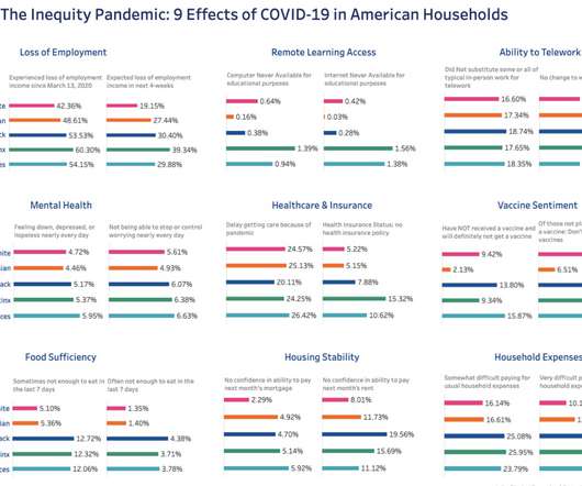
This dashboard shows how a state health department might approach disaggregating COVID-19 metrics by race and ethnicity. Using the state of Virginia as an example, this dashboard shows the different view of the pandemic that emerges when key metrics—cases, hospitalizations, and deaths—are presented by population.
Data analysis and data communication are fundamental to the way people and businesses understand concepts, make decisions, and create solutions. This resource offers data communicators actionable insights to help ensure their research, analysis, and visualizations incorporate principles of diversity, equity, and inclusion.
Data analysis and data communication are fundamental to the way people and businesses understand concepts, make decisions, and create solutions. . This resource offers data communicators actionable insights to help ensure their research, analysis, and visualizations incorporate principles of diversity, equity, and inclusion.
The judges evaluated the vizzes based on three criteria: design, analysis, and storytelling. He included a violin chart showing distributions of numeric data for one or more groups using density curves. Let’s take a deep dive into the powerful data stories our finalists told. Two Countries.
The judges evaluated the vizzes based on three criteria: design, analysis, and storytelling. He included a violin chart showing distributions of numeric data for one or more groups using density curves. Let’s take a deep dive into the powerful data stories our finalists told. Two Countries.
Establish metrics that measure reactions, engagements, and your own internal successes and challenges in executing the plan—remember that staffing, budget, and organizational change management are components of your plan as well. Growing your digital engagement capacity will likely require investments of budget or time over time.
i While the survey focuses on salary rather than total compensation (which is a more holistic way to look at the full take-home differences), it provides a helpful metric to use as a baseline. Analysis set of grantmakers’ full-time CEO salaries Min 25th percentile Median Mean 75th percentile Max No.
That said, if you sell a lot of copies, your book will start to chart on Amazon’s Bestseller list which puts it front of more eyeballs. It’s a tiered chart for much you get (from 4 percent to 8.5 The metrics are simple, to me: look at the number of people who bought it and how much I made from it. within a few hours of launch.
As you can see the words paint a picture of a traditional ROI analysis, with the emphasis on quantitative, measurable results. Click to See Larger Image I have been noodling around with this chart to show that insight comes before dollars, but if you measure and improve your initial pilot efforts over time, eventually the dollars do come.
In this post, you’ll learn from my mistakes and create better charts for your audience – to show fundraising results, organization’s impact or benchmarking. Have you seen a chart and asked yourself, “What is this? Are we guilty of creating such charts ourselves? Here’s a chart from my thesis I created about 15 years ago.
Second, the FTC must establish that Facebook controls over 60% of the market — the correct metric to establish this is revenue. The right metric for this market share analysis is unequivocally revenue — daily active users (DAU) x average revenue per user (ARPU). The metric: Revenue shows Facebook’s monopoly.
What seemed to resonate most with the crowd was the concept of “ One Metric That Matters.” KD says don’t use pie charts, plot your data over time. ” She also advised us to use manual tracking for sentiment analysis because computers do not do nuance very well.
How do you approach data analysis when you are not a subject matter expert? . This analysis revealed how different drivers approach turns along the track through a metric called ‘roll angle’. . Through the process, we learned a lot about each sport, and how data can drive new insights and inform strategic decision-making.
Tools that incorporate a dashboard can help organizations visualize and more easily analyze their data by taking that information and turning it into charts and graphs. Even text can be measured with text analysis tools that can provide statistics on keywords and gauge sentiment.
There are two solutions for integrating your data — either build an in-house centralized data platform or research an analytics vendor to outsource data collection and analysis. Additionally, this digital shift to increased data interoperability means less chart chasing and improved quality care.
SR 11-7 further goes to detail the components of an effective validation, which includes: Evaluation of conceptual soundness Ongoing monitoring Outcomes analysis. In addition to examining feature importances, another step a validator may take to review the conceptual soundness of a model is to perform a sensitivity analysis.
Later, I found the chart in Net Gains. Also, the idea of faster tools like social network analysis that give us real time information and the need for someone who is embedded in the network as a real time evaluator. And, of course, what metrics to use. She also discusses it in the video above.
Read the 2021 report for Gartner analysis. You can dive deeper, pivot analysis, and change chart types without starting over or breaking your flow. Accelerate adoption with intuitive analytics that people love to use. Tableau offers a complete, integrated platform that people love to use.
We organize all of the trending information in your field so you don't have to. Join 12,000+ users and stay up to date on the latest articles your peers are reading.
You know about us, now we want to get to know you!
Let's personalize your content
Let's get even more personalized
We recognize your account from another site in our network, please click 'Send Email' below to continue with verifying your account and setting a password.


Let's personalize your content