This site uses cookies to improve your experience. To help us insure we adhere to various privacy regulations, please select your country/region of residence. If you do not select a country, we will assume you are from the United States. Select your Cookie Settings or view our Privacy Policy and Terms of Use.
Cookie Settings
Cookies and similar technologies are used on this website for proper function of the website, for tracking performance analytics and for marketing purposes. We and some of our third-party providers may use cookie data for various purposes. Please review the cookie settings below and choose your preference.
Used for the proper function of the website
Used for monitoring website traffic and interactions
Cookie Settings
Cookies and similar technologies are used on this website for proper function of the website, for tracking performance analytics and for marketing purposes. We and some of our third-party providers may use cookie data for various purposes. Please review the cookie settings below and choose your preference.
Strictly Necessary: Used for the proper function of the website
Performance/Analytics: Used for monitoring website traffic and interactions
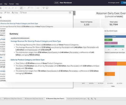
Alyssa Jenson November 14, 2023 - 6:59pm Sue Kraemer Senior Data Skills Curriculum Strategy Manager, Tableau Charts are all around us. When viewing and creating charts, it’s vital that we gain the ability to critically explore and discern the integrity of the information and conclusions shown in charts. Chart Design.
I think sometimes there is a disconnect between measurement and the actual practice. In some organizations, measurement is this thing done at the end to justify or validate social media. These are the practice indicators for measurement – for three different areas – analysis, tools, and sense-making.
As I’ve been working on “ Measuring the Networked Nonprofit ” with co-author KD Paine, we’ve come to the chapter on measurement tools. I sent out a query nonprofit tech colleagues who are social media mavens and ask that age old question, “ What’s in your social media measurement tool box ?”
Last week I wrote about nonprofit “ measurement malaise &# that keeps some nonprofits putting a measurement strategy for their integrated communications campaigns into practice. In the comments, I asked how can we make measurement fun ? We measure EVERYTHING, all the time. Flickr Photo by Martin Deutsch.
Malaise is a feeling of general discomfort or uneasiness, of being “out of sorts.&# Lately, I’ve been hearing about “measurement malaise&# infecting nonprofits and not just social media measurement. Idealware Study. Respondents that names tools were labled as “substantial.’
This post summarizes the sessions I facilitated or participated in related to “ Measuring the Networked Nonprofit ,” which included a book signing, panel discussion in the Beacon Lounge , and a workshop with co-author KD Paine. KD says don’t use pie charts, plot your data over time.
I Love Social Media Measurement. I tested out the five phases of falling in love with measurement. Given the topic was measurement, I couldn’t help but go a little meta and play with incorporating learning analytics into the instruction. This blog post shares some insights about those two somewhat disconnected ideas.
Scientist / Data Analysis Engineer / General Techie Want to help save the world with your code? We're Benetech's Human Rights Data Analysis Group, and we're hiring right now ! This technology and analysis is used by truth commissions, international criminal tribunals, and non-governmental human rights organizations around the world.
Data analysis is a process, not a one-time thing. Data nerds know how to clean and recode data, look for patterns, calculate key statistics, and then show off the most important information in graphs and charts. You can follow this syllabus to boost your skills at all stages of the data analysis process. Why get good at Excel?
AARP helps policymakers by providing a digital scorecard that measures how states nationwide perform across different categories, such as nursing home costs or long-term care insurance. We knew the value of the website wasnt providing the number, but providing the interpretation, in the analysis, of that number. Is that number good?
After helping my kids with math homework (they had to represent some data in a chart), I found this awesome, free chart maker at the National Center for Education Statistics. But the bonus was the tutorial to help you better understand and apply charts. That’s the most important thing to me, anyway.
It includes a tool that helps measure your networking skills and also lots of methods to help you identify, expand, and use your network to improve your knowledge and work. This book is how to create a data-informed culture in your organization that values outcome based measurement. Impact and Excellence by Sheri Chaney Jones.
It makes really easy to do a quick content analysis, figure out what content resonated, and build community. Crowdbooster is another Twitter analytics tool that gives you a lot of interesting charts and graphs and data. I used for anytime I teach a workshop or give a presentation. It is a Twitter analytics tool.
Yesterday, KD Paine and I delivered an NTEN Webinar on measurement based on the ideas in our new book ” Measuring the Networked Nonprofit: Using Data to Change the World.” ” I often hear nonprofits say, “We don’t have those skills within our organization so we don’t do measurement.”
Last week, I facilitated a mini-innovation lab on measuring impact for grantees of the Google Nonprofit program at the Impact Hub. We started off with an affinity clustering of the strengths, challenges, and opportunities for improving their organization’s practice of measuring impact and communicating about it.
Spitfire’s useful SMART chart planning tool has been used by many nonprofits and was adapted for social media for nonprofits by NTEN’s WeAreMedia project several years ago. Benchmarking comparing your organization’s past performance to itself or doing a formal or informal analysis of peer organizations can help.
ROI had it origins as an accounting term and was originally a measure of return on the total investment in the entire business. It is a flow chart that calculates business performance taking into account not only whether the company had a profit, but whether that profit was good enough relative to the assets it took to generate it.
Having tools in place to help you monitor, measure, and evaluate your work in real time will help you be more successful with your campaign, better engage with the community, and make more lasting change in the long run. Then, for each group, create a chart with 4 columns and identify: Their goal: why do they engage with you.
The maze of charts, graphs, and numbers can obfuscate rather than clarify. Given the robust analysis, you also get relevant insights that may have been overlooked. Boost Your Data Game : Automate data professionals' time manually writing commentary that explains their data analysis.
It has been almost exactly four years since I published Measuring the Networked Nonprofit: Using Data to Change the World , with co-author, Katie Paine. Back then, not many nonprofits were talking or practicing the use of measurement and data to improve nonprofit results. Refinable – adapt to rapidly changing environments.
Ateken Abla November 14, 2023 - 6:59pm Sue Kraemer Senior Data Skills Curriculum Strategy Manager, Tableau Charts are all around us. When viewing and creating charts, it’s vital that we gain the ability to critically explore and discern the integrity of the information and conclusions shown in charts. Don’t be SCAM’d!
“Our product roadmap is high confidential, but let’s say our high-level vision looking a decade or so forth is to take people out of the loop and have a completely automated data collection, processing and analysis,” co-founder and CEO Maximillion Boosfeld told TechCrunch.
Numeric, quantitative values that you can measure. Measures can be aggregated. When you download your Spotify data, the time measure they use is milliseconds, written as ms. The “Hours played” column and measure will replace any measures related to milliseconds or “msPlayed” in the instructions. Colored green.
I introduced several methods for using measurement for transformative results, including the Maturity of Practice Model (CWRF) and how to use it as an assessment tool, principles of being data-informed , and how to apply KD Paine’s 7 Simple Steps of Measurement. What are your measurable objectives?
That's why we've partnered with TechSoup to offer basic data visualization tips in Beyond the Pie Chart. Part 1 covered some basic terminology and why you shouldn't use a pie chart. Use Line Charts and Area Charts to Track Trends over Time. First, let's look at the line chart below. Explore Tableau.
In this short article, I’ll discuss when to start measuring diminishing returns and how to use a simple regression analysis to find optimal spending levels. Regression analysis If you’re looking to get analytical and have a minimum of 90 days of data at varying levels of spending, a regression analysis is your answer.
Here we share four key insights from our recent analysis of Candid’s nonprofit demographic data and what they mean for the nonprofit sector today. The chart below compares the proportion of nonprofits by subject area overall (in blue) with that of the subset of nonprofits sharing demographic data (in orange). Source: Candid, 2023.
Numeric, quantitative values that you can measure. Measures can be aggregated. When you download your Spotify data, the time measure they use is milliseconds, written as ms. The “Hours played” column and measure will replace any measures related to milliseconds or “msPlayed” in the instructions. Colored green.
When configured correctly, Tableau dashboards can support your fundraising team members through greater self-service access to reports and data analysis, distributing the understanding of your key metrics across the organization far more efficiently. . On-Demand Webinar: Measure Your Impact with Salesforce Tableau .
Since Tableau's first release in 2004, all visualizations created inside Worksheets have been rendered using VizQL , a breakthrough technology that allows you to create a chart with a simple drag-and-drop. Shipping sankey chart by Tristan Guillevin. Say hello to complex charts, as easy as drag and drop. What are Viz Extensions?
There are a few ways to measure the health of any market. Let’s add the latter two to our analysis to see if we were ignoring illuminating data, and therefore being accidentally glib yesterday. That said, there’s a spike in the April/May time frame that sticks out compared to our chart from yesterday. What drove it?
Chart: NOAA ] When severe weather is on the way, the agency issues the official alerts youll see in the news and on your phone. All of this analysis happens before the information reaches private weather apps and TV stations. measuring weather conditions 24/7. Others orbit the planet.
I'm doing a workshop on Social Media Metrics, Measurement, and ROI at PodCamp Boston tomorrow. But, here are a few comments: Kudos to you for setting clear goals and starting off with measurement from the beginning. Maybe another way to think about it is measurement as data collection, but focused data collection.
If you have no idea what a good or poor donor retention rate is, it’s difficult to measure your own performance. What kind of Gift Chart represents your current distribution of donors, and how many donors do you need at each level to meet your goals? . You know what they say about measurement, right? Start with benchmark data.
In an analysis accompanying the new report, they point out data showing that some companies see their enterprise value increase much faster than the competition. Measuring up. Just look at this chart: Nowhere is this more apparent, the authors claim, than when you look at public B2B SaaS companies. ” OpenView Partners.
Much like a developing human, our data collections have gotten bigger over time (see chart below), undergone developmental changes, and experienced the associated growing pains. as measured by total giving. Analysis tip : We still create these annual data sets. And this year, it enters full-fledged adulthood!
How does it measure its impact? When technology does more of the heavy lifting – more data analysis, more personalized communication with constituents, more automation – employees have more time to tackle the bigger challenges that require human brainpower. Is the work happening efficiently? It’s far from a distraction. Greg Perlstein.
A year ago, he said that measuring outcomes for social media is, "an evolving art (not quite a science yet) and you have to be up to the challenge of both thinking a bit differently and be ok with leveraging several different tools. Measuring the success of social media efforts can't be done with a single metric. Technorati ???Authority???
Understanding Revenue Projections When a nonprofit is putting together a budget for the coming year, an important step is to perform a revenue projections analysis that can inform the expected amount of income used for operational expenses and deepen mission impact. The article below has everything you need to know—and then some.
Measuring outcomes for social media tools and strategy is as Avinash Kaushik notes in his recent post on the topic , "an evolving art (not quite a science yet) and you have to be up to the challenge of both thinking a bit differently and be ok with leveraging several different tools. measuring your impact on the world!).
We all know we need a strategic plan, yet so many people don’t have one, probably because they’re afraid of this: Your Board and staff sequestered in a room, led by a consultant, doing exercises on flip charts with sticky notes and dots, exercises that never lead to a clear, finished product you can understand or use. Yuck, right?
Spitfire’s useful SMART chart planning tool has been used by many nonprofits and was adapted for social media for nonprofits by NTEN’s WeAreMedia project several years ago. SMART Objectives are specific, measurable, attainable, relevant, and timely objectives. 3: Have a measurement strategy on the front-end, not the back-end.
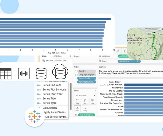
Chart showcasing a list of English speaking movies with an average IMDB rating higher than 8 in the Sci-Fi genre which is the population for this analysis. This is just a way of saying a measurement, property, or characteristic of something that can vary or change. Imagine you are trying to buy a new watch band.
We organize all of the trending information in your field so you don't have to. Join 12,000+ users and stay up to date on the latest articles your peers are reading.
You know about us, now we want to get to know you!
Let's personalize your content
Let's get even more personalized
We recognize your account from another site in our network, please click 'Send Email' below to continue with verifying your account and setting a password.


Let's personalize your content