This site uses cookies to improve your experience. To help us insure we adhere to various privacy regulations, please select your country/region of residence. If you do not select a country, we will assume you are from the United States. Select your Cookie Settings or view our Privacy Policy and Terms of Use.
Cookie Settings
Cookies and similar technologies are used on this website for proper function of the website, for tracking performance analytics and for marketing purposes. We and some of our third-party providers may use cookie data for various purposes. Please review the cookie settings below and choose your preference.
Used for the proper function of the website
Used for monitoring website traffic and interactions
Cookie Settings
Cookies and similar technologies are used on this website for proper function of the website, for tracking performance analytics and for marketing purposes. We and some of our third-party providers may use cookie data for various purposes. Please review the cookie settings below and choose your preference.
Strictly Necessary: Used for the proper function of the website
Performance/Analytics: Used for monitoring website traffic and interactions
While there are many data analysis tools available, including the sophisticated data science variety, and more line of business-focused BI tools, it hasn’t been easy for a person with little experience to work with data without going to one of these experts for help. Today, the company announced a $2.4
Scientist / Data Analysis Engineer / General Techie Want to help save the world with your code? We're Benetech's Human Rights Data Analysis Group, and we're hiring right now ! This technology and analysis is used by truth commissions, international criminal tribunals, and non-governmental human rights organizations around the world.
We are here to help them with product discovery and strategy, market analysis, UX/UI design, smoke testing, usability testing, and everything else that is needed to get it right. The intake process can vary a lot depending on the particularities of each project and collaboration.
Mine includes markers , sticky notes , index cards, and flip chart paper. The brainstorming methods remind me of the “creativity” techniques such as Michael Michalko’s “ Cracking Creativity ” but instead of drawing them on paper alone, using sticky notes to make it a collaborate or group process.
With these tools, developers can easily create complex AI applications like chatbots, image generators and data analysis systems. Microsoft and NVIDIA collaborated to bring CUDA and RTX acceleration to WSL, making it possible to run optimized, containerized microservices on Windows. Support for ComfyUI is coming soon.
Our analysis of Scott’s 2020 grants is available here.) . This time around, more than 30 recipients were fiscally sponsored entities, collaboratives, or specific funds within organizations. An analysis of organizations and projects funded against Candid’s Philanthropy Classification System validates her statement. .
That way you could develop ideas together, you could collaborate together,” he says. We can make a physician in a small town in Montana basically equivalent to an Alzheimer’s expert by letting the AI do the analysis and then feeding it back to the physician in a digestible manner so he can respond to the needs of the patient.
Yesterday was the 3rd annual Women Who Tech Telesummit , bringing together over 600 women (and men) from for-profit and nonprofit organizations and technology start, connecting developers and techies with those new to the field, igniting conversations and long-term collaborations. Your goal: why do you engage with them.
Read the complete issue on "Collaboration" when you subscribe to the journal for free! Data sharing has become a critical part of collaboration and will continue to do so as we are able to access and create more data. You can filter the raw data, RSS feeds of the data, charts, maps, or even widgets made of the data.
is a collaborative management app that helps businesses work more organized when it comes to documents, workflow and finances. SocialBro ( SocialBro.com – see earlier coverage on The Next Web ). SocialBro is a desktop and browser app that helps people and businesses manage and analyze their Twitter community. Sush.io ( Sush.io ).
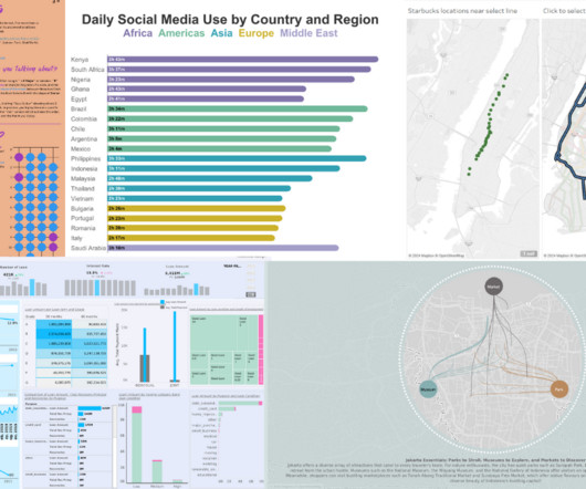
Since Tableau's first release in 2004, all visualizations created inside Worksheets have been rendered using VizQL , a breakthrough technology that allows you to create a chart with a simple drag-and-drop. Shipping sankey chart by Tristan Guillevin. Say hello to complex charts, as easy as drag and drop. What are Viz Extensions?
One that I was not familiar with it is called CLEAR goals are defined as: Collaborative – achieved in partnership with others. The Playbook offers a clear definition and steps for using basic statistical analysis, even if you are not an expert. All measurement processes start with defining objectives or outcomes. Meaning Making.
There are two solutions for integrating your data — either build an in-house centralized data platform or research an analytics vendor to outsource data collection and analysis. Additionally, they can experience improved care collaboration and enhance overall patient care. Improved staff collaboration.
We received copies of his Luma’s book and cards, “Innovation for People,” which is a synthesis of landscape analysis of design-thinking and human centered design methods. A frequent question Peter is asked about how an organization can become more innovative. “What are the skills that we need to practice for 10,000 hours?
Datamaking can enhance capacity building efforts through group questioning and analysis. It can support funder and cross-sector collaborations and the processes of decision-making. For datamaking, visuals like charts, diagrams, or maps are important for more than data collection. These are opportunities for meaning making.
2008 donorCentrics Internet Giving Collaborative Benchmarking Analysis); * The average online gift was $144.72, according to BlackBaud though M&R’s benchmark study noted that the average one time online gift was $81. How Does Your Nonprofit Measure Up? Tell people what you want them to do quickly.
While some startups are trying to get people to leave spreadsheets behind, Canvas , which is developing a collaborative data exploration tool, is going all in with a spreadsheet-like interface for non-technical teams to access the information they need without bothering data teams.
a collaborative effort, not just a single department or team’s responsibility. Collaborative efforts: Various organizations contributing their own resources, content, and data to create a common service that none of them would have been able to develop on their own is possible through digital platforms. a toolkit, not a bookshelf .
As of now, Glean supports all of the standard visualizations (think pivot tables, line charts, bar charts, etc.). ” Looking ahead, the team wants to build more collaboration features to bring an almost Google Docs-like experience to these dashboards — and that is, in part, what the team is going to use the new funding for.
But it missed the ability to expand and explore data through charts, tables, and reports that organizations needed to glean important insights and take action. But they also needed the ability to look deeper into the data and conduct more elaborate analysis in order to become a more data-driven organization.”.
Developers rely on 230 to collaborate on platforms like GitHub and to build and operate new platforms rethinking social media. As the chief legal officer at GitHub, a global community of over 100 million software developers collaborating on code, I know firsthand the importance of keeping 230 intact.
Read the 2021 report for Gartner analysis. You can dive deeper, pivot analysis, and change chart types without starting over or breaking your flow. Accelerate adoption with intuitive analytics that people love to use. Tableau offers a complete, integrated platform that people love to use.
And the goal of those relationships can be learning, collaboration, policy, service delivery, advocacy, mobilizing or action. Later, I found the chart in Net Gains. We also discussed the whole issue of network evaluation and the difficulty of measuring those relationships versus a specific impact. And, of course, what metrics to use.
The quality and accuracy of the datasets you’re working with increase when you present them in attractive graphs, charts, shapes, and plots. Easy Collaboration & Sharing. Trend Lines & Predictive Analysis. Businesses deal with a lot of data, and analyzing it in its raw form is frequently difficult. Conclusion.
Here at TechSoup, we are collaborating with the Foundation Center on upcoming webinars designed to provide you with new ideas and tools to aid your organization. At the Foundation Center, he builds mapping applications, data visualizations, semantic analysis scripts, and application programming interfaces (APIs).
With Tableau Genie , you can automate analysis on all of your data, and have an entire organization collaborating and acting on real-time insights. Collaborate and act on real-time insights. We’ve taken collaboration to the next level with the Digital HQ for Analytics, our Tableau and CRM Analytics integrations with Slack.
With Tableau Genie , you can automate analysis on all of your data, and have an entire organization collaborating and acting on real-time insights. Collaborate and act on real-time insights. We’ve taken collaboration to the next level with the Digital HQ for Analytics, our Tableau and CRM Analytics integrations with Slack.
New “Tableau-Safe” Fonts Steve Adams: Being Economist with the Truth Will Sutton An Introduction to Tableau Pulse An AI Toolkit for Tableau - The Information Lab Frederic Fery: Sales Analysis with Tableau 2024.3 DataFam content Jim Dehner: Spatial Parameters Dive into content created by the Tableau Community: Kevin Flerlage: Tableau 2024.3:
Nonprofits today are increasingly asked to collaborate. Despite these pressures, rarely does anyone define what is meant by “collaboration.” This dual role for our center operators gave us a window into the inner workings of creating authentic engagement or collaboration among nonprofits who are members or tenants of these centers.
At the time of that Economist article, I was on leave from UC Berkeley to run a lab for Intel Research in collaboration with the campus. There are some situations where you can Google for a quantitative question and get back a little table or chart, but that’s only if you ask just the right questions.
Another great trick to use is the "quick win" Find a tech project that meets a specific organizational need and can be quickly implemented with quick payback -- for example, a wiki to support a cross-departmental collaboration. The Organizational Chart ~ Look for Obstacles. Never underestimate the power of relationships.
How to do it Create a separate account for each fund in your segmented chart of accounts and assign each transaction to the appropriate fund. Learn how to build customized reports that give you complete control over the analysis you can get from your system.
How to Avoid: Organizations should consider adopting the Unified Chart of Accounts for Nonprofits (UCOA). Skipping this analysis can lead to missed opportunities for adjustment and improvement, potentially causing long-term financial issues.
“Our customers have experience with BBT (body basal temperature charting) or LH tests (ovulation tests) and they are overall interested in holistic fertility and wellness, not in medication. ” “We are supportive of science and are open for research collaborations,” she adds.
Last month, the Tate joined the party when they opened up their collection database to the world on GitHub, a website where programmers collaborate on projects. Jim Davenport, an astronomer living in Seattle, charted the height and width of all of the works in the Tate''s collection. These visualizations are fun. They are beautiful.
Here’s an example of the chart that I created: Tasks Start Date Completion Date Who is Responsible? Other project management tools that I recommend and like to use are Asana or Trello or any other collaborative digital tool that might be useful and preferred by your team.
CollaborationCollaboration skills are a combination of effective communication, emotional intelligence, and organization skills. Data visualization is the ability to convert massive volumes of data into easy-to-understand charts, graphs, and other visual aids to improve decision-making among business users.
CollaborationCollaboration skills are a combination of effective communication, emotional intelligence, and organization skills. Data visualization is the ability to convert massive volumes of data into easy-to-understand charts, graphs, and other visual aids to improve decision-making among business users.
CollaborationCollaboration skills are a combination of effective communication, emotional intelligence, and organization skills. Data visualization is the ability to convert massive volumes of data into easy-to-understand charts, graphs, and other visual aids to improve decision-making among business users.
"Citizen journalists" throughout the country collaborated to collect information about this violence; they received incident reports from thousands of citizens via web and mobile phone, collated the data, and displayed it on a Google Maps mashup. Collecting and Disseminating Information - Ushahidi.
Opportunity Collaboration. Opportunity Collaboration. Opportunity Collaboration / Cancún Yucatán, (Int.) Participants will network and learn about other areas of practice, discuss a range of opportunities and challenges faced by different sectors, and work collaboratively to improve impact measurement. Oct 9 - 14.
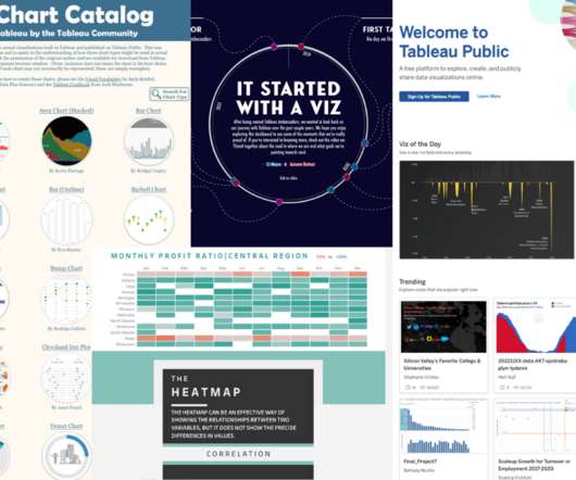
Collage of Tableau Public visualizations ( The Tableau Chart Catalog by Kevin Flerlage, The Tableau Chart Builder by Jeff Plattner, and It Started With A Viz | VOTD by Autumn Battani) and the Tableau Public homepage. Or how exciting it was anytime a journalist included any form of data analysis in a story? Taha Ebrahimi.
Collage of Tableau Public visualizations ( The Tableau Chart Catalog by Kevin Flerlage, The Tableau Chart Builder by Jeff Plattner, and It Started With A Viz | VOTD by Autumn Battani) and the Tableau Public homepage. Or how exciting it was anytime a journalist included any form of data analysis in a story? Taha Ebrahimi.
Rolling out a well-thought-out business plan is like charting a course through treacherous yet conquerable terrains. Step 2: Conducting a Market Analysis for Your Non-Profit Conducting a comprehensive market analysis is crucial for non-profits to understand the landscape they operate in and make informed decisions.
We organize all of the trending information in your field so you don't have to. Join 12,000+ users and stay up to date on the latest articles your peers are reading.
You know about us, now we want to get to know you!
Let's personalize your content
Let's get even more personalized
We recognize your account from another site in our network, please click 'Send Email' below to continue with verifying your account and setting a password.


Let's personalize your content