This site uses cookies to improve your experience. To help us insure we adhere to various privacy regulations, please select your country/region of residence. If you do not select a country, we will assume you are from the United States. Select your Cookie Settings or view our Privacy Policy and Terms of Use.
Cookie Settings
Cookies and similar technologies are used on this website for proper function of the website, for tracking performance analytics and for marketing purposes. We and some of our third-party providers may use cookie data for various purposes. Please review the cookie settings below and choose your preference.
Used for the proper function of the website
Used for monitoring website traffic and interactions
Cookie Settings
Cookies and similar technologies are used on this website for proper function of the website, for tracking performance analytics and for marketing purposes. We and some of our third-party providers may use cookie data for various purposes. Please review the cookie settings below and choose your preference.
Strictly Necessary: Used for the proper function of the website
Performance/Analytics: Used for monitoring website traffic and interactions
We all know we need a strategic plan, yet so many people don’t have one, probably because they’re afraid of this: Your Board and staff sequestered in a room, led by a consultant, doing exercises on flip charts with sticky notes and dots, exercises that never lead to a clear, finished product you can understand or use. Yuck, right?
As always with Iron Viz, I get the most joy from the small but important design flourishes, the little tweaks that advance the data storytelling, and the sometimes-hidden steps that elevate the data analysis. Don’t be afraid of “boring” bar charts. Don’t forget, though, that you have an audience who want to understand your chart.
As always with Iron Viz, I get the most joy from the small but important design flourishes, the little tweaks that advance the data storytelling, and the sometimes-hidden steps that elevate the data analysis. Don’t be afraid of “boring” bar charts. Don’t forget, though, that you have an audience who want to understand your chart.
Anyone and everyone, even beginners, can learn how to analyze their own data in Excel. Data analysis is a process, not a one-time thing. Data nerds know how to clean and recode data, look for patterns, calculate key statistics, and then show off the most important information in graphs and charts. Secret #8.
From this project, I saw a really great post from Darragh Murray about the importance of exploratory data analysis. The importance of exploratory data analysis: Exploring the first B2VB challenge. Part 2 The Build: An Annual Sunburst Chart Template. Tableau Coxcomb Chart Template. Sizing a Trellis Chart in Tableau.
From this project, I saw a really great post from Darragh Murray about the importance of exploratory data analysis. The importance of exploratory data analysis: Exploring the first B2VB challenge. Part 2 The Build: An Annual Sunburst Chart Template. Tableau Coxcomb Chart Template. Sizing a Trellis Chart in Tableau.
To highlight specific metrics on our charts and graphs, we’ll need to learn how to make groups. Apply any filters you would like by going to the Analysis menu, hovering over filters, and then filtering either axis (Ms preferred). Feel free to rename any labels or values on the charts to make the data easier to understand.
It’s easy to use and intuitive and a great option for beginners wanting to test out their new site. Loaded with analysis tools, it also contains a video feature that lets you see exactly what problems exist that are making your site sluggish and quick tips for correcting any issues.
To highlight specific metrics on our charts and graphs, we’ll need to learn how to make groups. Apply any filters you would like by going to the Analysis menu, hovering over filters, and then filtering either axis (Ms preferred). Feel free to rename any labels or values on the charts to make the data easier to understand.
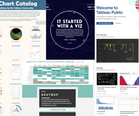
Collage of Tableau Public visualizations ( The Tableau Chart Catalog by Kevin Flerlage, The Tableau Chart Builder by Jeff Plattner, and It Started With A Viz | VOTD by Autumn Battani) and the Tableau Public homepage. Or how exciting it was anytime a journalist included any form of data analysis in a story? Taha Ebrahimi.
Collage of Tableau Public visualizations ( The Tableau Chart Catalog by Kevin Flerlage, The Tableau Chart Builder by Jeff Plattner, and It Started With A Viz | VOTD by Autumn Battani) and the Tableau Public homepage. Or how exciting it was anytime a journalist included any form of data analysis in a story? Taha Ebrahimi.
KM4Dev has a section devoted to Social Network Analysis process and tools. Via NTEN blog Google moves one step closer to making desktop applications obsolete with the release of the Google Chart API. MasterNewMedia has published an awesome Video Beginner's Guide written by Michael Pick. " Whats Your Revolution?
We organize all of the trending information in your field so you don't have to. Join 12,000+ users and stay up to date on the latest articles your peers are reading.
You know about us, now we want to get to know you!
Let's personalize your content
Let's get even more personalized
We recognize your account from another site in our network, please click 'Send Email' below to continue with verifying your account and setting a password.


Let's personalize your content