This site uses cookies to improve your experience. To help us insure we adhere to various privacy regulations, please select your country/region of residence. If you do not select a country, we will assume you are from the United States. Select your Cookie Settings or view our Privacy Policy and Terms of Use.
Cookie Settings
Cookies and similar technologies are used on this website for proper function of the website, for tracking performance analytics and for marketing purposes. We and some of our third-party providers may use cookie data for various purposes. Please review the cookie settings below and choose your preference.
Used for the proper function of the website
Used for monitoring website traffic and interactions
Cookie Settings
Cookies and similar technologies are used on this website for proper function of the website, for tracking performance analytics and for marketing purposes. We and some of our third-party providers may use cookie data for various purposes. Please review the cookie settings below and choose your preference.
Strictly Necessary: Used for the proper function of the website
Performance/Analytics: Used for monitoring website traffic and interactions
However, we worry that crowdsourced data are not a good data source for doing statistics or finding patterns. An analysis team from European Commission's Joint Research Center analyzed the text messages gathered through Ushahidi together with data on damaged buildings collected by the World Bank and the UN from satellite images.
Spencer Czapiewski August 6, 2024 - 6:34pm Kyle Massey VP Lead Software Engineer Kyle Massey, a two-time Tableau DataDev Ambassador and co-leader of the DataPride Tableau User Group, shares his experience with VizQL Data Service. What is VizQL Data Service? Why should you be excited about VizQL Data Service?
and provided the two possible responses of “friends&# or “data&# – I used the question style where respondents had to pick one answer or the other exclusively. As soon as the question is live, you start seeing the impressions and the responses, aggregated in real time. It’s incredible!
Third Sector Labs recently presented a data migration webinar with host Bloomerang. The topic – “10 Decisions You Will Face with Any Donor Data Migration” – focused on preparing for your next CRM or data migration while addressing 10 tough decisions nonprofits encounter along the way. 1-2 = 61%.
My colleagues at Ushahidi have already swung into action and are mapping crisis information from Haiti. For those you who arenot familiar with Ushahidi, they have a platform that allows anyone to gather distributed data via SMS, email or web and visualize it on a map or timeline. Tags: maps. Disclaimer: I'm on the board).
The annual M+R Benchmarks Study is a wide-ranging exploration of digital fundraising, advocacy, and marketing data. Participation primarily involves collecting and coding a big stack of data, which our analytics team will combine (anonymously!) Your data security and anonymity are VERY IMPORTANT to us. Read time: 2 minutes.
Google has banned a company that sold Android users’ location data for COVID-19 mapping and other purposes, Motherboard reports. Motherboard says it’s not clear whether SafeGraph is still collecting any data from Android apps, and The Verge has reached out to Google and SafeGraph to confirm.
Crisis Mapping My colleagues at Ushahidi have been working around the clock and around the globe mapping crisis information from Haiti. For those you who are not familiar with Ushahidi, they have a platform that allows anyone to gather distributed data via SMS, email or web and visualize it on a map or time line.
Gartner identifies these qualities as key to delivering value: A customer journey mapping process that extends beyond acquisition and purchase through the life of the relationship. The ability to accurately develop personas and create their journey maps. The data results in business intelligence that better meets customer needs.
The startup, which calls itself “Google Maps for business growth,” announced today that it has raised $15 million from Elevation Capital, Jungle Ventures and Venture Highway, plus 25 angel investors. He saw that top-performing companies used data in their decision-making. This requires a systems-thinking and a data-driven approach.”.
Marketing automation tools integrate with CRM systems, ensuring that donor data is up to date and synchronized across platforms. Other types of engagement, (clicks, email opens, social follows) can be factored into the scoring system, even if the data comes from a third party source. Which email copy is best?
Data Management A tutorial on how to use VDK to perform batch data processing Photo by Mika Baumeister on Unsplash Versatile Data Ki t (VDK) is an open-source data ingestion and processing framework designed to simplify data management complexities.
Fitbit activity analysis with DuckDB Photo by Jake Hills on Unsplash Wearable fitness trackers have become an integral part of our lives, collecting and tracking data about our daily activities, sleep patterns, location, heart rate, and much more. What insights are buried within my archive of personal fitness activity data?
Optimizing queries, improving runtimes, and geospatial data science applications Photo by Tamas Tuzes-Katai on Unsplash Intro: why is a spatial index useful? In doing geospatial data science work, it is very important to think about optimizing the code you are writing. This is where concepts such as spatial indices come in.
Note from Beth: In a report entitled Information for Impact: Liberating Nonprofit Sector Data, authors Beth Novek and Daniel Goroff address the challenges of obtaining better, more usable data on the nonprofit sector to match the field’s growing importance. Liberating 990 Data by Beth Simone Noveck.
By Kurt Voelker, CTO, Forum One Data is the new black. These days everyone is releasing it, visualizing it, aggregating it, and mashing it up. Data is so much more than a stack of numbers or a server filled with client outputs. The truth can become obvious when you reveal the change in data in a visual way.
The Social Media Strategy Map and Worksheet 1. You may also want to improve your organization's reputation as an expert by being consistently involved in discussions on topics or aggregating information that are relevant to your organization. What hard data points or metrics will you use to track your objectives?
Another new product, the Visium HD Spatial Gene Expression Assay, enables users to layer cell-level gene-expression data on top of histology (tissue) images, with high-resolution, to pinpoint drug targets, for example. Protagonist reported over $259 million in license and collaboration revenue for the first half of 2024.
He has some terrific advice about how to apply visual thinking to your data visualization and to get insights. But first, he simplifies what visual thinking is: Look, See, Imagine, and Show. These are a great set of questions to ask as you look over your data. The steps are: Collect your data. Map the data.
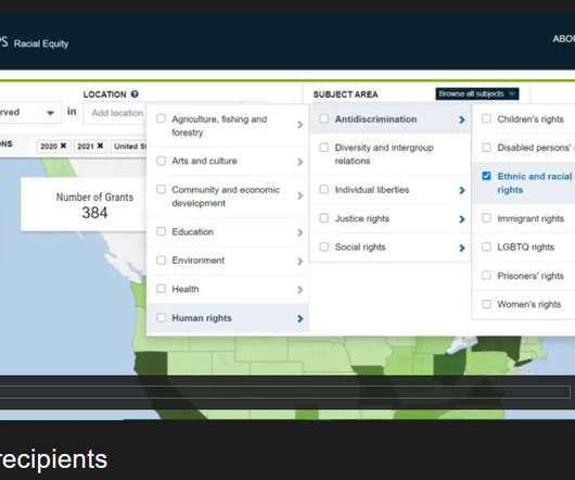
As the largest source of data on philanthropic and nonprofit organizations, Candid fields many of these questions. . It takes more than two years to collect comprehensive data about U.S. To help the sector understand the emerging funding picture, Candid prioritizes collecting current, “real-time” data. foundations’ giving.
Mappingdata can help nonprofits monitor protests and election violence, decide where to buy repossessed homes to convert into affordable housing, determine how and where to deliver supplies and aid in disaster-stricken areas – and document zombie invasions. Do you use GIS systems in your work?
SmartNews’ Vaccine Alert and Map features for its Japanese app. The news discovery unicorn decided to create Vaccine Alert and Map features for its Japanese app because many people there are frustrated by the speed of vaccine rollouts. A screenshot of SmartNews’ vaccine finder feature for the American version of its app.
Three Zero-Cost Solutions That Take Hours, NotMonths A data quality certified pipeline. Source: unsplash.com In my career, data quality initiatives have usually meant big changes. Whats more, fixing the data quality issues this way often leads to new problems. Create a custom dashboard for your specific data qualityproblem.
Vizify scans your Twitter account to find your most retweeted tweets, most influencial and engagaged followers, and the most common words associated with your Twitter account and then packages the data into a Twitter video that you can share with staff and followers. VinePeek :: vinepeek.com. Twubs :: twubs.com. Twibbon :: twibbon.com.
For health data to impact health outcomes and related policies, the data must be made accessible to policymakers, health advocates, and other interested parties. Too often, health data is locked in massive datasets that are opaque to all but epidemiologists and statisticians.
The first example is Ushahidi – originally designed as a tool for mapping reports of violence in Kenya after the post-election unrest in 2008. The platform would then take their data, map it from their sending location, and create the other visual support data you see on the map. Indirect Content.
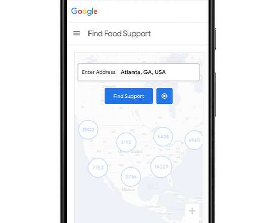
Google is working with non-profits to aggregate 90,000 locations with free food support across all 50 states. The “Find Food Support” site includes a food locator tool powered by Google Maps which people can use to search for their nearest food bank, food pantry, or school lunch program pickup site in their community. Image: Google.
As data-loving professionals, our team gets many questions about what an engagement score is, how to assign members points and how to use the data. As you start scoring, you should include data that is easily accessible like the number of members, amount of donations and course registrations. Use data to calculate.
Meet Vianova , a French startup that is building a data platform for shared mobility companies as well as local governments. The company acts as both a data repository and a data visualization dashboard. Policymakers and data scientists can also leverage this platform to discover some trends. It has raised a $6.4
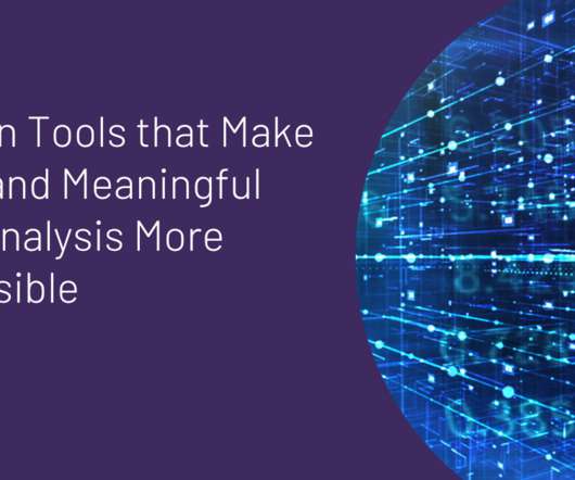
Not that long ago, powerful data management and analysis tools were often only accessible to the commercial sector. Today, there is a wealth of modern tools that make deep and meaningful data analysis more accessible to the nonprofit and social good sector. When people think about data, the concept of data visualization (aka.,
Start with data. Data is one of the easiest things we can share. We already share this data regularly: we put it in documents for our funders and our annual reports, and if we're really bold, we put it up on our blog. The problem is that the data in these formats is usually still locked away – inside a PDF, wrapped in text.
A recent report surveyed most of the countries in the world, and shows half of the top 10 most expensive countries to buy mobile data in the world are in Sub-Saharan Africa, which may be hindering investor activity and startup opportunity in the region. It raised $13 million to get there, Kyle reports.
Data is the new black. These days everyone is releasing it, visualizing it, aggregating it, and mashing it up. Data is so much more than a stack of numbers or a server filled with client outputs. Here are 6 ways to tell your stories with data that you can apply to your own web and communications work: 1. Focus the Story.
And that information can almost always be broken down into its underlying data: the literal and figurative bits and bytes that catalog our lives, the work we do, and the world around us. Why pay attention to data? Data is valuable! Our environment is telling us how important our data is by how hard we work to protect it.
But you can also see aggregated information about the voting process on Our Vote Live created by Election Protection , Lawyers’ Committee , NOI , and Ushahidi. It is mapping out all reported voting/election questions and incidences around the country. I love seeing these photos of polling places where my friends are voting.
In our book, The Networked Nonprofit , co-authored with Allison Fine, we provide an overview of mapping your social network in Twitter and other sites using some of the social network analysis tools available. . After all, data is only as good as it is actionable! After all, data is only as good as it is actionable!
There are a number of trends worth exploring: Technology that fuels data-driven storytelling. Our work with the Service Employees International Union (SEIU) shows the power of harnessing data for impact storytelling. With real-time data, SEIU has been able to show potential funders the efficacy of the program.
Without a doubt big data is one of the most talked about topics in nonprofit technology and IT in general this year. But if you’re not a big collector of online information like Google, Facebook or Microsoft, what does big data have to do with you and your work? What Is Big Data Anyway? It was last year as well.
To give you a taste of the course, we’ve included a clip below on how to use Foundation Maps to identify potential grantees. For our next example, we’re going to learn how to use Foundation Maps to identify potential grantees. I’d like to use the Funding Map to identify other potential grantees, not already in our network.
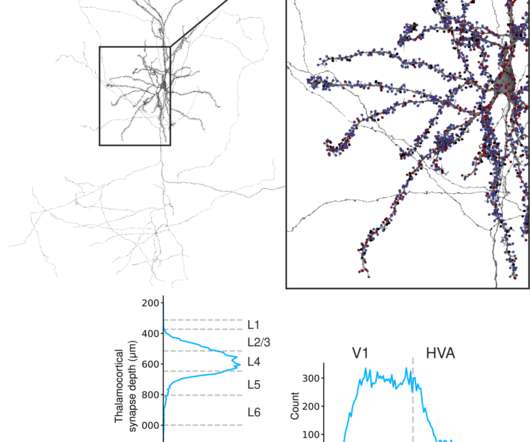
Li, Research Scientist, and Sven Dorkenwald, Student Researcher, Connectomics at Google Mapping the wiring and firing activity of the human brain is fundamental to deciphering how we think — how we sense the world, learn, decide, remember, and create — as well as what issues can arise in brain disease or dysfunction.
Ideally, the conversation with map the various services to the segments or groups who already/could benefit. In CTX’s eyes it is the engagement, aggregation, or the weaving of people and ideas, questions and answers. This conversation should naturally define segments or groups, as well as the attributes that define those members.
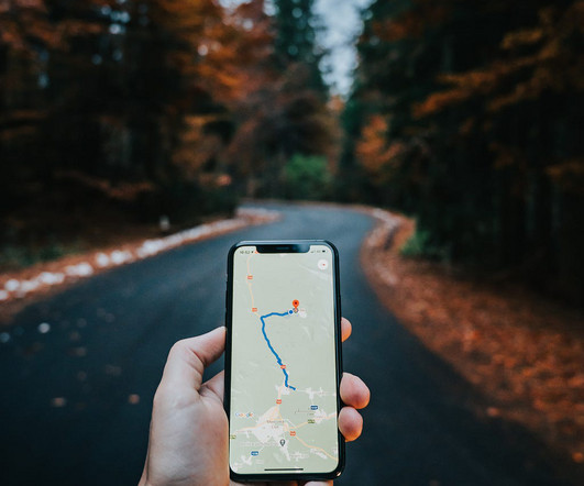
It is a technical handshake that allows one system to request pre-determined data from another system and get a response in a standardized format. For example, when you use Google Maps to find directions, you’re using an API that connects your browser to Google’s database of maps, locations, and traffic information.
If you think that a mash-up of online tools for capacity mapping and resource matching would assist nonprofits, philanthropies, and the communities that they serve, then we invite you join us at our upcoming session at the 2011 Nonprofit Technology Conference. I think that our best hope is to work for incremental successes.
I think there’s a lot of potential for hyper local search and the power that comes with geo-tags/data. Creating a map or other aggregate of local resources, conversations, news and so on (even if it was done in a dashboard ) could help your community and help position your organization as the hub.
We organize all of the trending information in your field so you don't have to. Join 12,000+ users and stay up to date on the latest articles your peers are reading.
You know about us, now we want to get to know you!
Let's personalize your content
Let's get even more personalized
We recognize your account from another site in our network, please click 'Send Email' below to continue with verifying your account and setting a password.


Let's personalize your content