This site uses cookies to improve your experience. To help us insure we adhere to various privacy regulations, please select your country/region of residence. If you do not select a country, we will assume you are from the United States. Select your Cookie Settings or view our Privacy Policy and Terms of Use.
Cookie Settings
Cookies and similar technologies are used on this website for proper function of the website, for tracking performance analytics and for marketing purposes. We and some of our third-party providers may use cookie data for various purposes. Please review the cookie settings below and choose your preference.
Used for the proper function of the website
Used for monitoring website traffic and interactions
Cookie Settings
Cookies and similar technologies are used on this website for proper function of the website, for tracking performance analytics and for marketing purposes. We and some of our third-party providers may use cookie data for various purposes. Please review the cookie settings below and choose your preference.
Strictly Necessary: Used for the proper function of the website
Performance/Analytics: Used for monitoring website traffic and interactions
Alyssa Jenson November 14, 2023 - 6:59pm Sue Kraemer Senior Data Skills Curriculum Strategy Manager, Tableau Charts are all around us. In today’s world, the ability to swiftly make decisions and act on data is crucial. In today’s world, the ability to swiftly make decisions and act on data is crucial. Don’t be SCAM’d!
As a grantmaker in a digital world, gathering data seems to be the easy part. You have data on your grantees flowing into your grant management system (GMS) through applications and their updates. Your own historical data on grants awarded accumulates with every grant cycle. Using Charts in Your Grant Reporting.
Spencer Czapiewski August 6, 2024 - 6:34pm Kyle Massey VP Lead Software Engineer Kyle Massey, a two-time Tableau DataDev Ambassador and co-leader of the DataPride Tableau User Group, shares his experience with VizQL Data Service. What is VizQL Data Service? Why should you be excited about VizQL Data Service?
and provided the two possible responses of “friends&# or “data&# – I used the question style where respondents had to pick one answer or the other exclusively. As soon as the question is live, you start seeing the impressions and the responses, aggregated in real time. It’s incredible!
He has some terrific advice about how to apply visual thinking to your data visualization and to get insights. But first, he simplifies what visual thinking is: Look, See, Imagine, and Show. These are a great set of questions to ask as you look over your data. The steps are: Collect your data. Map the data.
Today, Candid released our latest research manual, Analyzing Candid’s demographic data. nonprofits currently share some demographic data about their staff and board with Candid. In fact, about 1,000 nonprofits are now adding demographic data to their Candid profiles every month. Over 62,000 U.S. For example, U.S.
Data analysis and data communication are fundamental to the way people and businesses understand concepts, make decisions, and create solutions. Anyone who communicates with data needs to be mindful of the impact of the stories they tell. Topics include: How the concept of empathy relates to data, research, and visualizations.
Not very much, according to data that Compass has shared with The Next Web. The company collected salary data from 11,160 startups around the world that use its benchmarking tool. In Silicon Valley, 75% of founders pay themselves less than $75,000 per year and 66% pay themselves less than $50,000 per year, according to the data.
You don’t have to wait for your music streaming service to provide that for you anymore—you can see and learn from your listening data at any point in the year using Tableau. Whether this is your first Tableau visualization or your 100th, let this be a chance to practice and grow your viz-building skills using your own personal data!
Can data fix healthcare? Not alone, but you might be able to make a lot of progress with the right data in the right hands. Myerson is best known for his time one-rung below the top of the Microsoft org chart, where he ran things you might have heard of, like Windows. But now they are at a healthtech data company.
Leveraging your data throughout the entire member journey can impact your association and your members. From successfully converting non-member audiences into members, to your membership engagement strategy, to events and non-dues revenue, data can inform every step along the way. Pillar: Advance the Profession What to track?
Data analysis and data communication are fundamental to the way people and businesses understand concepts, make decisions, and create solutions. . Anyone who communicates with data needs to be mindful of the impact of the stories they tell. How the concept of empathy relates to data, research, and visualizations. .
You don’t have to wait for your music streaming service to provide that for you anymore—you can see and learn from your listening data at any point in the year using Tableau. Whether this is your first Tableau visualization or your 100th, let this be a chance to practice and grow your viz-building skills using your own personal data!
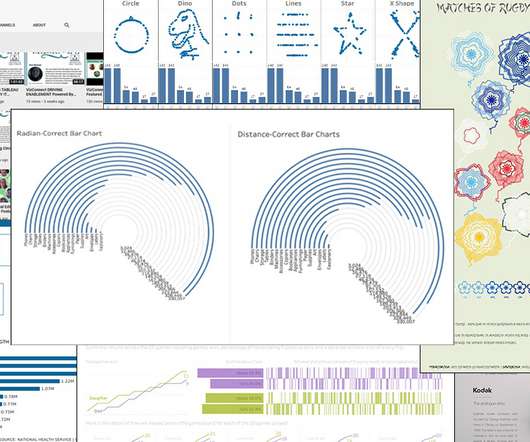
This month, I want to highlight three posts that point to some of the big challenges we face as data communicators: balancing form against function, and how those choices affect accessibility. Luke Stanke, Circular Bar Charts: Why you should make them but never share them. Pierre Hansquine, Bar Charts: The Good, the Bad, and the Ugly.
By Kurt Voelker, CTO, Forum One Data is the new black. These days everyone is releasing it, visualizing it, aggregating it, and mashing it up. Data is so much more than a stack of numbers or a server filled with client outputs. The truth can become obvious when you reveal the change in data in a visual way.
Fitbit activity analysis with DuckDB Photo by Jake Hills on Unsplash Wearable fitness trackers have become an integral part of our lives, collecting and tracking data about our daily activities, sleep patterns, location, heart rate, and much more. What insights are buried within my archive of personal fitness activity data?
Many nonprofits struggle to maximize their data usage. In fact, when surveyed, 97% of nonprofit professionals expressed an interest in learning how to use their data more effectively, and only 5% reported using data in every decision they make. So, how do healthcare organizations overcome these data silos?
Per the company, which tracks real-time consumer spend data, here’s a look at how well Airbnb recovered ahead of its larger industry after the initial recession in pandemic lodging spend: Impressive, right? The drooping line, however, was echoed in similar SimilarWeb data that was also shared with The Exchange. On to the S-1!
See chart above]. To maximize the benefits of integrated marketing, nonprofits must commit to an integrated approach and organizational alignment, aggregate and analyze data, and move away from a one-size-fits-all donor treatment plan to toward paths that align with unique donor preferences.
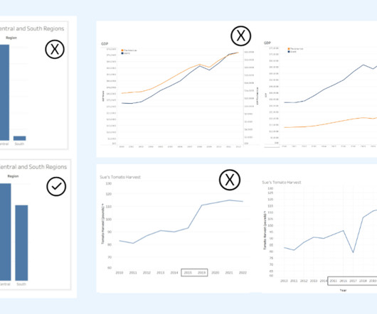
Ateken Abla November 14, 2023 - 6:59pm Sue Kraemer Senior Data Skills Curriculum Strategy Manager, Tableau Charts are all around us. When communicating with data, viewing a chart instead of a table of numbers helps us quickly understand data, make comparisons, see patterns, and make better decisions.
It’s data season, with groups like Silicon Valley Bank (SVB), CB Insights, PitchBook and Crunchbase News putting out data sets that we’re having fun exploring. SVB data shows a useful 2020 versus 2021 differential, with an aggregatechart tracking the same data over a longer time period on the right: Image Credits: SVB.
The venture capital market is retreating somewhat from its aggressive 2021 pace, new data indicates. We’re mere weeks away from the conclusion of the first quarter of 2022, which means in short order we’ll get a deluge of data concerning the domestic and global venture capital market’s performance at the start of the year.
Streamline Data Pipelines: How to Use WhyLogs with PySpark for Effective Data Profiling and Validation Photo by Evan Dennis on Unsplash Data pipelines, made by data engineers or machine learning engineers, do more than just prepare data for reports or training models. It lets you log all sorts of data.
For health data to impact health outcomes and related policies, the data must be made accessible to policymakers, health advocates, and other interested parties. Too often, health data is locked in massive datasets that are opaque to all but epidemiologists and statisticians.
Survey Link: [link] Survey Deadline: Friday, January 5, 2024 @5pm Eastern Your Data Matters: Rest assured, your responses are confidential and anonymous. The aggregateddata will be utilized to generate an industry report, providing a comprehensive overview that benefits everyone. Take the Survey now but clicking her e.
In a previous blog post written by Kestryl Lowrey (Managing Director, Technology Services) and Stephen Earheart (Director, Campaign Services ), Cloud for Good explored the role of data warehouses in nonprofit technology strategies. Higher Education Data Warehousing Use Cases. Data Warehousing for Recruitment & Admissions.
Similar to the advancements in telescope technology, data visualizations 10 years ago were no where near the art they’ve become today. Vizzes advance as the industry learns more about accessibility and human cognition, and as improved data literacy pushes the world to be more data driven. Go TEAM DATA! Darragh Murray.
Ateken Abla November 14, 2023 - 6:59pm Sue Kraemer Senior Data Skills Curriculum Strategy Manager, Tableau Charts are all around us. When communicating with data, viewing a chart instead of a table of numbers helps us quickly understand data, make comparisons, see patterns, and make better decisions.
Ateken Abla November 14, 2023 - 6:59pm Sue Kraemer Senior Data Skills Curriculum Strategy Manager, Tableau Charts are all around us. When communicating with data, viewing a chart instead of a table of numbers helps us quickly understand data, make comparisons, see patterns, and make better decisions.
Learn from Software Engineers and Discover the Joy of ‘Worse is Better’ Thinking source: unsplash.com Recently, I have had the fortune of speaking to a number of data engineers and data architects about the problems they face with data in their businesses. The data industry should not be afraid to to think the same way.
Ateken Abla November 14, 2023 - 6:59pm Sue Kraemer Senior Data Skills Curriculum Strategy Manager, Tableau Charts exist everywhere. Viewing a chart instead of a table of numbers helps us quickly understand data, see patterns, and make better decisions. In today’s world, swift decision-making with data is crucial.
Data is the new black. These days everyone is releasing it, visualizing it, aggregating it, and mashing it up. Data is so much more than a stack of numbers or a server filled with client outputs. Here are 6 ways to tell your stories with data that you can apply to your own web and communications work: 1. Focus the Story.
As a Database Administrator, my world revolves around helping users make sense of the information they receive, from voice-of-the-customer anecdotes and impressions to polished Key Performance Indicator (KPI) graphs, charts, and dashboards. Why pay attention to data? Data is valuable! Data fuels most activities in a nonprofit.
Similar to the advancements in telescope technology, data visualizations 10 years ago were no where near the art they’ve become today. Vizzes advance as the industry learns more about accessibility and human cognition, and as improved data literacy pushes the world to be more data driven. Go TEAM DATA! Darragh Murray.
Ateken Abla November 14, 2023 - 6:59pm Sue Kraemer Senior Data Skills Curriculum Strategy Manager, Tableau Charts are all around us. In today’s world, the ability to swiftly make decisions and act on data is crucial. In today’s world, the ability to swiftly make decisions and act on data is crucial. Don’t be SCAM’d!
Spitfire’s useful SMART chart planning tool has been used by many nonprofits and was adapted for social media for nonprofits by NTEN’s WeAreMedia project several years ago. Often, there is too much data collected and not enough sense-making of it. Many organizations think more data is better.
The Iron Viz finalist and fellow Aussie has been in the Tableau Community for a few years, yet only just recently started the She Will Viz blog focused on raising women’s voices in data visualization. Yuko , from the Tableau Data Heroines group, and Tableau Niisan demonstrate this beautifully. Maggy Muellner , Playfair Data.
The Iron Viz finalist and fellow Aussie has been in the Tableau Community for a few years, yet only just recently started the She Will Viz blog focused on raising women’s voices in data visualization. Yuko , from the Tableau Data Heroines group, and Tableau Niisan demonstrate this beautifully. Maggy Muellner , Playfair Data.
A chart of accounts (COA) is the foundation for all financial reporting. It is a list that details your nonprofit’s financial accounts to organize your most essential financial data. Once you’ve developed the structure of the COA, all that’s left is to fill it in with your nonprofit’s financial data.
It is a technical handshake that allows one system to request pre-determined data from another system and get a response in a standardized format. They can handle complex queries, large amounts of data, and real-time updates. You don’t have to download files, upload them to your system, or manually enter data.
Whether you’re analyzing patient outcomes, tracking academic trends, or gathering insights from donor demographics, data visualization can be a valuable tool for any organization. Let’s explore key data visualization do’s and don’ts to transform your communication and align your team.
We’ll look at the changing public market perspective, and then ask ourselves if the aggregate image that appears is good or not good for software startups. Here’s the Battery chart that makes the change clear: Page 31, Battery report. So, we’ll lean on their perspective a little as we go to help us move quickly.
If you are wondering about the chart, it came a cool free tool called “ Export.ly “ It will analyze your Twitter audience, Facebook page, and even your email box by grabbing the data and dumping it into a spreadsheet. You pay per export and right now you can pay with a Tweet. I used it analyze the Facebook page.
Data is the new black. These days everyone is releasing it, visualizing it, aggregating it, and mashing it up. Data is so much more than a stack of numbers or a server filled with client outputs. Here are 6 ways to tell your stories with data that you can apply to your own web and communications work: 1. Focus the Story.
We organize all of the trending information in your field so you don't have to. Join 12,000+ users and stay up to date on the latest articles your peers are reading.
You know about us, now we want to get to know you!
Let's personalize your content
Let's get even more personalized
We recognize your account from another site in our network, please click 'Send Email' below to continue with verifying your account and setting a password.


Let's personalize your content