This site uses cookies to improve your experience. To help us insure we adhere to various privacy regulations, please select your country/region of residence. If you do not select a country, we will assume you are from the United States. Select your Cookie Settings or view our Privacy Policy and Terms of Use.
Cookie Settings
Cookies and similar technologies are used on this website for proper function of the website, for tracking performance analytics and for marketing purposes. We and some of our third-party providers may use cookie data for various purposes. Please review the cookie settings below and choose your preference.
Used for the proper function of the website
Used for monitoring website traffic and interactions
Cookie Settings
Cookies and similar technologies are used on this website for proper function of the website, for tracking performance analytics and for marketing purposes. We and some of our third-party providers may use cookie data for various purposes. Please review the cookie settings below and choose your preference.
Strictly Necessary: Used for the proper function of the website
Performance/Analytics: Used for monitoring website traffic and interactions
How Salesforce is Powering Personal Giving Integrated Data: Salesforce provides a unified view of each donor, consolidating information from various sources, including giving history, website and text messaging interactions, event attendance, advocacy actions, and email engagement. Dive deeper!
Do you ever feel like you’re approaching your digital marketing without a map? On your property, you might also have outbuildings, guesthouses, or community spaces that you control (in the digital world, these are your specialized properties like micro-, affiliate, advocacy, peer-to-peer, or campaign sites). Settle in and stay awhile.
If your nonprofit engages in advocacy, it’s worth experimenting with. It’s also worth noting that they have an excellent mobile website which enables nonprofits to make their online advocacy campaigns mobile. Local Impact Map :: datamarket.azure.com/application. Change.org :: change.org. Dipity :: dipity.com.
Branding themselves as the “Play” button for the Web, Wibbitz automatically converts text-based posts and articles into engaging, interactive videos so your supporters “never have to read again.” Tripline is a clever way to visually plot check-ins on a map that can be shared with others. Wibbitz :: wibbitz.com.
This website allows users to build visually appealing interactive timelines using video, audio, images, location, social media, and timestamps. GlobalTweets is a website which plots recent tweets from all over the world on a map by using their geographical information. Local Impact Map :: datamarket.azure.com/application.
This website allows users to build visually appealing interactive timelines using video, audio, images, location, social media, and timestamps. GlobalTweets is a website which plots recent tweets from all over the world on a map by using their geographical information. Dipity :: dipity.com. Global Tweets :: globaltweets.com.
Nonprofit data nerds will love this new resource from Media Impact Funders and Foundation Center called “ Foundation Maps for Media Funding ,” a free, interactivemapping and research tool that shows the full scope of philanthropically funded media projects worldwide since 2009. Click to See Visualization.
This website allows users to build visually appealing interactive timelines using video, audio, images, location, social media, and timestamps. GlobalTweets is a website which plots recent tweets from all over the world on a map by using their geographical information. Local Impact Map :: datamarket.azure.com/application.
We use free and open source software whenever possible, but we're pragmatic and work with what our human rights monitoring and advocacy partners need, so our environment is a pretty eclectic mix. Design and implement data visualizations, including everything from simple static charts and maps to custom interactive visualizations on the web.
" Interactive: How America Gives – How America Gives – The Chronicle of Philanthropy- Connecting the nonprofit world with news, jobs, and ideas – The Chronicle of Philanthropy has launched a great new tool: an interactivemap of giving data in the US.
This website allows users to build visually appealing interactive timelines using video, audio, images, location, social media, and timestamps. GlobalTweets is a website which plots recent tweets from all over the world on a map by using their geographical information. Dipity :: dipity.com. Global Tweets :: globaltweets.com.
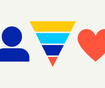
Whole Whale created the Funnel of Engagement to help orgs like you better map the typical journey a supporter takes from being Aware of your organization to becoming Committed to your cause. Make smarter decisions : Build campaigns and content that meet peoples needs at each stage and interaction with your org.
My Ocean , is a niche social network of more than 9000 divers and this guest post by Darren Barefoot describes some powerful outcomes for ocean conservation by bringing together several strategies: niche social network, crowdsourced data mapping, and deep engagement. For decades, scuba divers have been cleaning waterways. million divers.
Many nonprofits saw a surge in recurring subscription initiations following the 2016 election, particularly civil rights, social action, and advocacy organizations, according to Classy platform data. It’s my hope that these trends help your organization as you map out your strategy for 2020 and the years to come.
One of the topics was “How to understand social networks through social network analysis and mapping techniques.&# I thought I’d expand on it here. In the book, we talk about the using low tech tools like crayons or post-it notes to map out your network. Marty Kearns has a diagnostic tool over in his Advocacy 2.0
We so often focus on learning from innovative online campaigns that we miss out on opportunities to integrate offline cause communities and grassroots advocacy. Building buzz and press for an advocacy action. The road trippers also made stops for advocacy events in Boston and New York before concluding in Washington DC.
Social network maps, tree maps, and dot plots are some of the newest charts to enter the nonprofit field.† Social network maps are for visualizing relationships between people or organizations, like your nonprofit’s role in a nationwide advocacy campaign or your professional network as Andy Carvin did below.
October 2nd is LIVESTRONG Day- a day we set aside each year to focus on cancer survivors, advocacy efforts and community participation. Offer ways for the community to create something together We designed an interactivemap function on our website that shows where all the events are taking place.
Send Regular Communications: Consider creating a donor stewardship calendar to map out regular touchpoints, such as newsletters, mission updates, and impact stories. This could include volunteering, serving on advisory boards, participating in advocacy campaigns, or even becoming peer-to-peer fundraisers.
Check out the Tunisian Prison Map. Tunisian exile Sami Ben Gharbia is the creator of the Tunisian Prison Map -- an idea inspired by a New York Times interactivemap charting murder locations. The map is compelling and provocative, and it's one more reason Gharbia, who now lives in the Hague, says he can't go home.
The sum of all these parts and how your audience interacts with your organization at each stage creates the Customer Journey. A Customer Journey is a full lifecycle view that details all of the interactions a person has with your organization as well as the internal or external influences affecting the person’s behaviors.
This year, Forum One took home three gold, two silver, two bronze, and one merit award in the website, apps, and interactive, and annual report categories. The goal of the Children’s Hospital Colorado Foundation is to care for and cure children through the provision of high-quality care, education, research, and advocacy.
This project received national media attention and was built using a headless architecture with a Contentful back-end, React front-end, and interactivemaps with Carto. March of Dimes, with an 84-year legacy, is a leader in impactful research and advocacy for moms and babies.
Magic happens when social entrepreneurs, nonprofits leaders, technologists, and young people are brought together for a high energy, creative, and interactive event that exposes everyone to new ideas and stories. These philanthroteens lead workshops on advocacy, communications and learned about their peers in developing countries.
What if I give her a written note that she ignores in favor of a richly interactive iPad app? IP networking technology has blossomed into a widely available, and widely used, interactive mass medium capable of spawning entirely new and uniquely digital communication forms. But what if I tell her in a language she doesn't understand?
She led teams that examined biases in decision-making, studied economic inequality and the manifold ways in which sociology interacts with venture capital. But even in the midst of this breather, Maillian is mapping out what’s next. I’ve been the Black woman founder; I’ve been underestimated.
In June, Tides partnered with Rhiza on a data mapping pilot using their Insight software. After doing some research and testing out some of the data mapping tools, we started with just making basic maps of where grants were made and partners are located, from which initial story threads emerged. and "to what ends?"
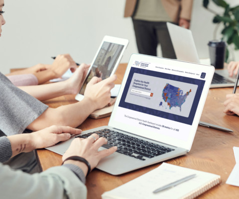
The implementation employed a headless architecture with a Contentful back-end, React front-end, and interactivemaps featuring Carto. This innovative project offers comprehensive data on 36 metrics for all 435 U.S. congressional districts, empowering policymakers to make informed decisions.
Forum One collaborated with Tangled Bank Studios to develop a stunning, mobile-responsive WordPress site for Wild Hope, resulting in a dynamic, user-friendly platform that not only showcases the Wild Hope documentary series but also enhances user interaction and exploration.
As the relationship grows, you’ll learn their preferred means of communication, and with increased interaction, how to set up campaigns to have the most traction with your audience. Take action to make it easier for your community to volunteer and do advocacy work. Interactions and interest. Analyze your “Donate” page.
But in the last few years, advocacy from within the knitting community — mostly in digital spaces, like Instagram networks — have sparked discussion and action around how to make the craft more inclusive. “It It took probably five minutes to map out the increases after I had my first set of numbers”.
Sometimes, it requires taking a step back to gain perspective on all the different ways data storytelling can enhance advocacy efforts. Over the past year, many different initiatives and projects have emerged that focus on tracking people killed during interaction with law enforcement. Creating a Searchable Database.
How do you encourage audience participation and interaction? Also, don't forget to check out this week's webinar, Geocoding for Legislative Advocacy , on Thursday, December 1 at 11a.m. Join this webinar to learn how to create mapping tools to better reach your legislative districts, better inform your donor base, and more!
You should take inspiration from websites that you enjoy interacting with and that offer a positive user experience, but understanding why those features create that experience will be instrumental in helping you upgrade your organization’s website. . Interactive Media. Accessibility Features. Recurring Donor Options. Matching Gifts.
Source: Foundation Center Focus on the Financial Crisis The map image above is an interactivemap that displays the distribution of the most recent support by U.S. At this stage, it is clear that nonprofit and advocacy groups are headed for extraordinarily difficult financial times. Drill down to see the details.
The Open Knowledge Foundation is a great advocacy charity in that field. Data Mapping and Visualization. Probably the clearest examples of the usefulness of data for charities is the explosion of infographics and maps that graphically illustrate the issues that nonprofits are working on. ESRI mapping tools software donations.
It can contribute to exchanges and interactions that are at the heart of nonprofit network building. Visualizing Where Meaning Making Can Happen “Mapping” activities are often the starting point of identifying data collection opportunities. Datamaking can ground processes of joint learning that energize grantee relationships.
Carriers “have provided more precise data about the exact location of wireless transmitters and supported more thorough analysis of how 5G C-band signals interact with sensitive aircraft instruments,” according to an FAA statement released on Friday , which you can read in full below.
Broadly defined, GIS refers to the use of a map format to collect and analyze data. GIS is a powerful tool for education and advocacy: it's not just about presenting data more attractively; it's about illuminating the real story behind the facts. Warning: This site is very dangerous for map geeks who have work to do.).
Free domain mapping. Social functionality makes sites more "sticky" and helps build community while giving people a reason to come back due to interactivity. Integration with YouTube, Picassa, and other rich media sites and files. Complete control over look and feel of the site (customization). Photo and video uploading. 41 languages.
The SXSW Interactive Festival. And like last year's ROI Poetry Slam , our session will be interactive, thought-provoking, and dare I say, fun! LIVESTRONG: The Lance Armstrong Foundation Takes Advocacy Digital : LIVESTRONG has taken the fight against cancer digital, connecting people and communities to drive social change.
What makes up your digital ecosystem Beyond tools and platforms, a digital ecosystem is also made up of the practices and people you interact with every day. Which ones are essential to the success of your website goals? How are the various components connected, and not connected, to your website?
Our Feeding Wisconsin Hunger Fighter program is our advocacy program. Registrants give us a little bit of information about themselves and in return we connect with them with rich advocacy and hunger-related content at the state and federal level. Speaking of your advocacy programs, I was impressed with your advocacy forms!
We organize all of the trending information in your field so you don't have to. Join 12,000+ users and stay up to date on the latest articles your peers are reading.
You know about us, now we want to get to know you!
Let's personalize your content
Let's get even more personalized
We recognize your account from another site in our network, please click 'Send Email' below to continue with verifying your account and setting a password.


Let's personalize your content