This site uses cookies to improve your experience. To help us insure we adhere to various privacy regulations, please select your country/region of residence. If you do not select a country, we will assume you are from the United States. Select your Cookie Settings or view our Privacy Policy and Terms of Use.
Cookie Settings
Cookies and similar technologies are used on this website for proper function of the website, for tracking performance analytics and for marketing purposes. We and some of our third-party providers may use cookie data for various purposes. Please review the cookie settings below and choose your preference.
Used for the proper function of the website
Used for monitoring website traffic and interactions
Cookie Settings
Cookies and similar technologies are used on this website for proper function of the website, for tracking performance analytics and for marketing purposes. We and some of our third-party providers may use cookie data for various purposes. Please review the cookie settings below and choose your preference.
Strictly Necessary: Used for the proper function of the website
Performance/Analytics: Used for monitoring website traffic and interactions
Last night it was finally time for Wayra demoDay 2013 – a chance for the fledgling startups to draw interest and offers of cash from a crowd of more than 200 investors. In the image below you can see the Drops Mix Chart – curated lists from users that have been voted the most popular. It also has a map of known defibrillator locations.
Nonprofit data nerds will love this new resource from Media Impact Funders and Foundation Center called “ Foundation Maps for Media Funding ,” a free, interactive mapping and research tool that shows the full scope of philanthropically funded media projects worldwide since 2009. Click to See Visualization.
13NTC tweets during the conference: 3000 from 806 unique tweeters from over 128 locations (thanks, Chris Tuttle for these cool visual charts). What We Learned at NTEN''s 2013 Nonprofit Technology Conference , Big Duck NYC. 3 Must-Watch Presentations for all NTEN 2013 Attendees , Nonprofit Hub. NTC 2013 , Simren Deogun.
I did a quick scan of data visualization resources to look for practical advice on the process of thinking visually and some technical information on what chart to select and data storytelling. The deck provides specific practical advice on charts, color, and maps. I like the chart advice: Avoid 3d-charts at all costs.
13NTC tweets during the conference: 3000 from 806 unique tweeters from over 128 locations (thanks, Chris Tuttle for these cool visual charts). What We Learned at NTEN''s 2013 Nonprofit Technology Conference , Big Duck NYC. 3 Must-Watch Presentations for all NTEN 2013 Attendees , Nonprofit Hub. NTC 2013 , Simren Deogun.
In 2013 (and still today) Kelly Martin blew us away with her Bird Strikes Redoux. Charting "Top N and Others" via Table Calculations in Tableau. How to build and interpret an index chart using Tableau. Learn to build a Butterfly Chart in Tableau. Nicole Lillian Mark , SELECT * FROM data; Chart Chat Live — Round 32.
In 2013 (and still today) Kelly Martin blew us away with her Bird Strikes Redoux. Charting "Top N and Others" via Table Calculations in Tableau. How to build and interpret an index chart using Tableau. Learn to build a Butterfly Chart in Tableau. Nicole Lillian Mark , SELECT * FROM data; Chart Chat Live — Round 32.
PowerPoint 2013 can be used to create image slides and animations like nonprofit Trickle Up did. You can also use Visio 2013 to make dynamic diagrams and charts for your story. Use Esri’s geographic information system software to create maps that tell your story.
Interally, we have a new organizational chart (if you can call it that! We are waiting to get additional reports on access points and a heat map from previous events to do as much as we can to ensure uptime. I am always available if you have ideas to share about how NTEN can serve you, your colleagues, or your community!
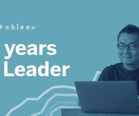
You can dive deeper, pivot analysis, and change chart types without starting over or breaking your flow. In 2020, we released some of the most highly-anticipated features in Tableau, including dynamic parameters , new data modeling capabilities , multiple map layers and improved spatial support, predictive modeling functions , and Metrics.
That's why TechSoup offers product donations that can help you with desktop publishing, presentations, sketches, graphs, charts, and more! Microsoft Publisher 2013 — I never know why more people don't use Microsoft Publisher. The 2013 version is more oriented to visual communications than ever.
Office 2013 Fundamentals Online Learning for End Users. Tableau is professional-grade data-visualization software that helps you create powerful, interactive data visualizations in the form of charts and graphs. Beyond the Pie Chart: When to Use a Bar Chart or Line Chart. It can do this from almost any data source.
Since its founding in 2013, NS1 has raised more than $100 million to build an engineering team and robust product portfolio that’s expanded to include DDI, which helps companies manage internal networks. Nextdoor’s SPAC investor deck paints a picture of sizable scale and sticky users.
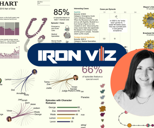
Several judges said the viz inspired them to watch all 77 episodes of the hit show, and praised Jessica’s “brilliant implementation” of data-driven line charts, advanced charts, glyphs and diagrams. She took a degree in nutrition and food science, and in 2013 went on to do an MBA with a specialization in contracts.
Eligible nonprofits, charities, foundations, and libraries can now request Office Standard 2013 and Office Professional 2013 editions through the Microsoft Software Donation Program at TechSoup: Office Standard 2013 (admin fee: $24). Office Professional Plus 2013 (admin fee: $32).
You can dive deeper, pivot analysis, and change chart types without starting over or breaking your flow. In 2020, we released some of the most highly-anticipated features in Tableau, including dynamic parameters , new data modeling capabilities , multiple map layers and improved spatial support, predictive modeling functions , and Metrics.
Now that this year is wrapping up and we have the verdict on nonprofit technology trends for 2013 , we queried charity Technorati like Amy Sample Ward, Beth Kanter, Marnie Webb, Peter Campbell, Nicole Wallace, the entire crew at Idealware, Lucy Bernholz, and other luminaries to find out what is in their crystal balls for 2014.
For instance, tech companies use algorithmic management to precisely surveil and manage the details of workers’ daily working conditions—tracking every delivery time, cataloging every customer review, mapping workers’ daily locations, even noting the length of bathroom breaks. Stocksy United: Platform Co-op for Freelance ”.
Orlando-based HypGames co-developed the experience with Niantic; HypGames CEO Mike Taramykin served as VP and GM over EA’s Tiger Woods franchise until 2013. On top of a real-world map of a player’s surroundings, All-World layers things like power-ups, challenges, gear, boosts and in-game currency.
I launched the channel in the fall of 2013. And this was in 2013. So I launched the channel at the end of 2013, and then it took off. How do you map that back to your revenue? And I don’t even know if that generational trust maps to age. What’s your org chart like? We talk to a lot of creators on the show.
We organize all of the trending information in your field so you don't have to. Join 12,000+ users and stay up to date on the latest articles your peers are reading.
You know about us, now we want to get to know you!
Let's personalize your content
Let's get even more personalized
We recognize your account from another site in our network, please click 'Send Email' below to continue with verifying your account and setting a password.


Let's personalize your content